F
Having been wearing the flag for so long, Steve is taking a step back to where he came from, living a life as Steve Rogers from Brooklyn. Of course, the area has changed, plus there are some things that never change, be it threats to the July 4th celebrations or bullies in the alley. Thankfully, Steve and Cap are there to handle both threats, the former with the help of Bucky. But in saving the day, one of the previously unquestioned bastions of freedom, liberty and the American way, is smeared with doubt. What does this mean for Cap?
Writers Jackson Lanzing and Colin Kelly mine the extensive Cap A history, whether it is from the books or from the MCU. They also look at the past to drive their story forward. It’s a trick that has been used a number of times, as is the inclusion of Bucky as a darker version of Cap regardless of his current hero status. The pair spend a lot of time setting up the living arrangements, which in turn set up the mental thought processes in Steve’s intentions. Steve’s mindset may be “Old Man Rogers”, the man out of time vibe still prevails. Am I wrong in thinking, that by now, Steve should have acclimatised? I am also often confused by Captain America himself; on one hand he always seems to be looking to find himself, on the other he is the super confident and competent sometime leader / member of the Avengers. Will the real Steve Rogers please stand up?
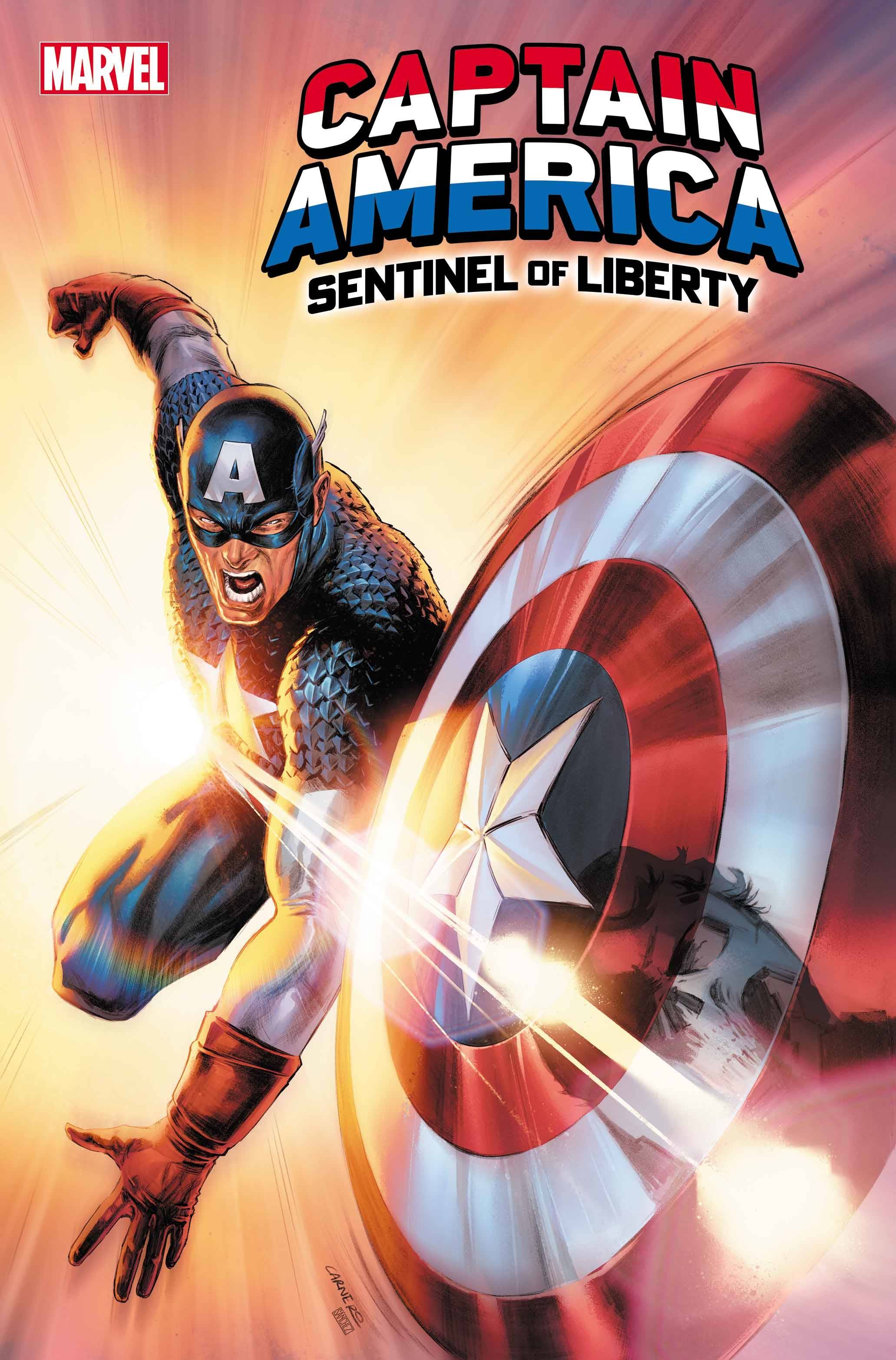
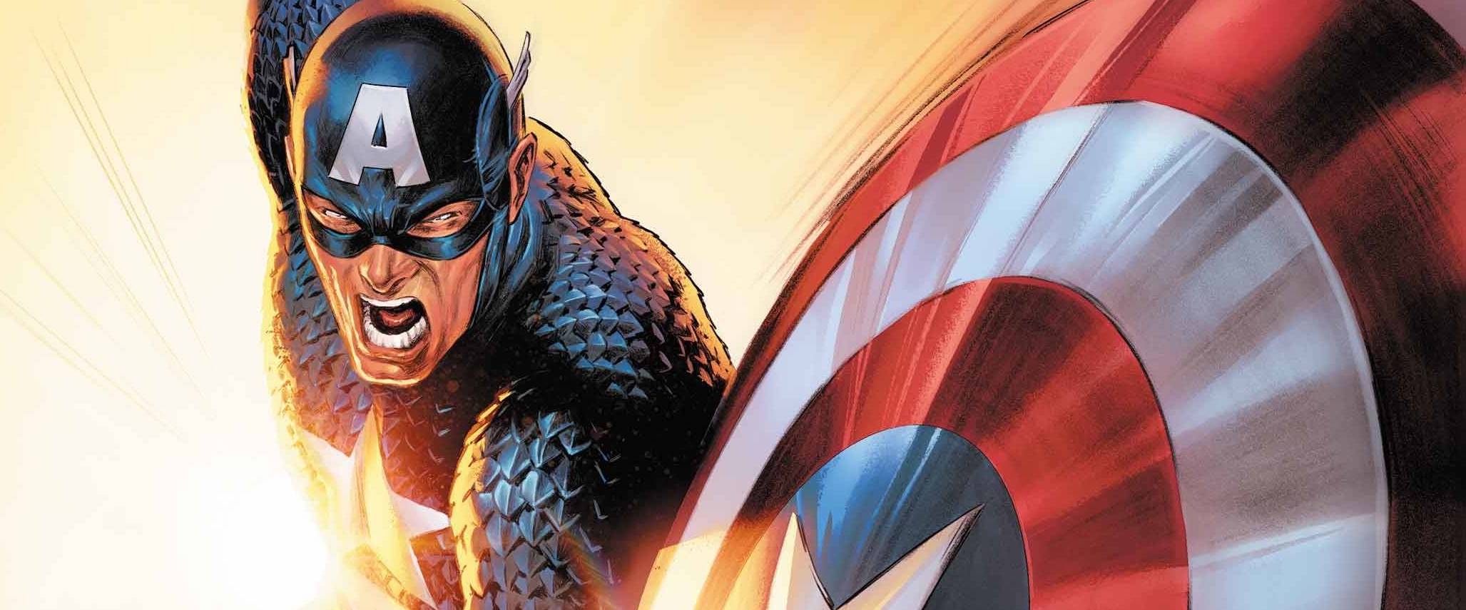
Fresh off a successful run on Captain Marvel, Carmen Carnero supplies the art for the book. Carnero’s style carries the same sort of weight as her work on Captain Marvel. This helps with generating a lot of the emotions running through Steve’s goals. The heavy lines work for the for most part, though ironically, the fight scene lacks details and appears clumsy in places; at times it is not clear how characters get to where they end up. Still thanks to Carnero the final panels certainly pack a punch. Colors are provided Nathan Woodard who carries on the vibe with a darker scheme than you may expect. VC’s Joe Caramagna supplies the letters with a font that is easy to read and doesn’t detract from the art, regardless of the verbiage. One thing I will say about the cover; when Cap throws his shield left-handed, the stars and stripes would also be on the left. Why let a a small matter of physics spoil a great cover, right?
Captain America, as a book, seems to be polarising in much the same way that Superman can be. Does Cap work better on a team rather than on his own? Is that why the MCU movies Winter Soldier and especially Civil War feel like de facto Avengers movie? I am quite interested in Cap, so I will be keeping an eye on this run.
Writing – 3.5 Stars
Art – 4 Stars
Colors – 4 Stars
Overall – 3.5 Stars
Written by; Jackson Lanzing & Colin Kelly
Art by; Carmen Carnero
Colors by; Nathan Woodard
Letters by; VC’s Joe Caramagna
Published by; Marvel Worldwide Inc.
Author Profile
-
I am a long time comic book fan, being first introduced to Batman in the mid to late 70's. This led to a appreciation of classic artists like Neal Adams and Jim Aparo. Moving through the decades that followed, I have a working knowledge of a huge raft of characters with a fondness for old school characters like JSA and The Shadow
Currently reading a slew of Bat Books, enjoying a mini Marvel revival, and the host of The Definative Crusade and Outside the Panels whilst also appearing on No-Prize Podcast on the Undercover Capes Podcast Network
Latest entries

