Following events in Inferno, and X Lives / X Deaths of Wolverine, the Quiet Council stands in abeyance, with a founding member stepping down. Now then is the time to re-elect a new member. But with those on the council who seem to know of “a future” standing in silence, against those with their own agendas, who will win out?
Kieron Gillen is back on the X-Men after quite some time on other projects. Gillen has slipped into Hickman’s arena well, setting up the pompous and the posturing of Mr Sinister along with quiet knowledge of Destiny. Gillen carefully crafts the various facets of the council, though I did find the meanderings of Sinister annoying; am I the only one who misses the more stoic version? Other than some of the council, there aren’t a whole lot of “fan favourite” characters, with that said, I think I would read a book just about Mystique and Destiny, probably the only committed to themselves couple in mutant-dom. Gillen writes for the long haul, a trait that seems to have become the trend when it come to writing X-books, the worry is that with so many “long hauls” are readers going to get bored?
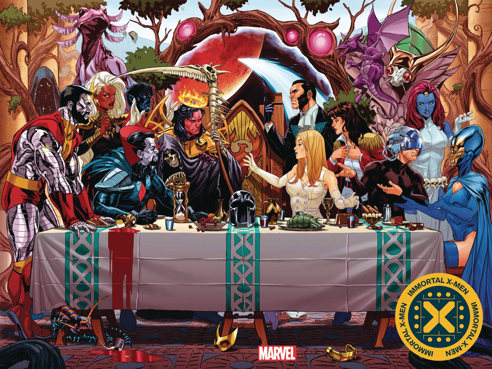
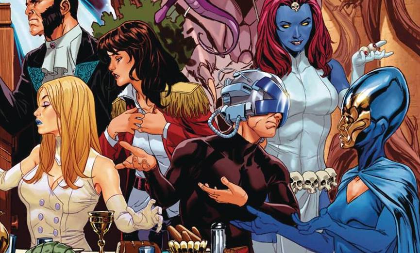
The art is provided by Lucas Werneck who maintains the status quo for this brand of book. At this point, I am not sure if that is a good thing or not. For me, artists need to be able to flex their muscles. After all, they are working with, mostly, recognisable characters, why therefore does an artist need to conform and possibly move away from their own standards. Colorist David Curiel maintains the “brand” with a scheme that matches those books that have gone before and probably those yet to come. Speaking of brand, VC’s Clayton Cowles utilises his X-font, as has every letterer working on these books, very well. With Gillen writing in long sweeping passages, Cowles does well in keeping the flow of dialogue in line with the art and plot, which makes the conclusion of this book more impactful. Finally, taking a nod from Battlestar Galactica which in turn took nod to The Last Supper, Mark Brooks drops another gorgeous cover, this time a wraparound cover shows the various sides of the council.
I like a good pot boiler as much as the next person, but it seems to me that Marvel seem quite content for numerous pots to boils, for an extended amount of time; I just hope that when all is said is done, the final meal is worth the wait, which may seem a tad fruitless given one inescapable truth, a truth know from the very beginning of House of X.
Writing – 4 Stars
Art – 3 Stars
Colors – 3.5 Stars
Overall – 3.5 Stars
Written by; Kieron Gillen
Art by; Lucas Werneck
Colors by; David Curiel
Letters by; VC’s Clayton Cowles
Cover by; Mark Brooks
Author Profile
-
I am a long time comic book fan, being first introduced to Batman in the mid to late 70's. This led to a appreciation of classic artists like Neal Adams and Jim Aparo. Moving through the decades that followed, I have a working knowledge of a huge raft of characters with a fondness for old school characters like JSA and The Shadow
Currently reading a slew of Bat Books, enjoying a mini Marvel revival, and the host of The Definative Crusade and Outside the Panels whilst also appearing on No-Prize Podcast on the Undercover Capes Podcast Network
Latest entries

