Advance Review: Moon Knight #1
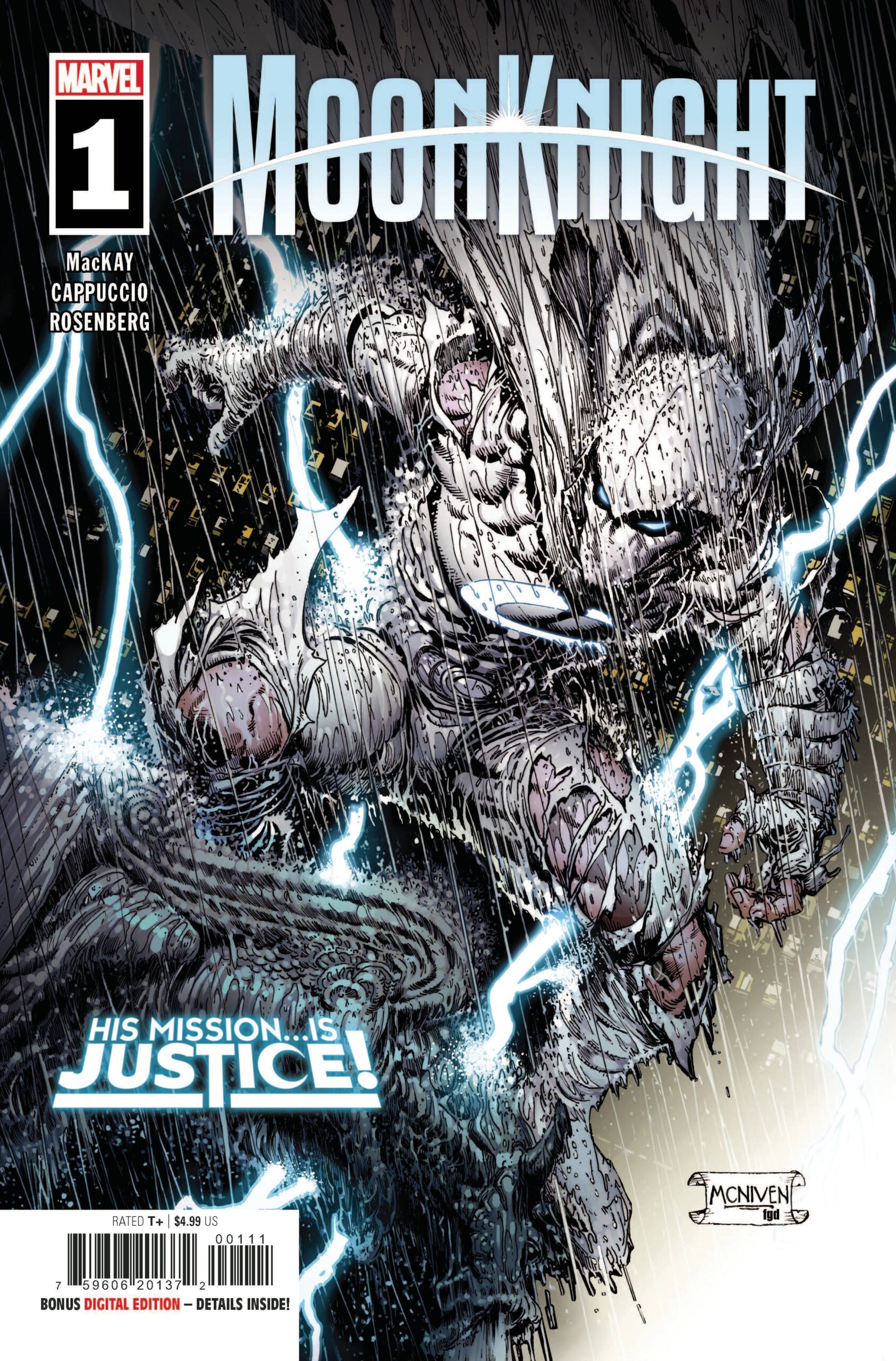 Comic books superheroes can be pretty much banded into two polar opposite groups; the super popular ones like the Avengers, Spider-Man, Batman and Superman and then there are the cult heroes such as Jessica Jones, Spider-Woman and of course Moon Knight. What better way to start with a cult character then. to invoke a cult theme throughout?
This issues serves as a re-introduction to both Moon Knight and Marc Spector. All the elements of his previous incarnations are there; vigilante, ex mercenary, Fist of Khonshu and of course the mental health element also receives some attention. The book also takes time to show Moon Knight in action as well as set-up the big bad for future issues. Overall, a very busy first issue.
Jed MacKay star has risen considerably over the last couple of years. His Black Cat book is one of the funnest book every month, his Infinite Destinies annuals are a great read in way that the more explosive Heroes Reborn tried to be, and know MacKay gets to hang up the funny and go for a more serious type of book….. for the most part. MacKay does well to make the expositional elements of the writing manageable, breaking up the chunks with action sequences that also serve to bring the Knight out into the night. It’s a wordy book; even the fight scenes have conversational parts. Of the actual true conversational parts, it never feels boring. For me, thats because I appreciate the historical recap, existing Moon Knight fans may not be as generous.
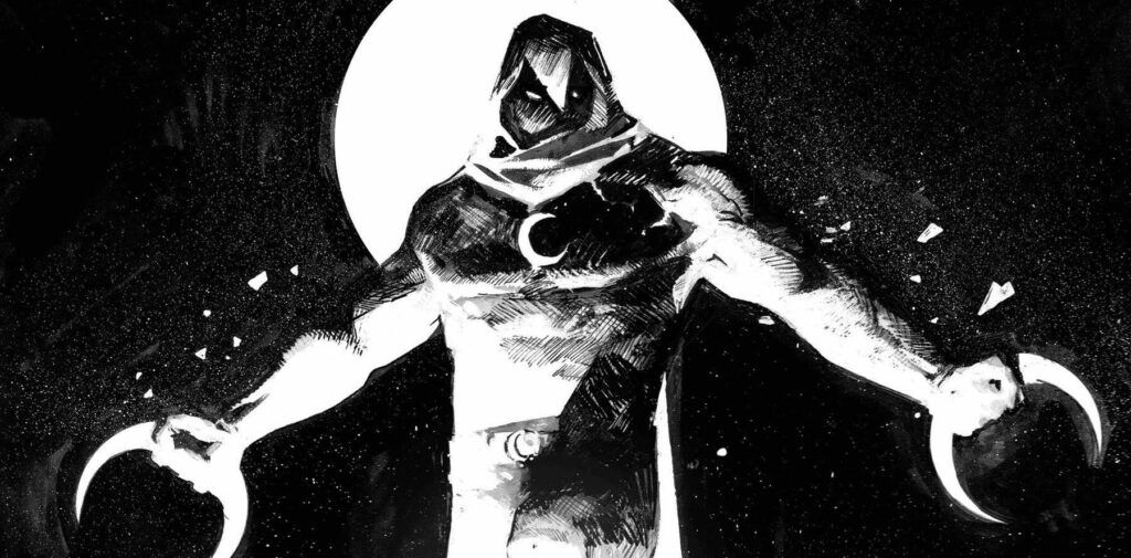
Behind the excellent though David Finch influenced cover from Steve McNiven and Frank D’Armata, the interior art is provided by Alessandro Cappuccio with a mix of styles in play. On one hand there are clean lines hint at a the darkness within Spector and then there are the scratchy, angular lines that offer odd perspectives. Its a juxtaposition that works well, once you get used to it though at first it is a tad jarring. Colorist Rachelle Rosenberg does well to add depth to what could be seen as a black and white focussed scheme, given the amount of black on the page and the contrasting whiteness of Moon Knight and Mr. Knight. I have been impressed with Rosenberg on a number fo books recently and I glad to see her knock it out of the park here. VC’s Cory Petit provides the font that is easy on the eye, allowing the art to capture the eye.
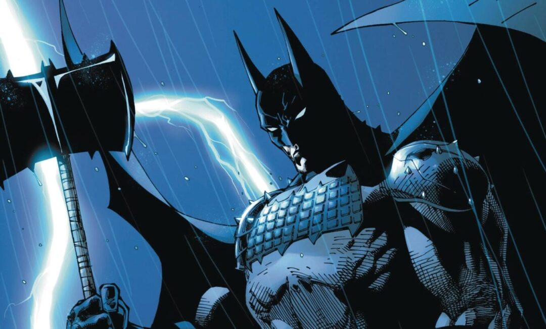
It’s easy to see how Moon Knight could be viewed as Marvel’s version of Batman, though Marvel have tried to downplay that element with the introduction of the mental health aspect and the focus as the Fist of Khonshu. In doing so, I feel that Marc Spector strays awfully close to Danny Rand territory. Still the introduction of a big bad that could challenge Spector’s belief, his duty and of course his physical prowess offers interesting options down the line.
Writing – 5 Stars
Art – 4 Stars
Colors – 5 Stars
Overall – 4 Stars
Overall – 4.5 Stars
Written by; Jed MacKay
Art by; Alessandro Cappuccio
Colors by; Rachelle Rosenberg
Letters by; VC’s Cory Petit
Published by; Marvel Worldwide
Author Profile
- I am a long time comic book fan, being first introduced to Batman in the mid to late 70's. This led to a appreciation of classic artists like Neal Adams and Jim Aparo. Moving through the decades that followed, I have a working knowledge of a huge raft of characters with a fondness for old school characters like JSA and The Shadow
Currently reading a slew of Bat Books, enjoying a mini Marvel revival, and the host of The Definative Crusade and Outside the Panels whilst also appearing on No-Prize Podcast on the Undercover Capes Podcast Network
Latest entries
 Comic BooksOctober 14, 2024Review: Absolute Batman #1
 Comic BooksSeptember 25, 2024Review: Defenders of the Earth #2 (of 8)
 Comic BooksAugust 7, 2024Review: Gatchaman #2
 Advance ReviewJuly 30, 2024Advance Review: Defenders of the Earth #1 (of 8)
