REVIEW: Sister Imperator #1
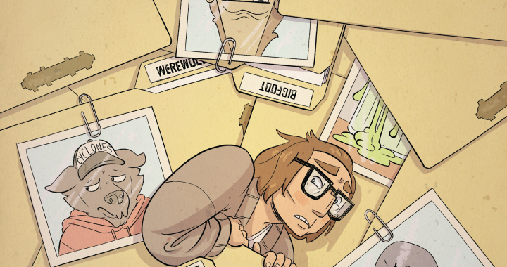
This comic hits the ground running with murder, mystery, and an art style that grabs your attention immediately. From the eerie, blood-drenched cover to its old-school horror vibes, it’s got a lot going for it visually. But as the pages unfold, what starts as a promising, atmospheric ride turns into something a bit messier—visually compelling but narratively scattered.
Let’s start with the good: the pacing at the beginning really works. The book kicks off strong with the main character committing a murder. It’s abrupt, shocking, and filled with mystery that promises to unravel over time. The panel layouts early on are creative and easy to follow, adding a real sense of rhythm to those first few pages. There’s something really enjoyable about how the mystery is seeded early—like we’re invited into a dark, secret world full of ghosts, violence, and trauma. Unfortunately, as the plot continues, things start to fall apart. There are a lot of ideas being thrown at the wall, but not enough of them stick. Characters appear out of nowhere, major revelations come with zero buildup, and tone-wise, it feels a bit all over the place. At one point, the protagonist is dealing with extreme trauma, and the next we’re just on the road with a new character that appears without context or setup. It ends just as abruptly as it unfolds, and that sudden cliffhanger doesn’t feel earned—more like the story just ran out of pages.
There’s some intense content here that could’ve really hit hard if given room to breathe. The revelation that the girl was raped by the priest and forced to give herself an abortion is massive. But the story just drops it in like an afterthought, with little to no setup. Sure, we know the priest sucks (and to the comic’s credit, it does a great job making you hate him), but it almost feels like a checklist of horrible things rather than a narrative arc. He did this, and this, and this other thing, oh—and this one too. It’s hard to connect emotionally when everything feels so rushed and crammed together.
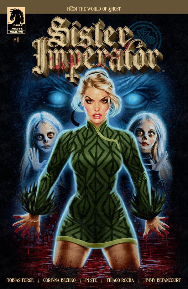
Visually though? The comic is doing some great work. The cover art is gorgeous. It’s got this photorealistic style with soft digital brushwork that blends beautifully, especially in the green and blue tones. And that splash of red at the bottom—a pool of blood—is just a great detail. The eerie ghost eyes floating in the background add an unsettling touch. I wasn’t sure about the little skull girls at first, they felt kind of weird to me, but as the story progresses, they make more sense. In fact, by the end, I appreciated their presence both visually and narratively. They tie in well with the horror themes, and thinking back to the credit page (which I initially liked more than the actual cover in terms of layout), I realized it might be referencing a very specific moment in the story. If that’s something that continues across the series—different credit pages that reflect key moments—that’s genuinely exciting.
The interior art is more stylized than the cover, leaning into a cartoonier look with a nice balance of airbrushed shadows and cell shading. It works well for this book’s tone, which jumps between grounded and surreal. Character designs are solid, very expressive—even the regular human characters manage to show a lot of personality through their faces and poses. There’s this vintage vibe running through the whole thing, maybe inspired by the 1940s to 60s, and it gives the world a unique atmosphere. The action poses are great too. There’s energy in the way characters move, fight, and react. I also loved the attention to environmental details—the pumpkins, Halloween banners, even the glow of a porch light. These little things add so much texture. The buildings though, not so much. They’re a little too clean, like they were maybe traced from 3D models. It doesn’t ruin anything, but they stand out in a way that clashes with the more organic character art.
There’s a ton of gorgeous color work throughout, and individual pages pop with contrast and mood. That said, the color script—the progression of colors used to tell the story visually—feels a bit unstructured. There’s not always a clear through-line, which can make transitions between scenes feel jarring. Still, moment-to-moment, the colors are beautiful. The mix of greens, browns, creams, and reds creates a rich, haunted world.
The lettering is serviceable but unremarkable. Mostly standard word balloons, with text a little too close to the edges at times. Not a lot of creative flair. There’s barely any sound effects text—maybe one or two, if that. That’s a missed opportunity, especially in a book with this much action and horror. A well-placed “CRACK” or “SLASH” could’ve really helped punch up some scenes.
So… did I like it? Yeah, mostly. There’s a lot of potential here. The art has style, the colors are great and the character designs are outsanding; there’s something interesting at the heart of the story. But the writing needs more focus. It’s trying to do too much at once, and in the process, it undercuts its own emotional beats. If the creative team had honed in on one or two key ideas and let them play out fully—maybe saved the bigger revelations for later issues—this could’ve landed with more impact.
As it stands, this comic is for horror fans who appreciate great visuals and moody atmosphere, even if the narrative is still finding its legs. If you’re someone who enjoys indie horror, doesn’t mind messy pacing, and can get lost in some stellar coloring and expressive art, you might enjoy the ride. But if you’re looking for a clean, tightly structured story with clear emotional payoffs, this one might leave you a bit frustrated.
I’d say give it a shot if the art grabs you. There’s definitely something here—it just needs time (and maybe a tighter script) to fully come together.
Writing: 2 Stars Art: 5 Stars Colors: 3 Stars
Overall: 3 Stars
Author Profile
Latest entries
 ColumnsMay 6, 2025Primordios: Enchanting Creations and Heartfelt Moments at Puerto Rico Comic Con 2025
 Comic BooksApril 17, 2025REVIEW: Sister Imperator #1
 Comic BooksFebruary 25, 2025REVIEW: Cruel Kingdom #2
 Comic BooksFebruary 24, 2025REVIEW: Godzilla Heist #1