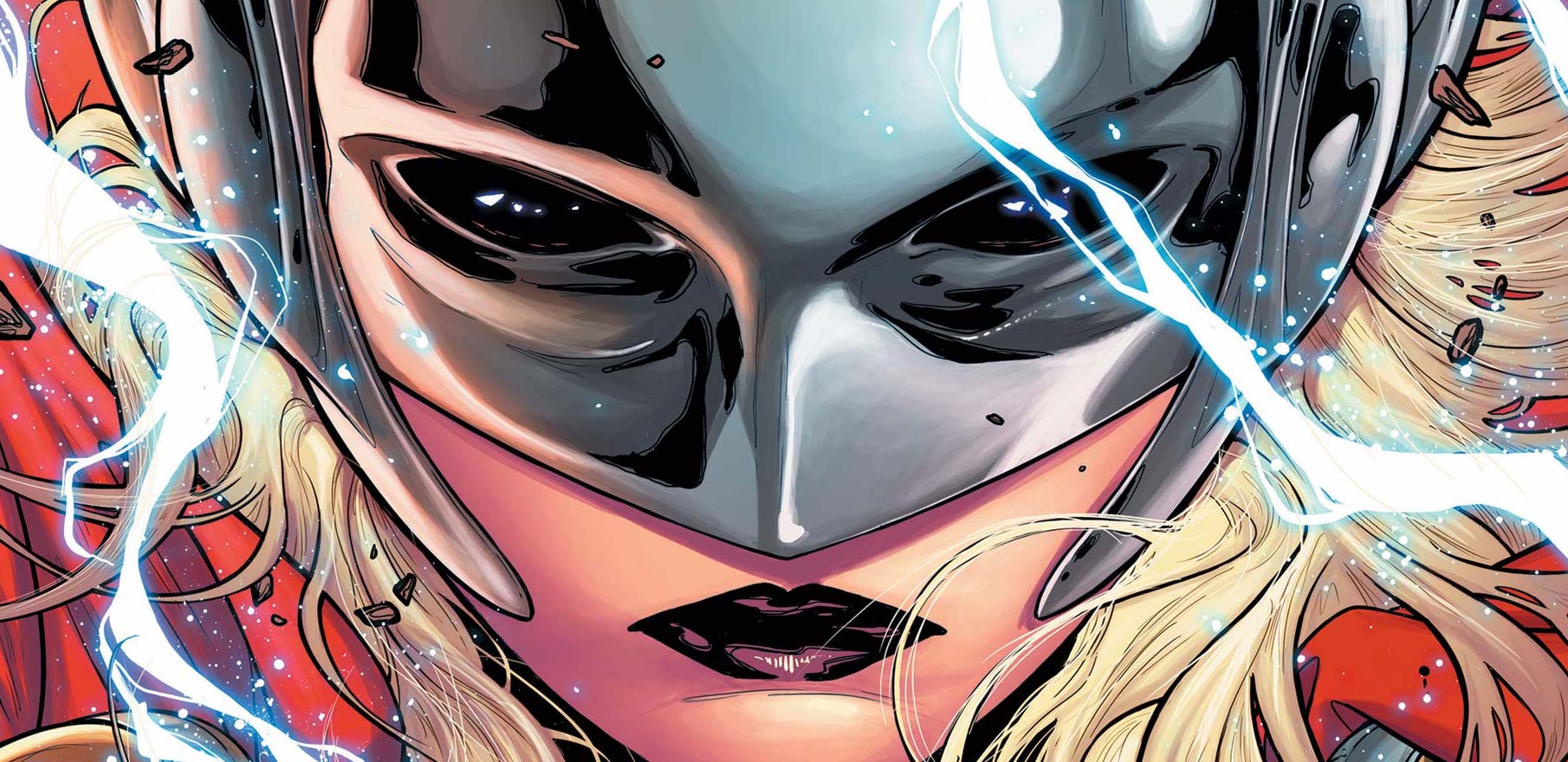
With a new Thor movie around the corner that is set to features anew Thor in the shapely form of Natalie Portman as Jane Foster who is set to prove herself worthy of Mjölnir. Now then is the best time to take a look at Jane Foster’s first two appearances as Thor!
What If? Vol 1 #10
(W) Don Glut; (A) Rick Hoberg; (Ink) Dave Hunt; (Col) C. Gafford; (Let) Carol Lay
The art from Hoberg is clearly hitting the “Marvel House” style; if imitation is a compliment, then John Buscema must be one of most complimented guys at Marvel. Hoberg keeps his Lady Thor, named Thordis, in the true blonde hair style with the unitard of the time, which I find odd considering how the other Asgardian women are drawn. The inks are heavy in places. The colors are also of their time in true four color standard. The letters are spectacular, with lots of bold and larger fonts used; pure Marvel style.
Writing – 3 Stars; Art – 3 Stars; Colors – 3 Stars; Overall – 3 Stars
Thor Vol 4 #1
(W) Jason Aaron; (A) Russell Dauterman; (Col) Matthew Wilson; (Let) Joe Sabino
Aaron though had a plan which he executed flawlessly. In Jane he had a sympathetic character who was recently diagnosed with cancer. Jane had been a constant in Thor books, so there was a modicum of sense to the choice. Aaron then dropped the kicker; when Jane transformed into Thor, her cancer went away; but when she changed back into Jane all the cancer treatment disappeared meaning the cancer got worst. Being a hero was actually killing her. Talk about being worthy! The final issue of this run remans one of the most powerful, the most emotional comic I have ever read.
The art of Russell Dauterman is simply gorgeous. As the book progresses, Dauterman delivers both the superheroics, matching that style with a heavily European influenced Asgard. What also makes the idea of the differences between Jane and Thor are the colors from Matthew Wilson who delivers a bold scheme for the most part; however shows a fantastic touch when it comes Jane with a washed out scheme to recognise Jane’s situation with empathic colors. Joe Sabino’s letters are as you expect for a Thor book, font wise.
Given how the original idea of Jane as Thor was something of a throwaway, Aaron took the idea and created a book that crossed the line form comic books into mainstream media, possibly legitimising the idea of diversifying characters. Her importance is so great, that Jane Foster is due to start in the next Thor movie. It’s hammer time for sure!
Writing – 5 Stars; Art – 5 Stars; Colors – 5 Stars; Overall – 5 Stars
Author Profile
-
I am a long time comic book fan, being first introduced to Batman in the mid to late 70's. This led to a appreciation of classic artists like Neal Adams and Jim Aparo. Moving through the decades that followed, I have a working knowledge of a huge raft of characters with a fondness for old school characters like JSA and The Shadow
Currently reading a slew of Bat Books, enjoying a mini Marvel revival, and the host of The Definative Crusade and Outside the Panels whilst also appearing on No-Prize Podcast on the Undercover Capes Podcast Network
Latest entries

