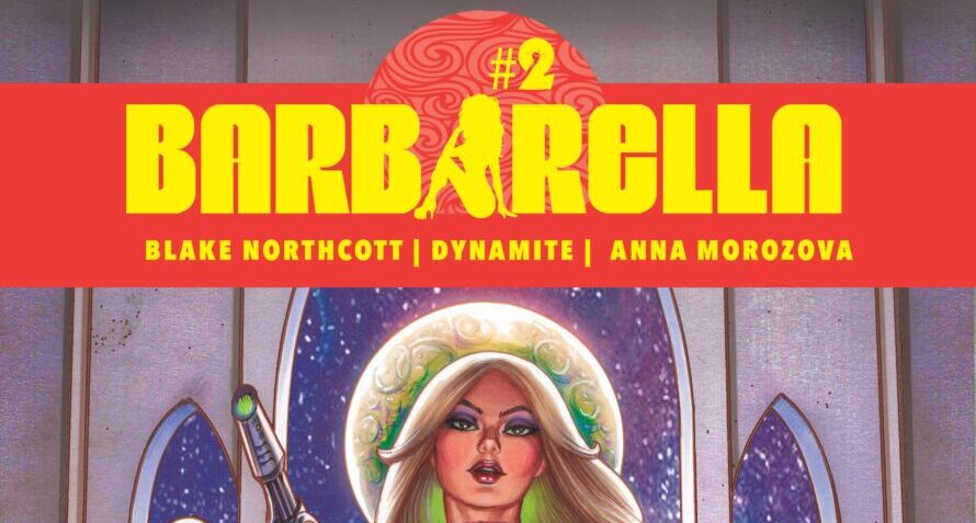
 Barbarella is back with a campy sci-fi adventure that feels like a throwback to cheesy 80s cartoons. Packed with flashy multiverse outfits, colorful spreads, and quirky humor, this issue delivers on style but stumbles with its storytelling and stiff action. Is the nostalgia enough to carry it? Let’s dive in.
The plot follows Barbarella on Planet V, a surreal world where alien animals produce a bizarre reality show. While the premise is fun and self-aware—taking jabs at modern media like reboots and remakes—it doesn’t deliver much substance. The pacing feels uneven, with lots of standing around in early pages and an underdeveloped spy subplot that exists purely to set up the next issue. The campy tone is consistent, but the shallow script limits its impact.
The art is a mixed bag. Character designs are vibrant and futuristic, with Barbarella’s multiverse-inspired outfits standing out as a creative highlight. However, doll-like proportions and inconsistent facial expressions detract from the overall quality. Action poses feel stiff, almost like posed figurines, and lack the fluid energy needed for high-octane moments. On the other hand, Werner Sanchez’s colors shine, resembling delicate watercolors that give certain panels a textured, dreamlike quality. The space spread is particularly striking, packed with intricate ships and vivid cosmic backdrops. The credit page is sleek and stylish, but it’s disappointing that cover artists weren’t credited.
Carlos M. Mangual’s lettering complements the comic’s campy tone. The word balloons are clean and well-placed, while the sound effects add flair to the laser battles and over-the-top moments. The font choice matches the story’s playful, retro vibe, enhancing the overall aesthetic.
Did I like it? Somewhat. The colors and creative designs are definite highlights, but the stiff art and weak writing drag the experience down. If you’re a fan of Barbarella’s campy style, you’ll appreciate the nostalgic charm, but others may find it hard to connect with the shallow plot and awkward action sequences.
This comic is for readers who enjoy campy sci-fi and nostalgic, 80s-inspired storytelling. The stunning colors and stylish designs make it worth a look, but the lackluster writing and stiff action might deter some. If you’re in it for the visuals and quirky humor, it’s worth the purchase; otherwise, you might want to skip this one.
Writing: 2 Stars
Art: 3 Stars
Colors: 5 Stars
Overall: 3.5 Stars
Author Profile
- Antonio Rodriguez
Latest entries
 ColumnsMay 6, 2025Primordios: Enchanting Creations and Heartfelt Moments at Puerto Rico Comic Con 2025
 Comic BooksApril 17, 2025REVIEW: Sister Imperator #1
 Comic BooksFebruary 25, 2025REVIEW: Cruel Kingdom #2
 Comic BooksFebruary 24, 2025REVIEW: Godzilla Heist #1
