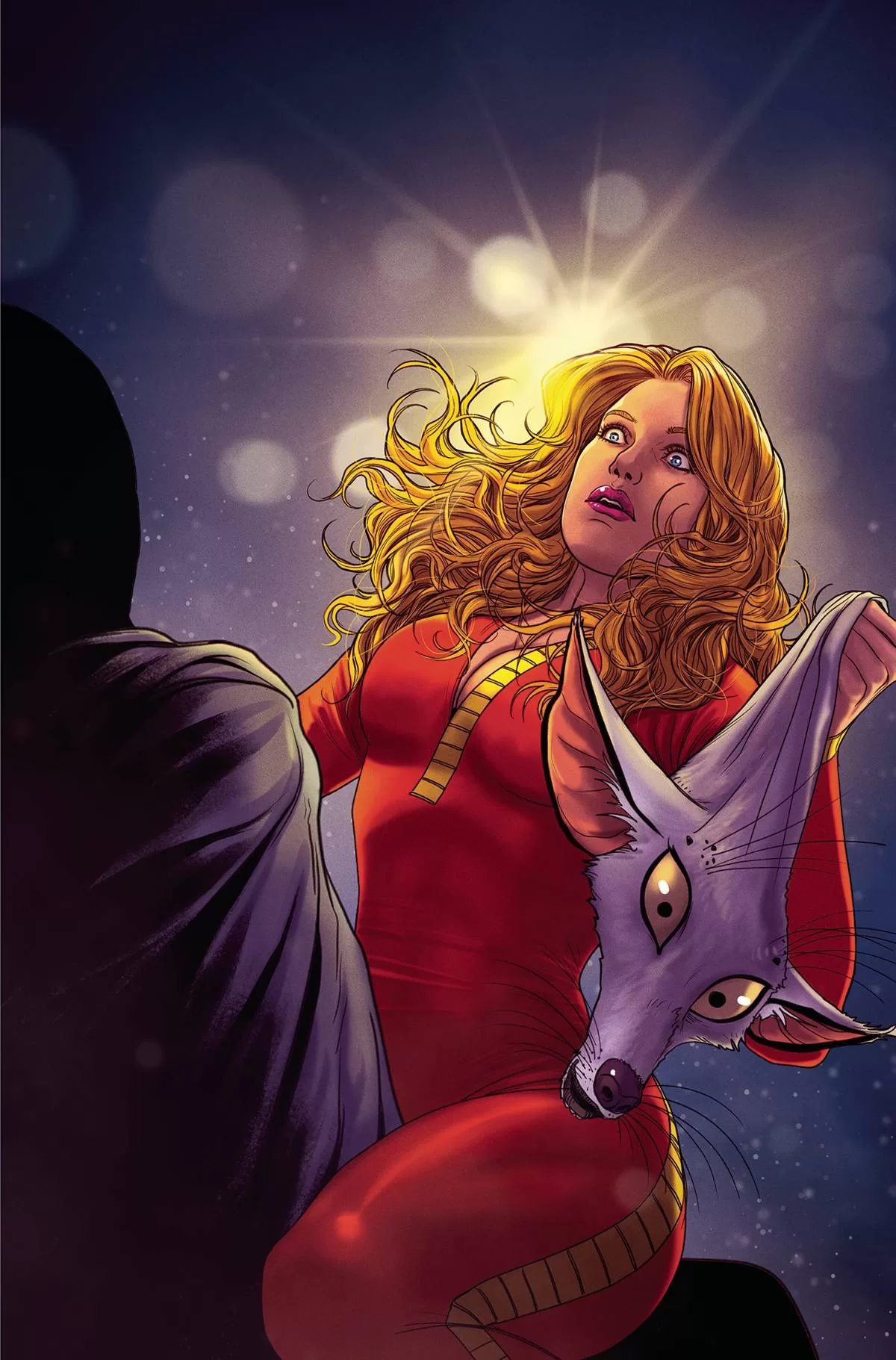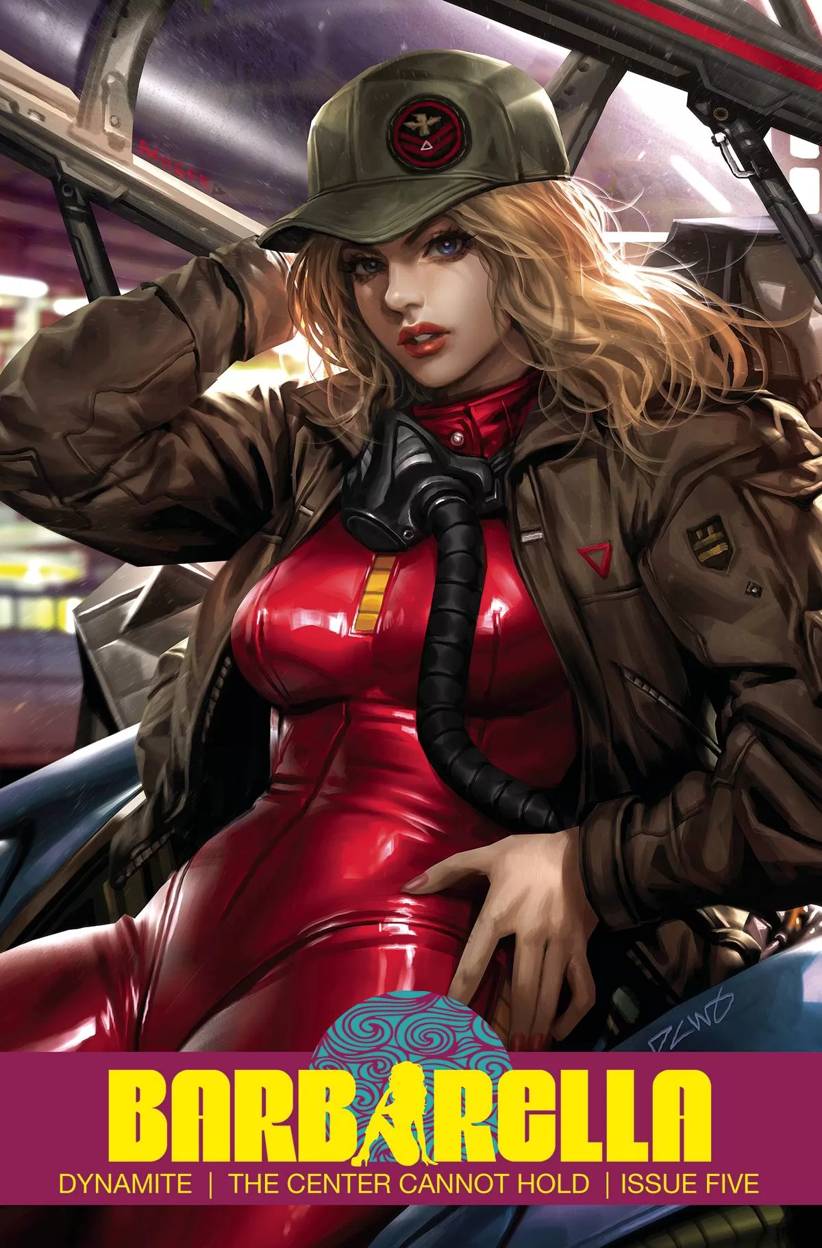
In this issue, Barbarella gets inside the mind of a creature named Durix that is part of a larger group of interdimensional beings known as the architects. From what I can, this being my first issue in the series, the architects did some horrible stuff to the Universe and now Barbarella is lecturing them about it. They come to terms with what they’ve done because Barbarella seems to also have the gift of gab on top of her beautiful looks. The story is really well written, it was fun to read and a quick story that took about 15 minutes. A great addition to the series no doubt. The one thing I did not like was that they added a narration box with the words “Epilogue” and I think that’s a little dumb, the way it was written would’ve made just as much sense without it.
The art itself is not bad, it’s not great either, but it’s not bad. The proportions of many of the characters are a little off and it seems like they either have too long of a torso or really small limbs. They also aren’t particularly consistent when it comes to the humanoid characters, which results in some panels looking pretty good and then some others just looking like bad character designs. The non-humanoid characters, which look sort of like lemurs though are really well designed and look really cool throughout the whole story, so I loved all of those. Another really cool aspect of this issue is the backgrounds, I think all of the backgrounds look awesome, and they opted for illustrating all of the backgrounds for all of the panels, and that’s not something you always see. Several comics go the gradients for backgrounds route and I think they made a really good choice going this way because these backgrounds add a lot of feeling to the story, and just look really good.
Sadly though the lettering could use some work. There were some typos here and there, a ‘y” missing from the word “you”, and some word balloons that weren’t clipped to the panels right, which honestly was incredibly jarring for me to see. It was cringey to see a quarter-page panel not have the word balloon end where it was supposed to, and that sucks because the actual panel was awesome. I don’t want to be too hard on the letterer though, it is a word balloon-heavy comic so it makes sense that something might have gone unnoticed in the end, but I wished they had doubled check that before going to publishing.
In conclusion, it’s still a fun read despite its flaws in character design and lettering. The coloring itself is enough to make this a wonderful experience to read through, and just to look at. I think there is a lot of potential in this story and I am excited to see what the next issue will bring. Also, it is common that as the series progresses and the artists get more practice at drawing the same character over and over they will get better in each issue so I’m looking forward to seeing that growth happen.
Writing: 4 Stars
Art: 4 Stars
Colors: 5 Stars
Overall: 4 Stars
Written by: Sarah Hoyt
Art by: Riccardo Bogani
Colors by: Werner Sanchez
Lettering by: Carlos M. Mangual
Cover art by: Derrick Chew
Varian Covers by: Celina, Geebo Vigonte, Madibek Musabekov & Rachel Hollon Cosplay
Published by Dynamite
Author Profile
Latest entries

