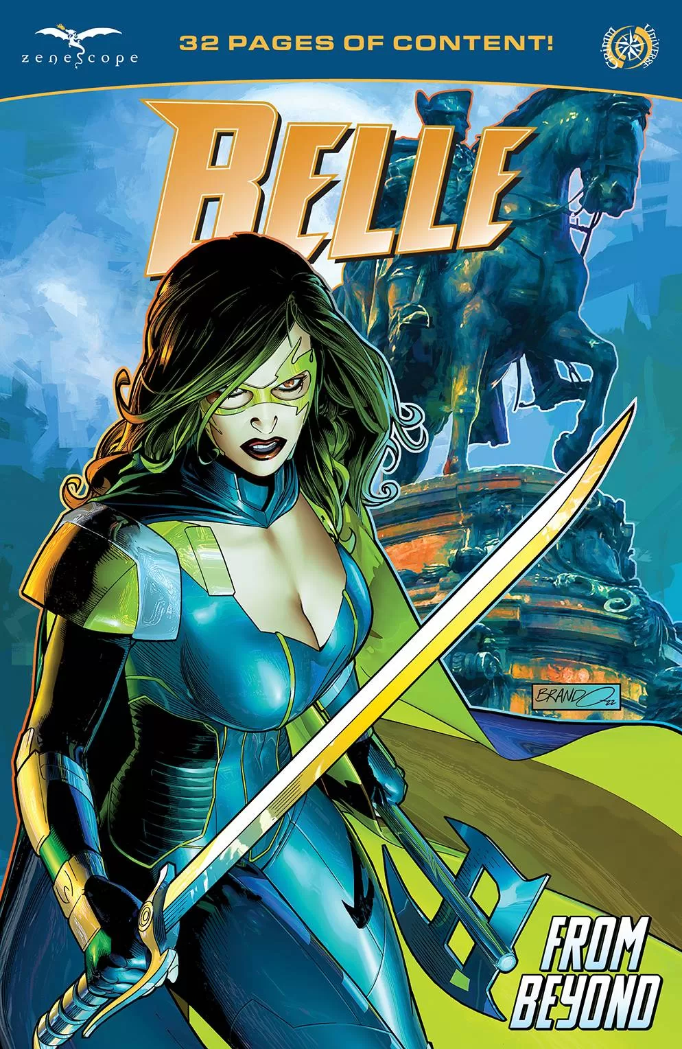
After surviving many a monster battle, Belle is looking forward to some down time. Unfortunately, thanks to a C.H.I.P distress call, she is called to take on a sweeping evil that is more insidious and deadly than anything she has faced before!
Eschewing the normal triumvirate approach to writing, Dave Franchini steps up to the plate. Now I understand that the purpose of the one-shot is to set the scene for future shenanigans, but the writing here is verbose to say the least. There is a lot of exposition to work through to the point that at some point I stopped caring. Granted, Belle isn’t my favourite Zenescope book, but still, I’d like my expectations to be raised somehow. At this point I have lost count of which evil monster is coming out of the woodwork and which “could be evil” militia is trying to stop them.
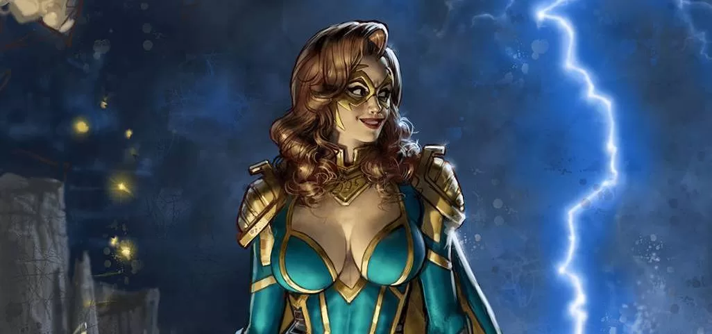
If the writing is by the numbers, then the art is underwhelming to say the least, with Rodrigo Xavier aiming for sexy and curvy girls (are there no male heroes in the Zenescope Universe?) but ends up with inconsistent body shapes, blank faces and certain body parts that change size and shape in any given panel. Other than the odd splash page, there is nothing really so shout about, artistically. My apathy is so triggered, even the colors, normally a Zenescope high point, are somewhat bland from Juan Manual Rodriguez. Part of that may be due to the environs that Belle find herself in; I guess its hard to show texture in an apartment and then a clinical lab. With all the exposition, at least Taylor Esposito of Ghost Glyph Studios gets to produce his usual high standards of letters. There are a raft of covers to choose from, which hark back to Zenescope’s original modus operandi of sexy curvy women covers, that unfortunately fail to materialise in their books.
I used to love Zenescope’s unapologetic mission statement. Somewhere along the line though, things have changed. Sure, the covers still fit their bill, but the interior art is nowhere near the same level. With so many new threats; seen every issue it seems, in Grimm, Robyn and Van Helsing, maybe its time for Zenescope to re-evaluate their stable of big bads’. As it is, the continued use of new threats only serves to create a faceless army as such, with no defining elements and totally replaceable, though Zenescope may find that their reader aren’t so!
Writing – 2 Stars
Art – 2.5 Stars
Colors – 3 Stars
Overall – 2.5 Stars
Written by; Dave Franchini
Art by; Rodrigo Xavier
Colors by; Juan Manual Rodriguez
Letters by; Taylor Esposito of Ghost Glyph Studios
Published by; Zenescope Entertainment
Author Profile
-
I am a long time comic book fan, being first introduced to Batman in the mid to late 70's. This led to a appreciation of classic artists like Neal Adams and Jim Aparo. Moving through the decades that followed, I have a working knowledge of a huge raft of characters with a fondness for old school characters like JSA and The Shadow
Currently reading a slew of Bat Books, enjoying a mini Marvel revival, and the host of The Definative Crusade and Outside the Panels whilst also appearing on No-Prize Podcast on the Undercover Capes Podcast Network
Latest entries

