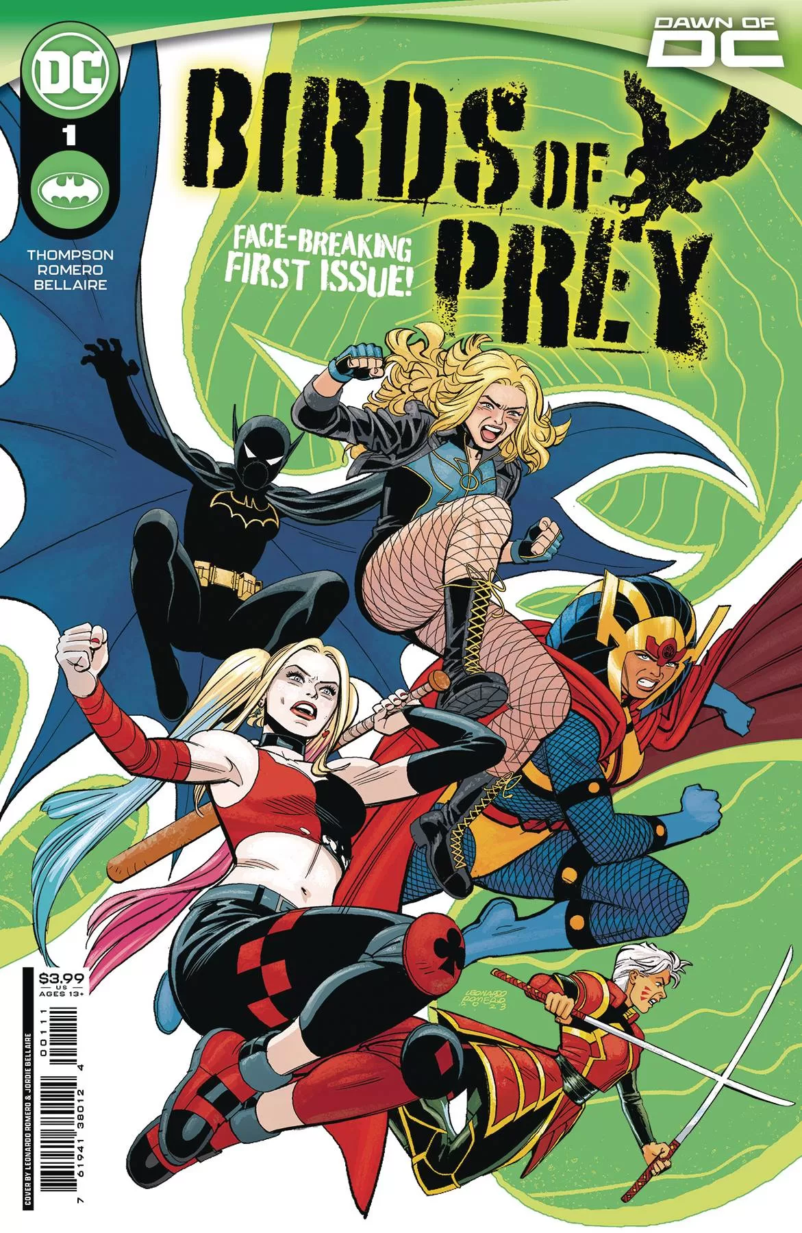
Black Canary has a problem. Seems that someone very close to her is being held prisoner. Time for the all-new, all-different Birds of Prey to reform. This first issue see the set up and the bringing together of the band for what could be a suicide mission!
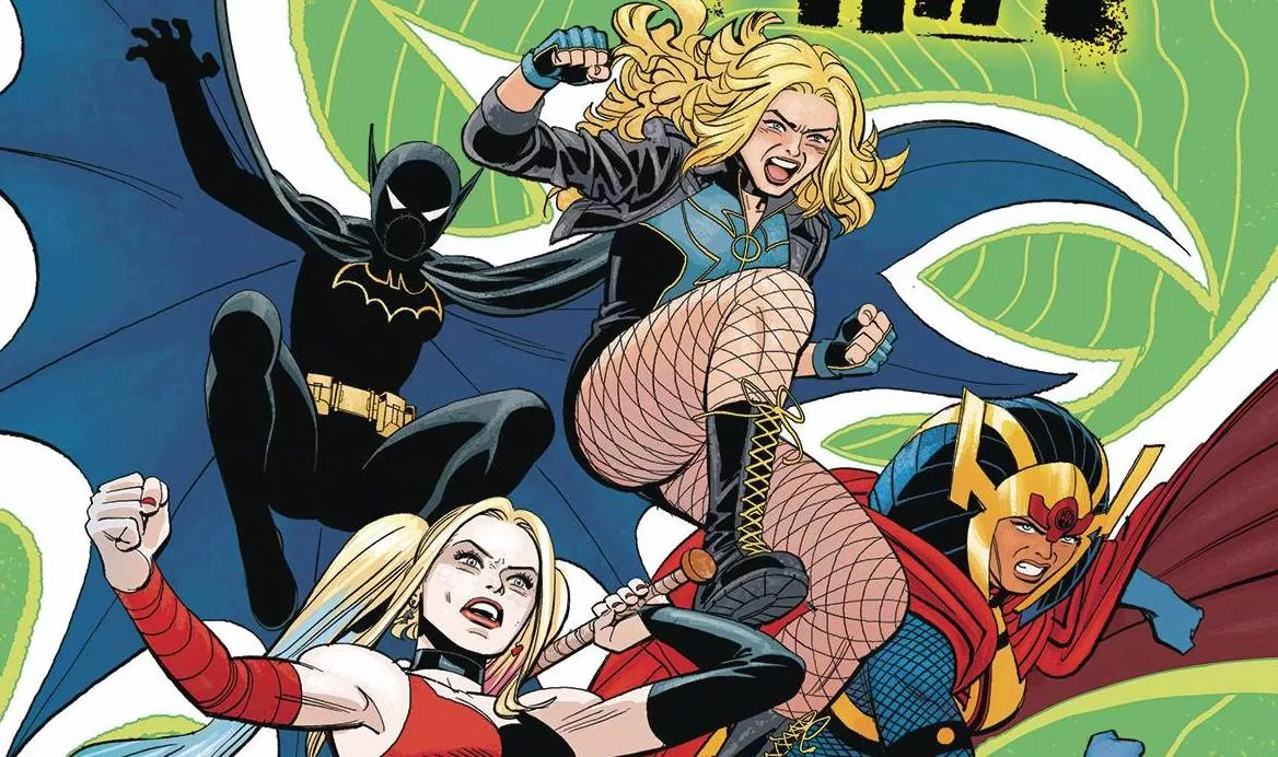
Kelly Thompson wastes no time in getting into the action. On her watch, Canary s leaving Green Arrow (has he returned to Earth in his own mini-series yet?) in order to scour the DC universe for her new team. By now you know that the Birds will consist of Canary, Batgirl (Cass), Big Barda, Zealot and Harley Quinn. now some of these you will love and other you may not know. Thompson works hard to get the voices right for the characters and does well with three of the five. Well, I don’t have a lot of history with Zealot, so lets say three out of four. Her Canary is spot on, as is her Harley. Batgirl is a tad talkative and when did Barda start talking in such a simplistic way? Having her call Cass “tine bat”. is as braindead as ‘Hulk smash”! Story wise, a mysterious stranger advises Canary leading her to from the team. I do wonder if this is going to be a minor rehash of Batman #232.
What is going to split fans of the original book is the art from Leonardo Romero. Now before I go into details, please remember I am not doubting Romero’s ability in any shape way or from. Right with that out of the way; I am confused how you can have book that features Canary in her fishnets (at times), Barda and Harley at her quirkiest and not have ANY of them look sexy? People will say “stop objectifying women, Machine!”, I am not objectifying women at all! In the place of no sex appeal are a cast of characters so androgynous, I could only tell who Green Arrow was thanks to his beard and him being topless! For those dissing me for the “sexy women” comment, I don’t see you shouting about equality when it comes to topless characters! Just saying! Romero’s art reminds me of Graham Nolan and Chris Samnee, both great influences, and on any other book it would be perfect. Here, maybe not so much. Maybe the proverb should read “expectations comes before a fall”, rather than pride. Jordie Bellaire delivers a colors scheme that seems washed out in places, give the book an a older vibe for sure; great work on Arrow’s pj’s! Clayton Cowels supplies the letters, enusring the easy going font doesn’t detract from the art.
The tone of the book is kind of odd. At points, it is quite dark, in others it’s quite fun with a recurring joke running through the book in contrast to the art that lacks seriousness, whilst building on the fun. With so many vibes in play, it will be interesting to see which, if any of them, will become the major focus.
Writing – 3.5 Stars
Art – 3 Stars
Colors – 4 Stars
Overall – 3.5 Stars
Written by; Kelly Thompson
Art by; Leonardo Romero
Colors by; Jordie Ballaire
Letters by; Clayton Cowles
Published by; DC Comics
Author Profile
-
I am a long time comic book fan, being first introduced to Batman in the mid to late 70's. This led to a appreciation of classic artists like Neal Adams and Jim Aparo. Moving through the decades that followed, I have a working knowledge of a huge raft of characters with a fondness for old school characters like JSA and The Shadow
Currently reading a slew of Bat Books, enjoying a mini Marvel revival, and the host of The Definative Crusade and Outside the Panels whilst also appearing on No-Prize Podcast on the Undercover Capes Podcast Network
Latest entries

