REVIEW: Bloodrik #3 (of 3)
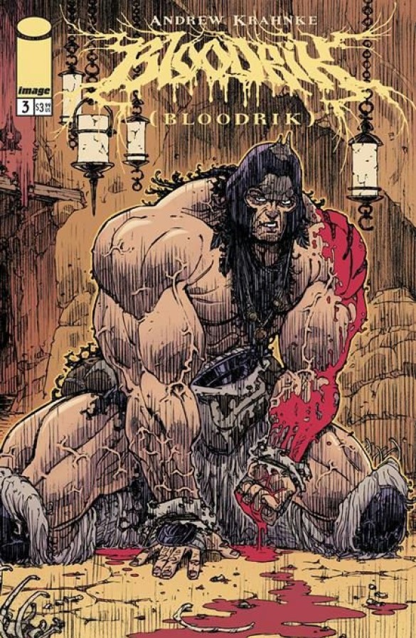 In what seems like a dance of blood, gore, and heavy metal-infused art; Bloodrik #3 delivers one last view of a savage’s struggle for survival. Created by one man, Bloodrik is no doubt a masterpiece, unlike any other comic I’ve ever seen. It seems to combine a lot of things that I like in comics such as; a wonderful use of panel layouts, great sound fxs, and beautifully rendered environments and character designs on top of a streamlined storyline with no other intention than to put you at the edge of your reading seat. When reading Bloodrik, I can’t help but be reminded of Tartakovsky’s Primal; the careful use of violence to not only move the story forward but add dimension to an otherwise simple character is quite wonderful to read through.
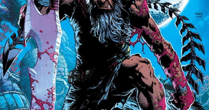
The comic starts with a one-page recap comic, of how Bloodrik is hungry after trying to hunt a deer but being beaten by a beer instead. Hungry and defeated, he begins to hallucinate and finds himself at the top of an icy mountain. It is on this mountain that he stumbles upon a ritual sacrifice and finds himself face to face with “The God of the Mountain” a man that from what I can surmise led his people to ritualistic suicide. Demanding that Bloodrik bow before his power, the man pushes Bloodrik a little too far, and the hungry and murderous Bloodrik does what he does best. Ripping the man apart limb by limb, and entrail by entrail; the God of the Mountain is no more. The same can be said for Bloodrik’s hunger. In a 5 page sequence of true rampage, Andrew Krahnke not only shows his immense talent with a pencil but is also able to work in some cool panel layouts that allow the story to move forward despite these pages being filled with blood, vile and eye-gauging gore. The plotline is simple, there is no humor to be gleaned from this comic other than the immense amounts of violence, which at times feel gratuitous. However, this is not a bad thing as the comic is titled Bloodrik; with a title like that you are bound to find blood inside. Bloodrik is a savage, he kills, he dismembers and he hunts. This is his nature and there is nothing and no one that can stand in his way. Often when you have a plotline as simple as that, you run the risk of becoming boring; yet this is not the case for Bloodrik. Because Andrew is so skilled at not only telling stories but also illustrating them, Bloodrik feels like an action-packed animated show very much in the vein of Primal or Metalocalypse. It is straight to the point and it knows exactly what it is trying to do, and that is to provide you with a quick dose of dopamine, and violence.
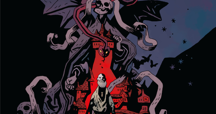
Most of the story is delivered through the voice of an all-knowing narrator. In the case of the main story, this narrator is a blacksmith who reminds me very much of black-smithing gods like Hephaestus or the dwarfs in Norse mythology. Speaking of Norse mythology, the snowy mountain landscapes and Bloodrik’s physique and armor also 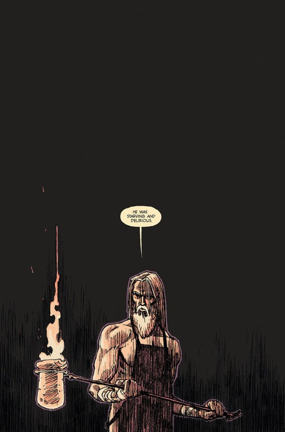 remind me of Viking culture and perhaps this is all too intentional as our social perception of Vikings tends to be that of savage bloodthirsty brutes, much like Bloodrik’s character. One beautiful aspect of the story is that Andrew manages to construct a world not through words and lore, but through environment and character design choices. For example; the moment that Bloodrik walks into the “church” he is welcomed by a grotesque figure of a human skeleton with the skin of a deer laid on top of it, and surrounded by more human bones in pools of blood. These gruesome details tell the story of a ritual sacrifice that either happened quite some time ago or is still happening right now. This technique of using the environment to allude to things that happened in the past is a wonderful way of giving your world lore, without having to spell everything out to the readers. The same can be done with specific character design choices. Instead of telling the reader that a certain character is crazy, like in the case of “the God of the Mountain”, Andrew chooses to convey this true his attire. A torn and bloody cape, a weird shawl, and a triangular mask combo allude to the character being of a religious nature but also that he is not altogether in his right mind. One last thing I would like to mention about the art is the coloring. Whilst most of it is colored with a flat coloring style, the fact that Andrew pencils everything traditionally and then cleans it up digitally gives way to a huge amount of color variation through different amounts of hashing, gradients, and spot blacks. The art style feels like if you took Hellboy but upped the grittiness factor by 10x, and I love all of it.
Whilst the lettering is nothing too crazy, it does the job well and we get a nice amount of lettering variation that works to tell the story as efficiently and clearly as possible. Where the lettering shines is during the action scenes, where Andrew manages to pack as many as 7 sound fx fonts into one single page. The use of sound fx in this story is just fantastic! Because they are all drawn manually, no two sounds are alike even when they are saying the same thing. It is a beautiful way of blending art and lettering, in a way that only the comics medium can do.
In my opinion, this has the potential to be a classic. It is well-drawn, it is easy to read, and it delivers a rush of adrenaline like only a handful of stories I’ve ever read before. It almost gives me the same feeling I got when reading Joe Kubert’s Tor remake. There’s just something so awesome about seeing a man become a beast in a world that is so different from our own. In this case, it is so well illustrated that even if you took out all the words, this would still be a truly enjoyable series. If you’ve read any of the comics or watched any of the TV shows I’ve mentioned in comparison to this comic; this is probably right up your alley. On top of the fantastic violence seen in this comic, there are also a few extra goodies to look forward to, such as; a bonus Bloodrik short story and a look behind the scenes at how Andrew Krahnke renders the art in the book: from cover to inside pages.
Writing: 5 Stars Art: 5 Stars Colors: 5 Stars
Overall: 5 Stars
Written, Illustrated, Lettered, and Colored by: Andrew Krahnke Cover art by: Andrew Krahnke
Published by: Image Comics
Author Profile
Latest entries
 ColumnsMay 6, 2025Primordios: Enchanting Creations and Heartfelt Moments at Puerto Rico Comic Con 2025
 Comic BooksApril 17, 2025REVIEW: Sister Imperator #1
 Comic BooksFebruary 25, 2025REVIEW: Cruel Kingdom #2
 Comic BooksFebruary 24, 2025REVIEW: Godzilla Heist #1
