A journalist moves to the Arctic Circle in hopes of finding the next big story, but what she finds is nothing short of disastrous. In this crime/thriller story written by Zac Thompson and illustrated by Nicola Izzo, one curious journalist tries her best to uncover the mysteries of what happened to two climbers who, after a fight, have disappeared.
I honestly really liked this story; it is not often that a simple art style can grab your attention and leave you wondering what happened. This is without a doubt a crime thriller. Feeling like “The Girl with the Dragon Tattoo” on literal ice, this has been a great read for me through and through. The plot follows a journalist hoping to get her big break out in the icy plains, but instead she films what could potentially be a murder. No one believes her because in this town everything is way too chill (pun intended).
A very moody story with beautiful art, fantastic coloring, and atmospheric shading that leaves you feeling cold with every page turn.
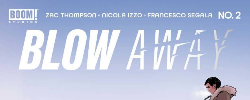
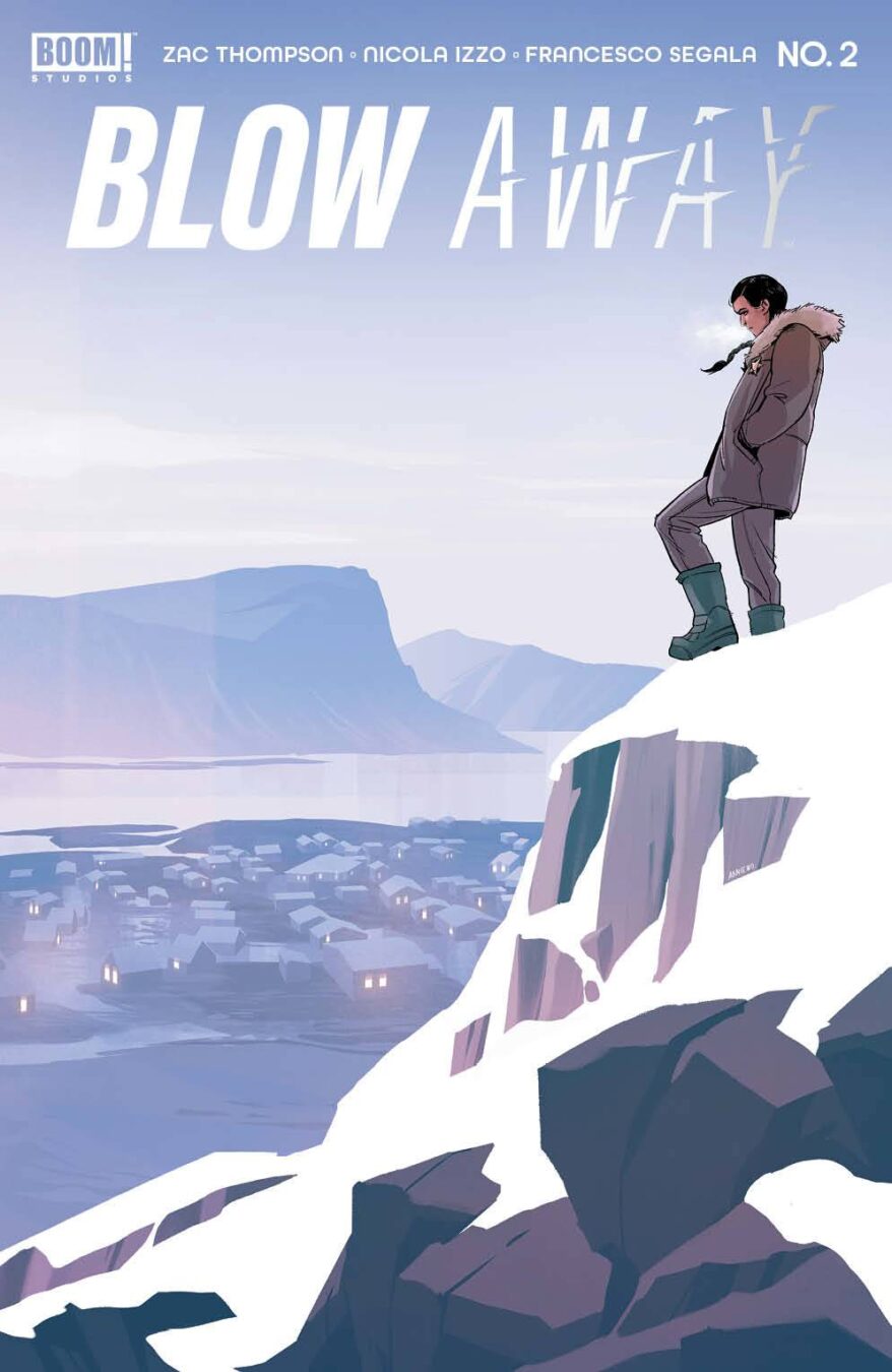
The art in this story is fantastic. It boasts a wonderful cover with a simple color scheme of blues and browns, featuring a silhouetted figure on top of a mountain. At first glance, it took me back to my vacation in Norway, where the snow was as big as the houses and the breeze so bone-chilling that three minutes out in the snow felt like an eternity for my tropical island body. The title text of this comic is just as inventive, with “BLOW” in a very bold typeface and “AWAY” made to look like it’s literally blowing away.
Moving further into the comic, we see an equally great credit page that is simple to read, with nice little details in the background that allude to the story we are about to reach. We also get a hint at the journalism motif with the title text inside a camera viewport. It is great when comic creators think everything through and try their best to deliver a unified experience with everything they do.
While the environment is very reminiscent of Image Comics’ “Antarctica,” the art style here is more stylized and feels more cartoony. It also happens to be a more dramatic story than “Antarctica” and feels more grounded than the fantastic sci-fi epic that sits in the “Antarctica” pages. However, this is just as epic, with tons of gritty textures, a vintage aesthetic that makes me think of the early ’90s, and so much snow that you could probably build an igloo the size of Nebraska on top of this book.
Speaking of stylization, the characters in this book are something to look at. They are all very angular, which makes them feel almost sinister—think of a town filled with Disney villains, or a Soviet propaganda poster set in the snowy mountains of Canada (perhaps, though I don’t think we know yet exactly where we are). The stylization goes beyond the characters and the environments, blending into the shots chosen to tell the story. A nice mix of angles, top shots, and far-away shots makes for a very cinematic read. This type of composition makes the reader feel distant, almost as if they are watching the action unfold from afar instead of experiencing the story with the characters—perhaps driving further the motif of this being a journalist trying to uncover a mystery through the lens of her camera.
One major moment that stood out for me is a sequence of panels laid out as stills from a video. It is wonderful because it reads as if you were seeing these stills in video editing software of some sort. That motif of journalism goes deeper and deeper. Moreover, there is one panel in which a man is holding a gun to his head that is fantastic—it shocked me the first time I saw it.
The lettering works really well in this story, too, with a great dose of sound effects, a nice variety of word balloons, and innovative use of the panels, their layout, and even their borders. Add on top of that a fantastic use of spot blacks to convey a dramatic, creepy, and distant mood, and you’ve got yourself a winning comic.
I’m going to go ahead and say it… This is a 5/5 for me. I’m invested and very interested in seeing what exactly happened to the two climbers our journalist protagonist is investigating and, more importantly, what will happen to her.
If you like crime thrillers with an interesting art style, go ahead and pick this one up!
Writing: 5 Stars
Art: 5 Stars
Colors: 5 Stars
Overall: 5 Stars
Written by: Zac Thompson
Illustrated by: Nicola Izzo
Coloring by: Francesco Segala & Gloria Martinelli
Lettering by: DC Hopkins
Cover art by: Annie Wu
Variant Covers by: Tyler Boss, Annie Wu & Megan Hutchison
Published by: Boom Studios
Author Profile
- Antonio Rodriguez
Latest entries
 ColumnsMay 6, 2025Primordios: Enchanting Creations and Heartfelt Moments at Puerto Rico Comic Con 2025
 Comic BooksApril 17, 2025REVIEW: Sister Imperator #1
 Comic BooksFebruary 25, 2025REVIEW: Cruel Kingdom #2
 Comic BooksFebruary 24, 2025REVIEW: Godzilla Heist #1
