REVIEW: Catfight #3
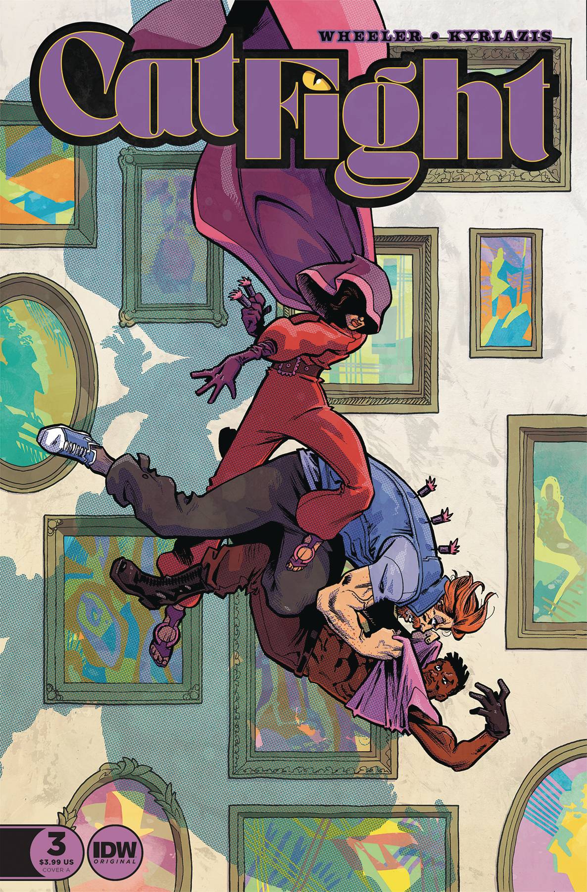 CatFight #3 continues the story of how killed Nana. Felix Lamar the grandson of Nana seems to be the culprit and yet he says he’s been set up. Did he kill her or is this an elaborate ruse concocted by Schrodinger to frame Felix? All in all, this is a very interesting comic and story. The art is quite nice and the layouts are very interesting. Sadly we are only provided with a small (7-page) sample of the issue so there isn’t much that I can talk about this time around, but I will focus on the things that I did enjoy.
First off the credit page is fantastic! it uses a “mystery corkboard” motif with the different major characters in the story and small colorful paper notes to credit the people involved in putting together this comic. Even the publishing information is displayed well and in a fun manner. In literally 4 notes they can tell you what the story is about, which makes me feel like everyone on the team is very knowledgeable of the story they are writing and I love that. One thing that was missing from this page however was the credits for the variant covers and that would honestly make my job as a reviewer a lot easier but other than that this was one of the best credit pages I’ve seen in comics thus far.
The art itself is really good, the backgrounds are a tad bit more realistic than the characters but it generally works well and it makes for a good contrast between the two of them. However, the strongest thing going for this comic has to be the panel layouts. Whilst I haven’t read the full story at the very least these 7 pages are packed with cool and unique layouts that keep you engaged and provide a wide range of details, actions, and really interesting close-ups. Speaking of close-ups, these faces are something! They are very expressive and provide you with a wonderful window into the feelings of the characters. The character designs are cool too, They aren’t too complex but they provide enough interest and contrast between the characters to at least not confuse you about who is who. I like “Ginger Tom’s” character design the most, even though I don’t particularly like his name, his orange hair and blue jean jacket make for some cool contrasting colors in many of the panels he is featured in. The action poses are also very good, and they feature very dynamic gestures that provide movement and interest through each panel. Anatomy is a little wonky here and there but the extravagant poses make up for the sometimes weird anatomy choices.
Color wise this is a strong piece of work. In this story, we are inside what looks like an abandoned warehouse or attic of some sort which makes for gloomy backgrounds, and yet the bright colors of the Ginger Tom and many of the hidden props in the room give a refreshing taste to all the darkness. It is cell shaded with a tiny bit of blending but the way it’s shaded with a textured brush allows for a very unique and interesting look through the whole comic. The lettering is also very good, and they went hard with the word balloons and the sound FX fonts. My favorite sound fx has to be on the panel where a phone gets stepped on, It uses two different phones to convey the sound of a phone breaking and it looks awesome. It is electric and rattling at the same time and just love it. It’s a tiny detail in an even bigger and cooler scene but I just think that it looks great and should be applauded. The backgrounds are also really good, for the most part, everything is rendered in the same style as the characters, and single-color panels are hardly ever used. Instead, we get panels that have several props or at the very least have one or two props that tie back to the overall composition and theme of the room to make you feel like you’re still inside the same room and not standing in the void of space. The attention to detail in this comic is very noticeable.
It was a good read. I enjoyed the art more than the writing because with just a 7 page sample it’s a little hard to really get invested in the characters, but I look forward to reading more and seeing how the story develops. Did Felix Lamar really kill his grandma or is this all just a trick?
Writing: 4 Stars
Art: 5 Stars
Colors: 5 Stars
Overall: 4.5 Stars
Written by; Andrew Wheeler
Art by; Ilias Kyriazis
Colors by; Dennis Yatras
Lettering by; Hassan Otsmane-Elhaou
Cover art by; Ilias Kyriazis
Variant Cover by; Joshua Swaby
Published by IDW Publishing
Author Profile
Latest entries
 ColumnsMay 6, 2025Primordios: Enchanting Creations and Heartfelt Moments at Puerto Rico Comic Con 2025
 Comic BooksApril 17, 2025REVIEW: Sister Imperator #1
 Comic BooksFebruary 25, 2025REVIEW: Cruel Kingdom #2
 Comic BooksFebruary 24, 2025REVIEW: Godzilla Heist #1
