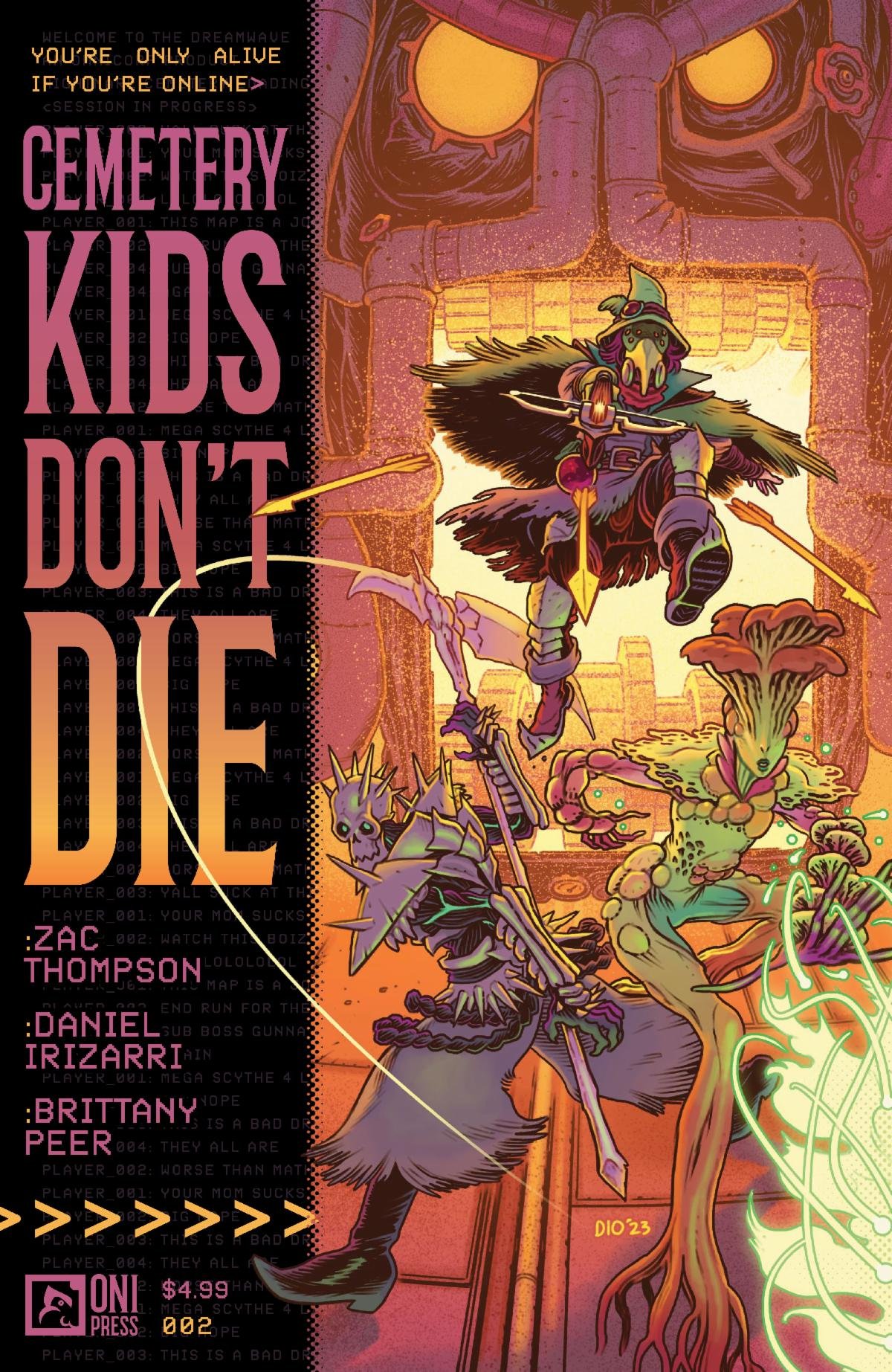
The story itself is quite interesting, and whilst I’m not a huge fan of the art style, things get interesting when the characters go into the game’s world. The issue is mostly told through Birdie’s POV and features a few cool action sequences. These all happen inside the dreamscape/game world as Birdie herself is paralyzed from the legs down. While the overall plot is very interesting and gives us a more grotesque look at the VR game world trope of recent years, I wasn’t a huge fan of the “Millennial” lingo. At times these forms of speech come off as very cringe, especially in what are supposed to be deeply emotional moments like that of Birdie analyzing her relationship with her father and using the word “chill” to describe how he used to be a loving father before her mom died. The first few pages of the story are rather difficult to follow if you haven’t read the series before, and would have benefited from a flashback in the POV of Birdie’s brother inside the dream world. This would have established the character a bit deeper and given us a headstart into the real interesting part of the story which truthfully is the dream world, the real-world happenings are rather boring.
Everything outside of the dream world is slow and feels very clunky to read through. Several scenes include a cell phone in some way or another and try hard to allude to modern culture. Whether it’s the “online” status of Birdie’s brother on the phone or a whole page of the kids texting back and forth only to continue the conversation during lunch. It reads like adults trying to write for children and the cringe levels are off the charts. That being said, once you step into the dream/game world things change completely and we get a more action-packed narrative. It even features some direct messaging conversation between the characters, but in the context of the game, it works very well because two of the characters are discussing something that they don’t want the other characters to hear. I would have appreciated a quick recap of how the “Nightmare Cemetery” technology works because at the moment I am still lost as to whether this is a VR Game or a Dream Game, and the fact that all the characters have very weird and different “headsets” (if that’s what you could call them) just makes things more complex.
I feel mixed feelings about the art. Whilst I do like the character designs a lot, I feel that a few of the expressions, and poses weren’t as strong as they could have been, and it almost feels amateurish. Yet, I only feel that when reading the scenes from the real world. Once inside the game, the art is handled very well, and features very good color palettes with wonderfully contrasting color schemes for the characters, and the environments are exceptionally illustrated. The poses are easy to read, they have a ton of life and movement to them and the characters just look fantastic in the game world. From the enemies to the main character avatars, everyone looks awesome and there is a ton of creativity in this world, which is something you would expect from a comic in the VR Game World Genre. That is something that I did not like about Sword Arts Online, just too many humanoid characters in that series. I enjoyed the coloring a lot, but mostly on the game world, during the real-world scenes it felt too all over the place; you either had full-color pages or this blue and light green color palette that for some reason also had pinks. I do understand that this blueish color palette was meant to transmit a sense of sadness and dread during the sense where Birdie is with her dad, but at the same time if should have been used during all the scenes with her dad and not just one scene and then a wholly different color palette for the other time she’s with her dad. The real world was just very confusing to read through.
The strongest part of this comic has to be the lettering. It is great, readable, and features a ton of variety in word balloons, fonts, and sound fxs. I also really liked the font choice used for a handwritten note inside the game, the panel came out well and the text feels part of the art and not like so many other comics where notes like these feel like text pasted on top of the art, this feels written. The sound fxs feel good too and fit well with the art. There aren’t as many instances of sound fxs as I would’ve liked but where there is, it works well and adds a ton of atmosphere to the panels.
Despite all of my issues with the book, I truly loved the end and I especially liked the way the boss puzzle scene was handled. It felt like a sinister version of the original Harry Potter Chess scene from the Sorcerer’s Stone. The back and forth between the characters trying to figure out how to beat the last level, and then the misdirection of Enid’s character going off on her own only to lead to the Cliffhanger. It was great, and that last page gives me the chills. In conclusion, while this might not be my cup of tea in a lot of regards, I do feel like it has a ton of potential and I am hoping that as the comic progresses these little kinks will be ironed out and the real crux of the story will come through and we will have a great payoff at the end of the series. I look forward to reading more and hopefully seeing this comic and its creators grow through its development.
Writing: 3 Stars
Art: 4 Stars
Colors: 4 Stars
Overall: 3.5 Stars
Written by: Zac Thompson
Illustrated by: Daniel Irizarri
Coloring by: Brittany Peer
Lettering by: Andoworld Design
Cover art by: Daniel Irizarri
Variant Covers by: Alex Eckman-Lawn
Published by: Oni Press
Author Profile
Latest entries

