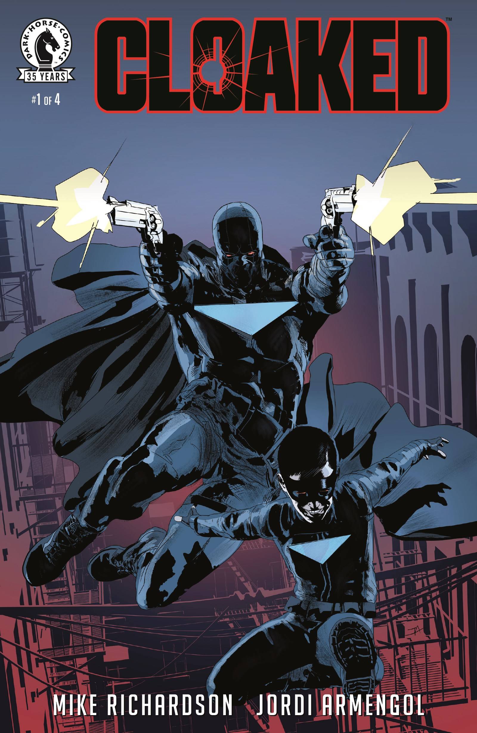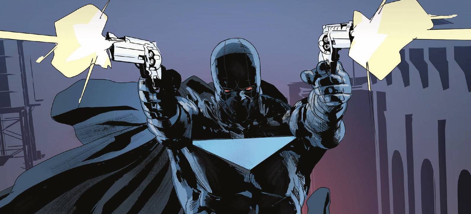
From out of nowhere a genuine masked hero took it upon himself to battle organised crime. But that was 25 years ago. Just as suddenly as he appeared, he was gone. Now a down-on-his luck private detective, Jake Stevens, has scored his biggest payday. All he has to do his find the long gone vigilante.
Mike Richardson is probably more well known for launching Dark Horse Comics than he is for his writing. Whilst that may seem like a disservice, you have to remember that reading this book you cannot help but notice the influences on show. A violent vigilante, a terrific twosome are the most obvious ones for sure, though there are shades of Ben Urich in there. In Jake, Richardson has created everyone’s favourite character; the flawed almost hero. Jake has his problems and he seems to make matters worse even as he tries to succeed. By taking the gig, Jake is looking to right some personal wrongs. Richardson script screams gumshoe in all its scenery chewing glory. In doing so, Richardson questions the ethical need for a sidekick.
The art and colors are provided by Jordi Armengol who goes for gritty and dark throughout the book. In doing so, it seems as if Armengol is channeling Michael Gaydos though there are a few differences. Firstly, faces seems to change shape regularly. I don’t mind that so much, as it gives the illusion of emotional responses. Secondly, quite a few of the characters seem to be missing eyes! As much as I like stylistic choices, eyes do help conveying emotions and their impacts, especially important when faces are inconsistent. Armengol’s colors are probably the most impactful elements of the art, setting the tone and vibe of the book. It feels like a dirty hot summer evening with the sort of heat in which dark things flourish, at least in the first act before cooling somewhat through the later acts. Finally, Nate Piekos of Blambot utilises a couple of fonts to differentiate vocal tones. Piekos does extremely well with sheer amount of verbiage in the middle section of the book, not allowing dialogue to pedestrianise the pace of the story.
An interesting book, part examination of the vigilantes and the need for a sidekick coupled with a gumshoe detective story with a well worked cliff-hanger which secures readers returning.
Writing – 4.5 Stars
Art – 3.5 Stars
Colors 4 Stars
Overall – 4 Stars
Written by; Mike Richardson
Art & Colors by; Jordi Armengol
Letters by; Nate Piekos of Blambot
Published by; Dark Horse Comics
Author Profile
-
I am a long time comic book fan, being first introduced to Batman in the mid to late 70's. This led to a appreciation of classic artists like Neal Adams and Jim Aparo. Moving through the decades that followed, I have a working knowledge of a huge raft of characters with a fondness for old school characters like JSA and The Shadow
Currently reading a slew of Bat Books, enjoying a mini Marvel revival, and the host of The Definative Crusade and Outside the Panels whilst also appearing on No-Prize Podcast on the Undercover Capes Podcast Network
Latest entries

