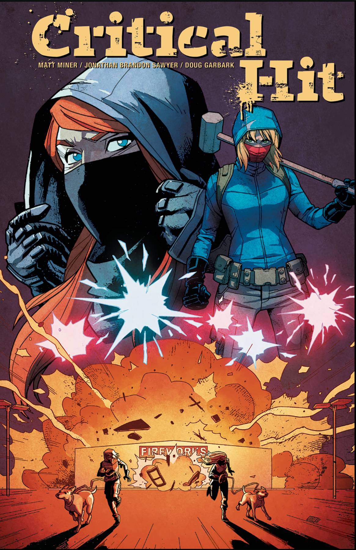
Sarah and Jeanette love animals, as do their mix of friends. Friends may be too strong a word to use for this collection of people with one shared interest. Friction is abound throughout this group. Following a minor excursion to stop some hunters, Sarah and Janette take matters into their own hands, wrecking havoc on the property belonging to a rogue group of hunters. From there, things get a little Quentin Tarantino as the girl find themselves in fight not only to save animals, but also each other!
It’s been said “to write what you know”, which will explain how New York Times featured writer Matt Miner tackles the various aesthetics and main thrust of this book. Animal welfare is a serious issue for a lot of people; I have a resume cat myself. By using animals as the main crux, Miner sets the idea that all animals are innocent and some people are cruel. It is an idea that is hard to disagree with. Miner goes about interjecting the main current story with variety of time frame sin which we see the various characters. It is the sort of planning that allows the under pinning of the characters to have as much, if not more import than their current lives. An interesting little side effect to this, is that at times, I cared more about the past than the trouble the girls found themselves in. The dialogue is terse, includes swearing, though behaviours and actions in some of the characters may feel a little stereotypical.
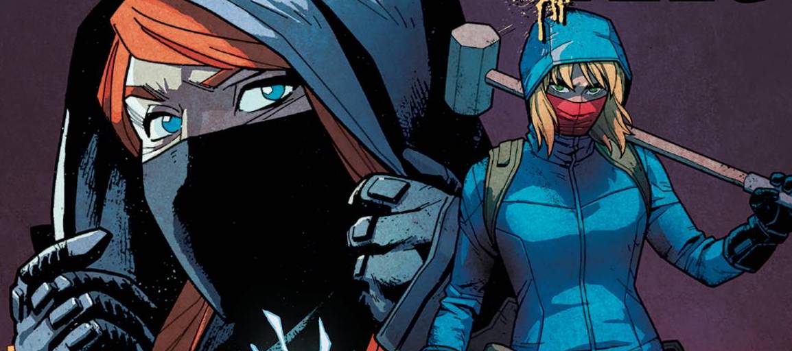
The line art is provided by Jonathan Brandon Sawyer whose main style seems a little cartoon y, a style of which you may see in a newspaper strip. Personally I don’t have a problem with this style at all. The bold, strong lines allow for all the characters to be easily recognisable and carries a decent amount of movement. It also serves a lovely juxtaposition to the serious topics and the over the top violence that serves the final two thirds of the book.There is a very clever page that delivers a decent interpretation of a cloudy head. Doug Garbark provides the colors that are as bold as Sawyer lines. There is a mix of lightness and darkness, both vying for dominance, giving further credence to the internal struggles, past and present for the range of characters. Finally, Jim Campbell and CRANK! Deliver a lettering scheme that competes with the rest of the art and holds its own admirably.
For those who, like me, missed this run the first time around, this trade showcases the bravery of topic and direction that is consistently shown by Black Mask Studios.
Written – 5 Stars
Art -4 Stars
Colors – 4 Stars
Overall – 4.5 Stars
Written by; Matt Miner
Art by; Jonathan Brandon Sawyer
Colors by; Doug Garbark
Letters by; Jim Campbell & CRANK!
Published by; Black Mask Studios
Author Profile
-
I am a long time comic book fan, being first introduced to Batman in the mid to late 70's. This led to a appreciation of classic artists like Neal Adams and Jim Aparo. Moving through the decades that followed, I have a working knowledge of a huge raft of characters with a fondness for old school characters like JSA and The Shadow
Currently reading a slew of Bat Books, enjoying a mini Marvel revival, and the host of The Definative Crusade and Outside the Panels whilst also appearing on No-Prize Podcast on the Undercover Capes Podcast Network
Latest entries

