Review: Dead Kingdom #1 (of 5)
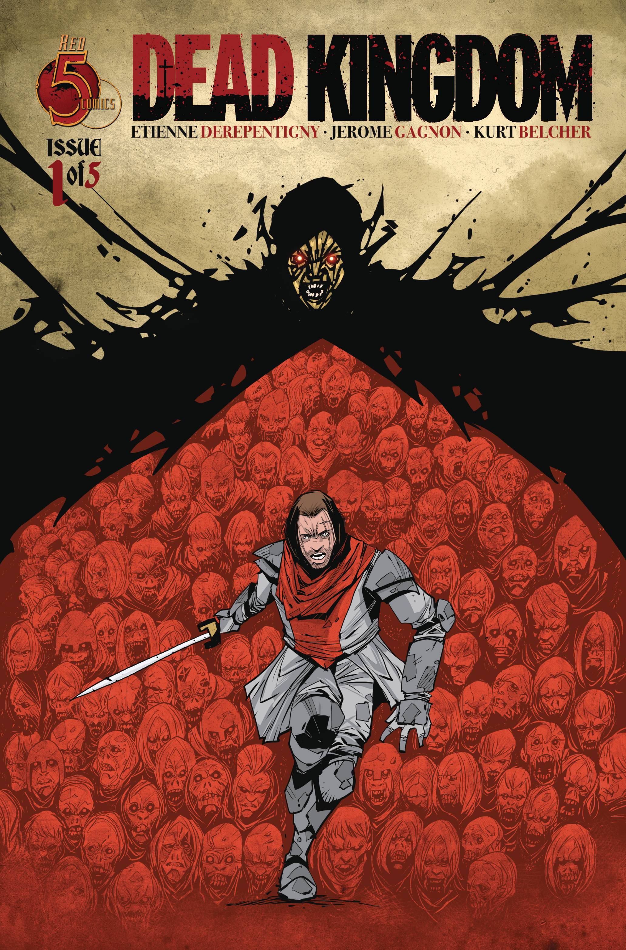 You would have thought that by now the whole zombie craze had, pardon the pun, died an undead death. But I guess you can’t keep the undead down for long. Now Red 5 Comics has taken the oft used trope and applied a totally different environment for the walking dead to stalk!
Two lovers, one a soldier or peacekeeper and the other a mysterious young girl who may be a witch are parted via his orders to investigate a village which holds a dark secret. Where all dreams are torn asunder, the dead don’t care with their single minded focus on eating. How this will affect the loved up twosome and their world remains to be seen,
Creator Etienne Derepentigny pulls triple duty as writer, artist and colorist. Taking the writing first, Derepentigny wastes no time in setting the scene with a touching dismemberment, turning into lunch before introducing the protagonists. The book is pacy, though Derepentigny does spend time doing a little bit of world building. It is important to world build, even if it is going to torn down in a couple of issues. The dialogue works well, both educating the reader and moving the story along, this is a rare skill for a lot of creators. Maybe as both writer and artist Derepentigny is able to recognise what to show and what to tell in the first instance without having to rely on a third party, which could possibly dilute the ideas on show. Of course, the alternative idea is that a third person can add a different take on aspect of a book. Derepentigny’s strength is clearly storytelling, in both writing and art.
Derepentigny’s art has a simple, almost cartoon like style, that is reminiscent of the Mignola-verse stylings. It figures as both this book and Mignola- verse books encapsulates horror along with a more rural, historic look and feel. The simplicity of art is understated, carrying the emotions and the horror of the situation. As well as the art works across the book, the fight scene is a tad confusing with characters looking very similar, perhaps the star of the show are the colors which carry the tone of the book across its various environs, be it the opening scenes, the forest, the town or even the clothes that are worn. Letters are provided by Jerome Gagnon, who gets a cover credit by the way, who uses a well spaced out type of font that helps the reader flow through the book.
An enjoyable mash up of the medieval and zombie tropes, that whilst playing within the expected confines of each is well produced that engages the reader .
Writing – 4 Stars
Art -4 Stars
Colors – 5 Stars
Overall – 4 Stars
Written by; Etienne Derepentigny
Art by; Etienne Derepentigny
Colors by; Etienne Derepentigny
Letters by; Jerome Gagnon
Published by; Red 5 Comics
Diamond Code: JUL221863
Author Profile
- I am a long time comic book fan, being first introduced to Batman in the mid to late 70's. This led to a appreciation of classic artists like Neal Adams and Jim Aparo. Moving through the decades that followed, I have a working knowledge of a huge raft of characters with a fondness for old school characters like JSA and The Shadow
Currently reading a slew of Bat Books, enjoying a mini Marvel revival, and the host of The Definative Crusade and Outside the Panels whilst also appearing on No-Prize Podcast on the Undercover Capes Podcast Network
Latest entries
 Comic BooksOctober 14, 2024Review: Absolute Batman #1
 Comic BooksSeptember 25, 2024Review: Defenders of the Earth #2 (of 8)
 Comic BooksAugust 7, 2024Review: Gatchaman #2
 Advance ReviewJuly 30, 2024Advance Review: Defenders of the Earth #1 (of 8)
