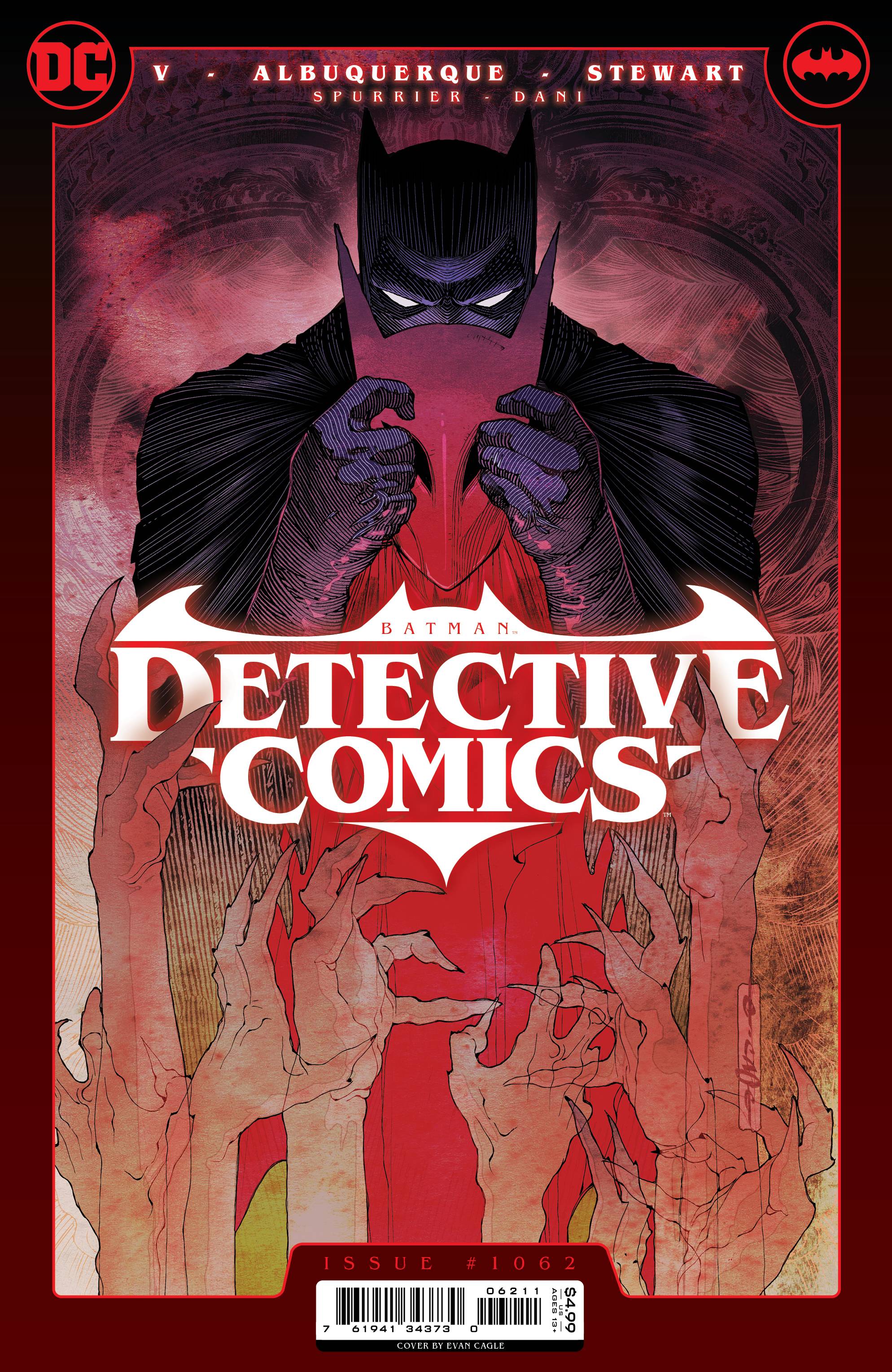
The book pretty much starts as many other Batman books; Batman trying to stop a crime. Things go awry and if not for a surprise intervention things could have gone more than pear shaped. In the aftermath, Bruce has a suspicion that things are off somehow. Is Bruce ready to deal with the vague warnings of death on his doorstep.
I have liked Ram V’s writing for a while now. These Savage Shores was a fantastic read, as was his Justice League Dark; his Catwoman maybe not so much; he isn’t the first writer to fall foul of the feline femme fatale. Here, V’s writing is over-wrought in places, belabouring the setup elements, whilst leaning heavily on several influences from The Dark Knight Returns to the Arkham Origins video game. This is also a surprise addition which brings up a sense of panic in me, and not in a good way, especially when he featured in Dark Metals. I am surprised that with all the demons around, V used one that has already mis-fired in DC’s recent history. V does manage to incorporate a nice Bruce and Nightwing element. I will say that I am confused over the time frame of the book. Is it set in Batman’s near future, hence the DKR vibes, or is it set in contemporary times due to the Bruce Wayne brownstone?
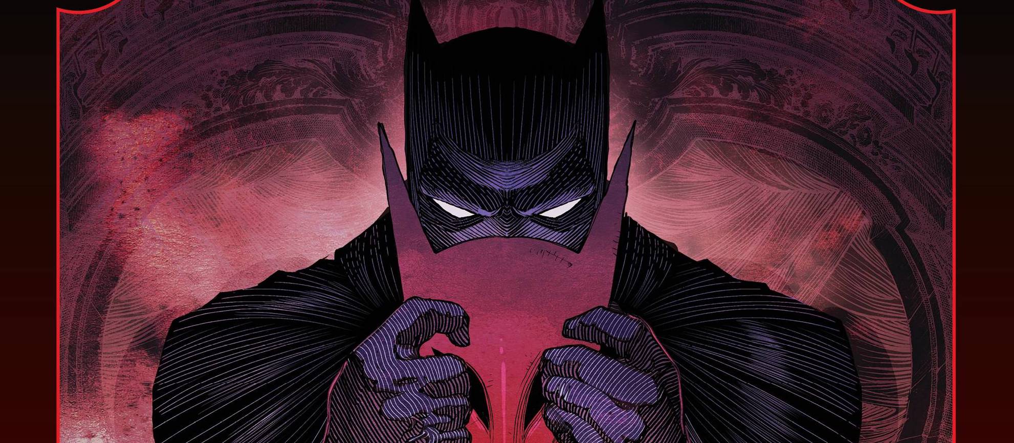
When you see a name on a book, you can’t help but have expectations. Rafael Albuquerque drops a style that exceeds those expectations in droves. As mentioned, there is a Dark Knight Returns styling to Batman and the art isn’t as svelte or light as Albuqurque’s Batgirl work. The heavy lines are used well to battle against the dark hues of colorist Dave Stewart, who to be fair, is the colorist you would want if you wanted the best in horror vibes and setting fro your comic book. Letterer Ariana Maher does a fantastic job mixing up the fonts, effectively differentiating the norm from the supernatural. Makes you wonder why she doesn’t get a cover credit?
There is a back-up story featuring Jim Gordon, the forgotten man of Gotham it seems. This little three parter is written by Steve Spurrier with art from Dani. Spurrier sets his sights on a Gordon who is facing retirement and lacks a sense of purpose. This being Gotham, new beginnings are not always a great idea. Dani’s art is another darker style that displays Gotham at it’s seediest. Dave Stewart is magnificent again, in a different manner to the main story. Steve Wands is the second letterer who fails to get a cover mention. Why?
Now that all the hype of The Batman has passed by, it’s perhaps time to get back to what Batman does best! With two new creative teams on the main bat-books, the excellent The Knight mini series, regardless of the varied crossover books (of mixed quality), this could be a rich vein for Batman.
Writing – 3 Stars
Art – 3.5 Stars
Colors – 5 Stars
Overall – 3.5 Stars
Written by; Ram V & Steve Spurrier
Art by; Rafael Abuquerque & Dani
Colors by; Dave Stewart
Letter by; Ariana Maher & Steve Wands
Published by; DC Comics
Author Profile
-
I am a long time comic book fan, being first introduced to Batman in the mid to late 70's. This led to a appreciation of classic artists like Neal Adams and Jim Aparo. Moving through the decades that followed, I have a working knowledge of a huge raft of characters with a fondness for old school characters like JSA and The Shadow
Currently reading a slew of Bat Books, enjoying a mini Marvel revival, and the host of The Definative Crusade and Outside the Panels whilst also appearing on No-Prize Podcast on the Undercover Capes Podcast Network
Latest entries

