Review: Disney Villains- Maleficent #1
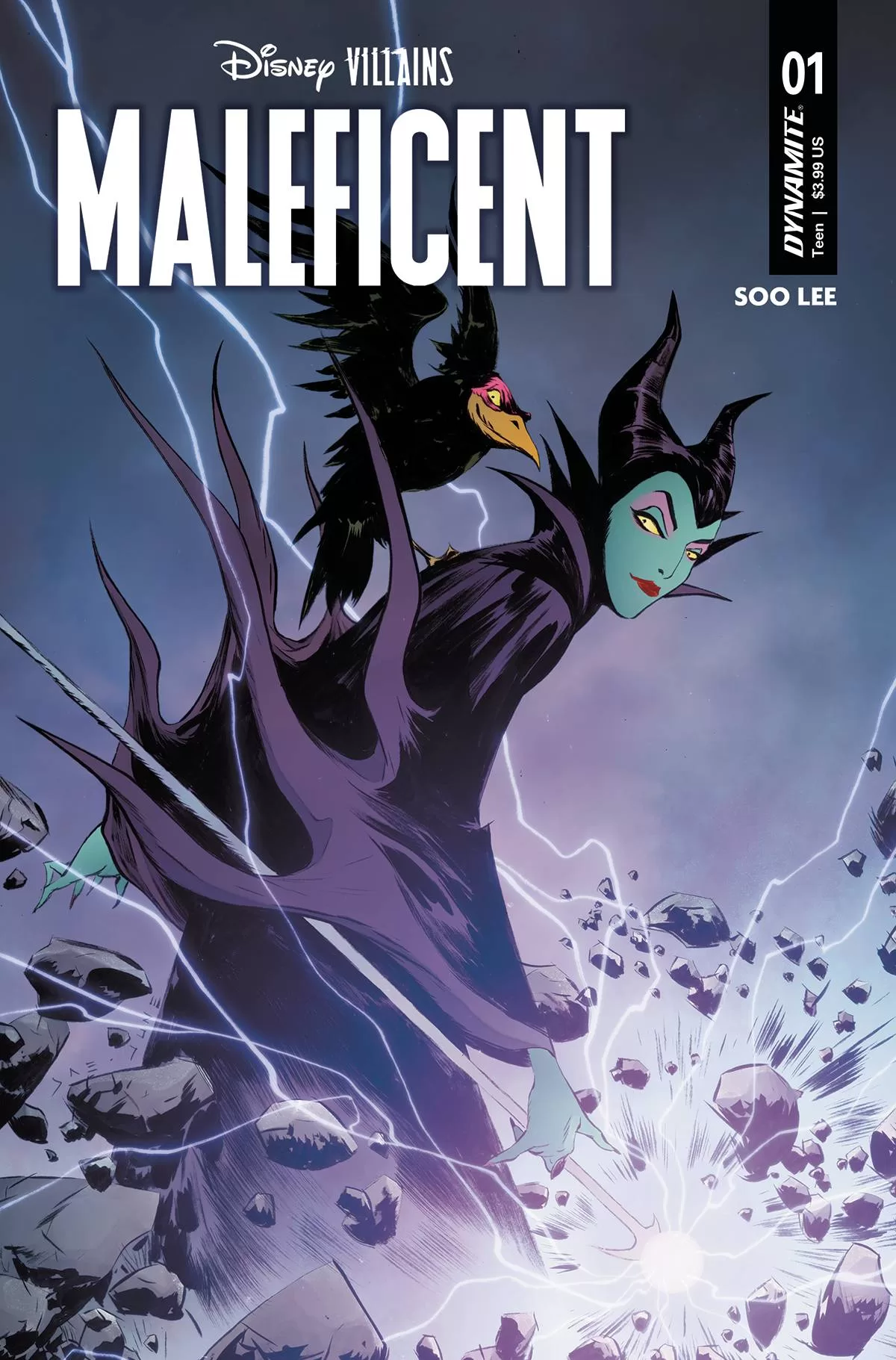 Seeing this story makes me really happy. Whilst I am not particularly a fan of Disney villains nor do I consume that much Disney content as I know many others online do, this book makes feels me with joy because it shows you what can happen when you give a renowned character to a writer and illustrator with skill. Maleficent number one follows the bewitching mother of magic through an unusual story arc where she saves a peasant boy looking for adventure from a pack of wolves. The boy makes some bad mistakes after Maleficent saves him, but that part of the story is for you to figure out. Here we must talk about the amazing background work by Soo Lee, it is truly spectacular imagery.
From the outstanding forest scenes to the beautiful thorny castle of Madam Maleficent, each panel is filled to the brim with wonderful shapes and masterful use of contrast and negative space. This is really a wonderful book to read through, it is for all intents and purposes a tour de force in outstanding brushwork, fun character design, and mostly silent storytelling. I really enjoy how this comic has less than 100 pieces of text (including sound fx) throughout the whole story and it’s mostly told in action sequences illustrated quite well. It is no doubt a great example of the idiom of “show don’t tell.” I would wager to say that it might have worked just as well with no text at all, but that would be a little sad because we wouldn’t be able to see the wonderful lettering by Jeff Eckleberry, who does a fantastic job translating the script to readable word balloons and terrific sound fx that look perhaps hand drawn in many cases.
This is perhaps a quick read which is due greatly in part to the fact that it has such little text, but then again I don’t think that’s a bad thing at all. It is a wonderful first book to build upon and if the coming books will have more backgrounds illustrated by Soo Lee, I have no doubt this will turn out to be a very immersive and aesthetically pleasing world to add to the great worlds created by Disney. I also have to give a nod to the great page design on some of these pages, the panel layouts are just right. When Soo Lee decides to break away from your standard layouts by using extra panels that fall outside of the margins or even does away completely with panels and instead uses thorny vines as a texture on top of the borders, it not only adds great character to the story but it makes you feel the emotion the characters are feeling, those of wonder and fear all wrapped into one.
As you can tell from my review so far I am a fan of the art in this book, but it is not without fault. Whilst the backgrounds are simply amazing a couple of the poses seem a little stiff, and the characters can look a little wonky, particularly the peasant adventurer. Maleficent on the other hand, as well as the animals in this story, are rendered perfectly especially Maleficent’s raven sidekick, Diablo who not only inspires fear into your heart with its glowing green eyes but also gives off a vibe of magic sort of like Edgar Allen’s Poe famous winged creature story.
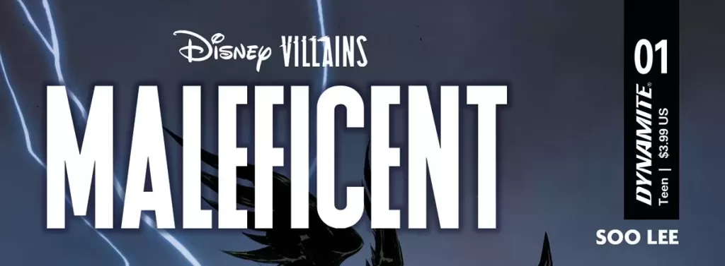
The cover art whilst not drawn by Soo Lee is just as good, but I just wish that the raven on the cover looked a little more like the one on the inside pages, however, I understand how the one on the cover is actually more aking to the one we see in the original movies, so it makes sense to have him on the front cover. The credit illustration though, that’s just fantastic. I am really liking this trend of books having the credit page be in black and white, and when it’s done so masterfully like in this book by using the thorned vines to frame the images, I can’t help but smile to myself.
All in all, this is a good first issue for any story and I’m excited to see more by the talented Soo Lee and Co. I know I mentioned it at the beginning but it makes me very happy seeing that a single person wrote and illustrated the whole comic. In a world ruled by corporations (Disney is one of the biggest), it is still a joy to see a single artist take on a full project and deliver quality, creativity, and passion.
Writing- 4.8 Stars
Art – 4.9 Stars
Colors – 5 Stars
Overall – 4.9 Stars
Writing and Illustrations by; Soo Lee
Lettering by; Jeff Eckleberry
Edited by; Nate Cosby
CoverArt by; Jae Lee & June Chung
Published by; Dynamite
Reviewed by Antonio “Mabs”
Author Profile
Latest entries
 ColumnsMay 6, 2025Primordios: Enchanting Creations and Heartfelt Moments at Puerto Rico Comic Con 2025
 Comic BooksApril 17, 2025REVIEW: Sister Imperator #1
 Comic BooksFebruary 25, 2025REVIEW: Cruel Kingdom #2
 Comic BooksFebruary 24, 2025REVIEW: Godzilla Heist #1
