REVIEW: The Displaced #4
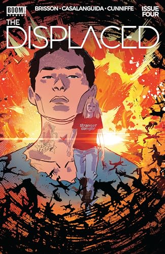
The Displaced is set in a world where if you stay by yourself for too long you start loosing your memories and the people that know you forget about you as well. A very interesting premise for a story featuring several characters and at least 3 different points of views. This issue was a little hard to follow due to the huge amount of perspectives being handled at any given time, but it still managed to provide several very interesting scenes that promise bright things for this series.
Like I mentioned before the story is hard to follow. Every 2-3 pages you are thrown into the perspective of a new band of characters and not all of them are connected at the end which leaves several loose ends when the book is done. That being said, the general premise of the book is; If you are alone you forget and are forgotten. Most of the story is build on the foundation of that premise, there are several really cool scenes that offer great pay-outs for the reader. Two very particular scenes come to mind, the first one being a gay couple that decides to split ways in hopes of finding safety. They way this scene was handled feels very realistic because you don’t really learn they are a gay couple right up to the end when they kiss goodbye. The tention builds up to that moment perfectly and you start questioning wether they are actually a couple or not until they kiss. I think that’s the way sexuality should be handle, you shouldn’t fall into stereotypes when it comes to people’s gender and instead you should be left in the abstract to figure out towards which side of the sexuality spectrum people lean to on your own, and based on the actions of the characters, not on obvious tropes. That all being said, however, the actual panel of the characters kissing is rather subpar. It’s almost like when you see actors in movies kiss and they aren’t really kissing but more like they are pressing their upper lips together but not really kissing, that was a missed opportunity because the build up was fantastic. One other moment that really stood out for me in this story comes in the form of a “junkie” that lives with one of the groups. This guy is tasked to go out into the world alone and pay for rent. Of course if he goes out into the world he forgets and is forgotten, and yet the way it’s handle is super interesting and rather morally reprehensive. The leader of the group basically keeps him drugged up so he barely remembers anything anyways but gives him enough money to pay for rent, he goes out and pays for the rent (perhaps as a force of habit) and when he comes back to his house they restart the whole process all over again. Each time the guy doesn’t remember who the people in his house are but the leader gaslights him into believing they are his friends and that he’s been living with them for a long time. It’s really a psychological trip to see the leader gaslight this poor addict into paying rent so the rest of the group can stay safe and not be forgotten. It’s also very cool because the way it happens at the beginning doesn’t really explain the full picture until the end when you realize why the leader has to do this in order to keep the rest of the group safe. This “aha” moment offers a wonderful reward for the readers as they piece together the reasons behind the morally reprehensive act of tricking an addict.
The art style isn’t bad, and yet it’s not particularly good either. You can think of it sort of like a Spider-verse type of art style with a few more flaws here and there. The biggest flaw comes from missed action poses, and badly drawn key scenes that leave us wanting more. There is also a weird use of a black blob shape in many of the character faces that is supposed to act as the shadow of the nose, but ends up looking like someone spilled ink on the page. It’s weird because the characters are shaded so this shape would have worked better as the shaded color instead of a full black blob, but perhaps it was done during inking and the colorist overlooked it when putting together the final art. One thing I do have to say is that the character designs are all very cool in this comic. The amount of very intersting character designs makes you realize that it’s not so much what or who the characters are by themselves but who they are in contrast to each other. These were all human characters but together they were all quite distinct in terms of silhouettes, shapes and sizes making them all stand out as cool character designs. It’s fun to see justapoxed skinny characters with heavier characters, and light skin characters with dark skin characters.
The lettering didn’t really stand out too much for me, but it did it’s job. It’s lke we’ve talked about before; good lettering is like a good bass player. If it’s good you barely notice it at all, but when it’s bad you can’t help but dislike it. I would also argue that a phenomenal letterer also stands out like a fantastic bass player would, but the way it stands out is different from the way a bad letterer/bass player stands out. One you can’t help but applaud, and the other you just want to shut down completely. Here though it was good, nothing too creative, but nothing that would take away from the reading experience so that’s an A in my books.
Despite the low-ish score, I did like this comic. The blob in the faces was annoying but the great character designs made up for it. The story was hard to follow but the few really good scenesmade up for it as well. It’s not the best comic I’ve ever read but it was a fun read-through and I think there’s a lot more to see from this comic, and I’m excited to see it. All in all I look forward to the next issue.
Writing: 4 Stars
Art: 3 Stars
Colors: 5 Stars
Overall: 3.5 Stars
Written by: Ed Brisson
Illustrated by: Luca Casalanguida
Coloring by: Dee Cunniffe
Lettering by: Hassan Otsmane-Elhaou
Cover art by: Luca Casalanguida & Dee Cunniffe
Variant Covers by: Declan Shalvey & Dylan Burnett
Published by: Boom Studios
Author Profile
Latest entries
 ColumnsMay 6, 2025Primordios: Enchanting Creations and Heartfelt Moments at Puerto Rico Comic Con 2025
 Comic BooksApril 17, 2025REVIEW: Sister Imperator #1
 Comic BooksFebruary 25, 2025REVIEW: Cruel Kingdom #2
 Comic BooksFebruary 24, 2025REVIEW: Godzilla Heist #1