REVIEW: Hack Slash Back to School #2 (of 4)
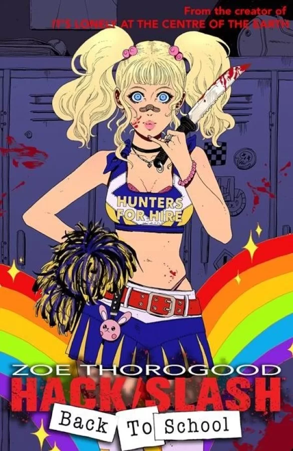 Hack and Slash your way through a depressive pixelated video game landscape until you find the “slasher” responsible for hanging and cutting people in half in their own apartments. Zoe Thorogood delivers a second installment to her creepy and gory “girls in uniforms solving bloody crime series”. Funny, well-paced, and filled with interesting and unique characters.
Hack and Slash #2 follows Cassie, Sam, and Boo, as they work their way through the different levels of a videogame called Frogboy. They enter this videogame through a portal in the computer of a recently deceased victim and through wonderfully written dialog, puns, and violence the group of girls must figure out who has killed this person and why. The comic is very well drawn, and I personally love the manga influences with the character of “Baby Boo”, who also happens to be a clumsy, borderline hentai-ish individual that pairs perfectly well with the competitive Sam and the serious Cassie. Featuring the support of Mabel the tech wiz, the girls meet Frogboy who is a pixelated boy with the head of a frog and is also the main character of the video game. The writing has a lot of unexpected twists, and while some of these twists enter the macabre and scary spectrum, the comic manages to stay light, and richly entertaining.
The story is a little convoluted, however, it very much reads as a “Monster of the Week” story, and I’m all on board for it. This structure of storytelling lends itself to wacky adventures, and Zoe Thorogood does a great job at playing out some crazy antics with the characters whilst still being able to build their interpersonal relationships and the background lore of each of them, even though chaos is running rampant around them. The pacing is very good, it reads effortlessly, and even with its bright colors and comedic undertones it still manages to be a little eerie and scary. Some of the drawings remind me of something you could see in a Junji Ito book, making the manga influences that much more apparent. The panel layout isn’t particularly innovative, but they do a fantastic job of delivering the story at a well-timed pace. However, I do think that a few of these pages could’ve used a black background instead of the white background around the panels, this would work especially well because the panels themselves are borderless but also because the tone of the comic is both comedy and horror rolled into one. Having full black pages where the comic turns really horrific would definitely enhance the overall impact of those moments.
I am not a huge fan of the art style chosen for this comic, yet for this type of story it works very well because it manages to feel light but at the same time has enough detail to convey the really horrific scenes that a story about a group of girls that fight serial killers (aka slashers) will no doubt conjure. Huge props to Zoe Thorogood for not only writing this very entertaining story but also for illustrating and coloring most of it. Whilst a few of the panels could use more dynamic poses to convey the action, there are some really interesting compositions throughout the issue, and I personally love all the funny poses Boo ends up in, she is definitely my favorite character out of the bunch so far. Where the art really excels though, has to be with the slashers and the monsters in the story. The Frog Boy King looks fantastic, and the Frog Boy Creator is equally just as awesome. The monsters are also very creepy, and I love how we get to see the girls in pixel art format for a few of the panels, and then we get to see them again but in their more realistic style. This exercise of translating pixel art into semi-realistic scenes is very nostalgic for playing Super Mario Bros and making the leap that a bunch of brown squares, and darker squares were actually monster mushrooms with little feet and eyes. It is a great way for the creator to exercise their creativity and show us not just the pixel art, but what the pixel art could really be under the hood. One minor issue I did find, however, was that the actual pixel art scenes were so different than the actual art of the book that they at times became jarring and unpleasant to look at. I think this could have perhaps been solved by having a panel or two where we saw the scenes through the computer monitor instead of just being right inside the game. Doing this every so often would allow our minds to bridge the gap better between the real world and the computer world, and it would’ve made it a little easier to look at.
The coloring is very good when it comes to the characters and the environments, however, a few too many of the backgrounds were simple flat colors, and because this story features so many different hues of flat color backgrounds, often in one single page, they can end up being quite overwhelming on the eyes. It is clear that artist and writer Zoe Thorogood has great penmanship and drawing skills, so having so many flat-color backgrounds shouldn’t be an issue. If it’s a matter of laziness in the face of backgrounds, then perhaps playing with spot blacks like Mignola would have been a better way to deal with this instead of vibrantly flat color backgrounds. At times, these flat color backgrounds do work, and I’m not saying do away with them altogether, but I do think there is no need for having 3-5 flat color backgrounds on any single page. The best pages in this story are the ones with full backgrounds, even when that background is just a box with a checkered pattern. One last thing I will say about the coloring is in regard to the shading. The shading in this story is mostly done with black ink, however a lot of the coloring also features a very subtle shading using a soft brush, and I personally don’t think it’s necessary. I would’ve much preferred to let the ink and flat colors work together and keep the soft brush only on background elements. When it comes to characters, this soft brush shading is so subtle on the characters that instead of having the desired effect of giving the character volume it actually ends up making them look muddy. If muddy is the look though, then perhaps a textured brush will be a much better choice for rendering.
Despite not finding a dedicated letterer in the credits of this book, which leads me to believe that this was also lettered by Zoe Thorogood, this book is very well-lettered. The choice of fonts works perfectly for the different character voices, and there is a very good variety of word balloons and SFX designs to carry the story in a wonderfully visual manner. I only found two instances of text that I didn’t really like which were, the font used for the pixel Frog Boy and one instance where an SFX word could have been a tiny bit larger. Other than that this is fantastically lettered, and I’m a huge fan of it. Especially the text work during the chainsaw prologue. The full-size page is so very well illustrated and lettered that you can hear the chainsaw buzzing right in your face. Fantastic work.
Whilst there are a few issues with the comic, in terms of the art, this was a wonderful read and I enjoyed it greatly. I personally think the writing is of stellar caliber. The way drama is cultivated and anticipation is built only to have you suddenly going in an unexpected direction is masterful. I liked this a lot, I think all the characters are very interesting, and even just from one issue, I can see a lot of potential for the development of the character relationships which is enticing, to say the least. Hack and Slash are building a wonderful world where women are not victims of serial killers and mass murderers, but instead, they are judges, juries, and executioners of these fiends and I love all of it.
In conclusion, this is just a fun story to read. It has unexpected turns, and a lot of lore to follow. The art is able to deliver some great moments, and if you’re a fan of horror and comedy (think Shaun of the Dead) then this could be right up your alley.
Writing: 5 Stars
Art: 4 Stars
Colors: 4 Stars
Overall: 4.5 Stars
Written and Illustrated by: Zoe Thorogood
Coloring by: Sarah Mitrache & Xludwigx
Cover art by: Zoe Thorogood
Variant Covers by: Ephk
Published by: Image Comics
Author Profile
Latest entries
 ColumnsMay 6, 2025Primordios: Enchanting Creations and Heartfelt Moments at Puerto Rico Comic Con 2025
 Comic BooksApril 17, 2025REVIEW: Sister Imperator #1
 Comic BooksFebruary 25, 2025REVIEW: Cruel Kingdom #2
 Comic BooksFebruary 24, 2025REVIEW: Godzilla Heist #1
