Review: Hell to Pay #1 (of 6)
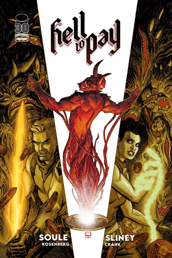 “‘Tis the season to be scary, tra la la laaa, la la, la, la”. It seems that every other book this last fortnight has been horror themed. I suppose if that all publishers are pushing out, those books are going to trickle somewhere. Hell to Pay is a kind of horror themed Indiana Jones type of quest affair. Throw in a deal with the devil and you have the sort of table turning story that promises to deliver some twists and turns.
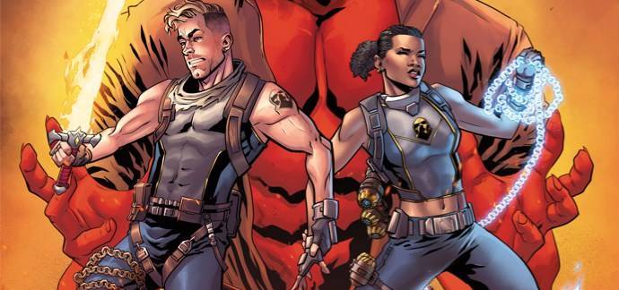
The Stones have made a deal with the devil. All they need to do is collect the remaining cursed coins, the qurrakh that exist on the earth. Now on the trail of the last one, its glad rags for Mrs Stone and back-up for Mr Stone, However, they are not the only ones who have made deals, and with an added pressure to the need to be free the race is on!
I am a fan of Charles Soule from across the various comic book aisles. Here, Soule sets the table out from the get go. If sex can sell, it certainly can also distract, with Maia Stone showing a lot of leg to the target of Ian Macready and an offer of joining his collection having the desired result, Soule is playing with the readers expectations. The setup allows for a ton of exposition, at least from a certain point of view. There is a need for this; first issues tend to have to sett the scene; Soule tries to keep this at a minimum, though with devil being in the details, you would do well to take notice of it all. The characters of Maia and Sebastian (the Stones) are well nuanced with a casual comfiness that comes from being a married couple for a number of years. The plot is quite pacy, even with the sideways history lesson that is required, a testament to Soule’s energy. and the sense of fun generate through the characters interactions.
The art is provided by Will Sliney, whose work I am not too familiar with. Here there are different stylings on show. Firstly Sliney uses some fine lines to accentuate Maia. This then moves into the second style, a sort of Tom Rainey look with an edge of cartoony elements. Finally, this segues into a more straight forward square jawed approach. Will the real Wll Sliney please stand up! Some tame body postures early on are rescued by camera angle changes later in the book. The colors from Rachelle Rosenberg work well, with a deepness that adds a mystic vibe to proceedings, matching the tone of most of the book. Finally, Chris Crank supplies a nice font, that is easy to read, exposition and. all. I will even give a nod to Image Comics for including Crank on the cover credits.
A fun book, that is an enjoyable romp, filled with characters who make logical decisions for the now, regardless with what this may mean down the line. Soule raises the ante as the Stones think they are finally out from under the hammer.
Writing – 4 Stars
Art- 4 Stars
Colors – 4 Stars
Overall – 4 Stars
Written by; Charles Soule
Art by; Will Sliney
Colors by; Rochelle Rosenberg
Letters by; Chris Crank
Published by; Image Comics
Author Profile
- I am a long time comic book fan, being first introduced to Batman in the mid to late 70's. This led to a appreciation of classic artists like Neal Adams and Jim Aparo. Moving through the decades that followed, I have a working knowledge of a huge raft of characters with a fondness for old school characters like JSA and The Shadow
Currently reading a slew of Bat Books, enjoying a mini Marvel revival, and the host of The Definative Crusade and Outside the Panels whilst also appearing on No-Prize Podcast on the Undercover Capes Podcast Network
Latest entries
 Comic BooksOctober 14, 2024Review: Absolute Batman #1
 Comic BooksSeptember 25, 2024Review: Defenders of the Earth #2 (of 8)
 Comic BooksAugust 7, 2024Review: Gatchaman #2
 Advance ReviewJuly 30, 2024Advance Review: Defenders of the Earth #1 (of 8)
