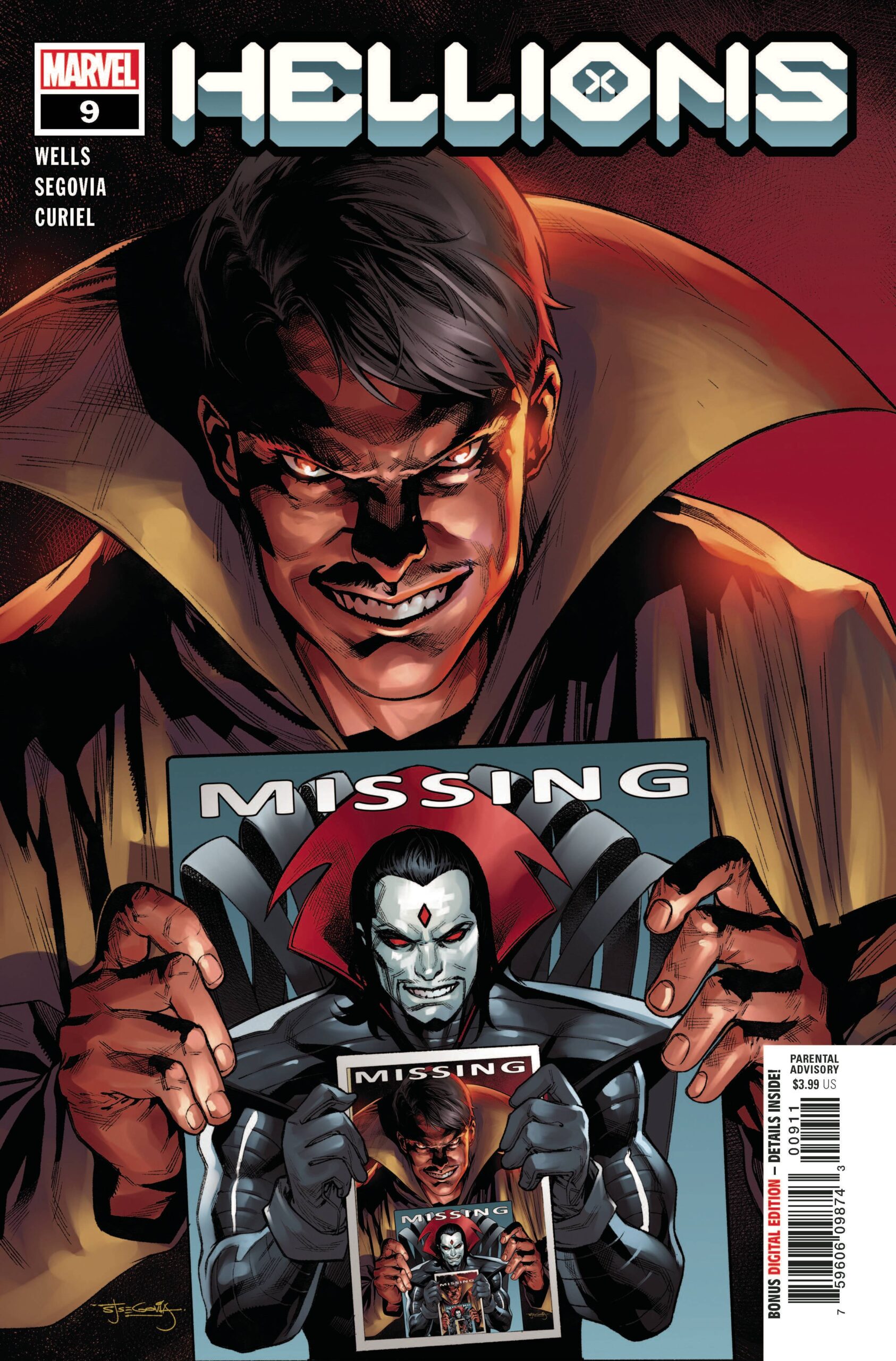
This book is a bit of a mini jumping on point. Sure there are the over reaching arcs of Krakoa being a heaven or hell and the idea that something dodgy is going on with Peter and Nanny (when is there not, right?), but for the most part, the setup is relatively self-contained. Mr Sinister has been kidnapped; the Hellions feel a tad responsible so off they go to New York and the Hellfire Club. Now long term mutant fans will know that nothing good ever really comes from going to the club. True enough a couple of their members are living on Krakoa, but that is a problem for another time. Quicker than you can say “hey, aren”t you the guy that almost took down the Phoenix?” Mastermind does what he does best, leading to the return of one of my all-time favourite villains!
Writer Zeb Wells seems to be having fun with these darker than normal characters. Each one is a little shady as if being on this team will help restore them in some way or put them in Xavier’s good graces. I like the interaction between the team members; there are some angsty moments. There is the usual marvel “fun’ quota to be had, and whilst I am no fan of a camp Mr Sinister, the majority of the humour was situational which makes sense rather than everyone on the team cracking jokes. After the mess that was the short lived Fallen Angels book, I am glad to see Psylocke back to her best here.
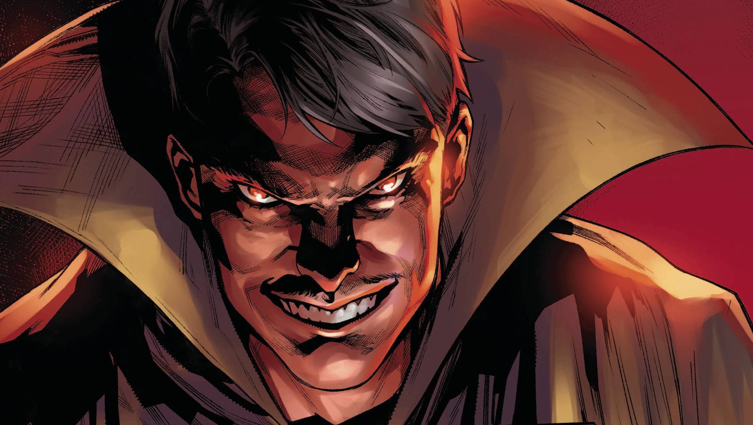
I am loving the majority of Stephen Segovia’s art. Characters are instantly recognisable, facial elements reflect what is going on in the script and even unappreciated, at least by me, characters like Mr Sinister get a quality treatment. The conversational pieces are structured to not impact the pace of the story via a mix of panel types which use for the action scenes, again do not detract. My only gripe and it is a small gripe; why does Psylocke’s chest change so much, in both size and shape? Yes in know that body parts can look different depending on posture, movement and camera angle, but there is little consistency which distracts the eye. Colors are provided by David Curiel , who gives everything a dark, heavy look that not only seems synonymous with the X -books, but also with a few other books in the greater Marvel universe. The colors aren’t bad, just dark. VC’s Ariana Maher utilises the X-font that is used solely for the book of X.
I thoroughly enjoyed this book, odd characters and body part shapes not withstanding. What’s not to like; a break from the Krakoan arc and a couple fo old school villains to boot. I can’t wait for the next issue!
Writing – 4 Stars
Art – 4.5 Stars
Colors – 4 Stars
Overall – 4.5 Stars
Written by; Zeb Wells
Art by; Stephen Segovia
Colors by; David Curiel
Letters by; VC’s Ariana Maher
Published by; Marvel Worldwide Inc.
Author Profile
-
I am a long time comic book fan, being first introduced to Batman in the mid to late 70's. This led to a appreciation of classic artists like Neal Adams and Jim Aparo. Moving through the decades that followed, I have a working knowledge of a huge raft of characters with a fondness for old school characters like JSA and The Shadow
Currently reading a slew of Bat Books, enjoying a mini Marvel revival, and the host of The Definative Crusade and Outside the Panels whilst also appearing on No-Prize Podcast on the Undercover Capes Podcast Network
Latest entries

