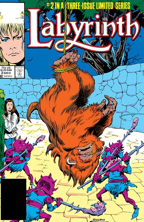
REVIEW: Labyrinth #2 (of 3)
Modern readers get a wonderful treat straight from the archives of Marvel comics with this wonderful remaster publishing of the original adaptation of Jim Henson’s 1986 movie, Labyrinth.
 In this, the second issue of Labyrinth, Saran continues looking for her little brother Toby who was stolen by the Goblin King. This beautifully remastered reprint of Marvel’s Labyrinth brings us the same wonderful story that no doubt was a success in the 80s but now with much brighter colors and ready for the digital age. The art is the same throughout the story of course we are treated to a lot of hatch lines, flat colors, and old-school word balloons, and yet this comic feels just as relevant today as it did back in the 80s. One thing we should do more of in comics nowadays, is to summarize the story so far in 2-3 narration boxes in order to catch the readers up to date quickly and efficiently without resorting to long-winded introduction pages that are composed of nothing but boring text. If you can’t summarize what happened in the last comic in a few sentences perhaps you’re better off going the flashback route and giving new readers a quick recap altogether. However, in this comic, it’s done masterfully, and in just 3 narration boxes we are caught up to speed and ready to read the rest of the story.
This issue begins with Saran trying to solve the classic puzzle of “Two Guards”. One guard can only tell the truth while the other one can only lie, in this situation how would you solve this riddle? Saran takes the common route and decides to ask one guard what the other guard would say. While this works in the real world; in the world of the Labyrinth, things aren’t always what they seem. Saran opens the door and instead of being led to her little brother she immediately falls down into an endless void where we are presented with a beautiful pun/metaphor called “The Helping Hands”. This scene is visually super creepy and yet it also manages to be quite beautiful. The blues and greens contrast wonderfully with Saran’s color scheme and the spot blacks make for a truly weird and nightmarish couple of panels where we can truly feel Saran’s fear and struggles. It is also very nice to see the main character fail right off the bat. When we see this we can quickly understand that the author doesn’t want to save the characters or play Mary Sue with them. The author wants to tell a story and if that means putting their characters through hell and back they are going to do it because all the characters serve the story, and not the other way around. A mark of truly good storytelling. The pacing of the story fluctuates between fast paced scenes and brief moments of respite that allow us and the characters to breathe in order to collect their thoughts and figure out what to do next in such a weird and wacky world. There are also a few scenes that take place in the Golbin King’s room and the transitions are done quite nicely through narration boxes and creative panel layouts.
Even close to 40 years later the art in this comic still holds up. The character designs feel very inventive and it feels like the artists wanted to innovate and really go above and beyond with what they were able to create in terms of interesting humanistic characters. This sort of comic shows us that human characters don’t have to be boring and all look the same, there is an innate understanding of shape language in this comic and it can quickly be seen when we look at the Goblin King, Hoggle, and even Saran. Even though every character is humanistic in nature there are very specific details that make them all stand out from each other. Whether that’s Hoggle’s huge nose and tiny stature, Saran’s groovy hippy-looking vest, or the Goblin King’s mystical glam-rock-looking appearance; the amount of creativity is undeniable. This creativity does not stop at character designs but extends through to the coloring and even the environments. While the environments themselves aren’t particularly complex and most of what we see is either a simple background or a straight-up black box with a few light effects, there is still a lot of room for showing the right amount of detail to bring us into the world. The real hero here though has to be the coloring and spot-black style. Everything is colored with flats but the beautiful inking adds so much-needed dimensionality that reminds us that these aren’t pictures on a piece of paper, but each panel is a small window into another world. A world where a sea of hands exists, a cave can have talking faces on the walls, and a wizard’s hat can speak faster and ruder than the wizards themselves. The creativity is endless and I am all for it.
Being able to read this comic almost 40 years later, allows us to take a look out how the language of comics has changed through the years. The use of narration boxes is ever present and it works not only as an omnipresent narrator but also as a way to deliver lines outside of the scene that still make perfect sense in the new scene. Think of dramatic voice-overs in a movie. Another interesting aspect of this old-school sort of comic making is how Shakespearean and theatrical everything is. There is hardly any fourth wall breaking, so much so, or rather “so little so” that not even word ballons are allowed to cross the panel borders. Retro.
This fantasy adventure drama is really good. It’s funny, it has suspense and it just feels masterful in so many ways. I’m not the first person to write a Labyrinth review, and I won’t be the last; but being able to read this old-school comic in such a modern way like my tablet, with such beautifully vibrant colors is a delight and an honor like no other. Whether you pick this up digitally or you pick it up from your local comic book store, I highly doubt that you will be disappointed. This comic still holds up because it relies on fantastic writing, creative artistic decisions and likeable characters. These things will never go out of style.
Writing: 5 Stars Art: 5 Stars Colors: 5 Stars
Overall: 5 Stars
Written by: Jim Henson Adapted by: Sid Jacobson Breakdowns by: John Buscema Finished by: Romeo Tanghal Original Colors by: Bob Sharen and restored by Kyle Hallemeir Lettering by: Joe Rosen
Cover art by: John Buscema & Romeo Tanghal
Variant Covers by: Rebeca Puebla Published by: Boom! Studios Archaia
Author Profile
Latest entries

 ColumnsMay 6, 2025Primordios: Enchanting Creations and Heartfelt Moments at Puerto Rico Comic Con 2025
 Comic BooksApril 17, 2025REVIEW: Sister Imperator #1
 Comic BooksFebruary 25, 2025REVIEW: Cruel Kingdom #2
 Comic BooksFebruary 24, 2025REVIEW: Godzilla Heist #1