REVIEW: Monstress #50
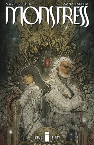
 Old terrible monsters, wolfmen and shark people, mermaids, and talking cats. Monstress is a story unlike any other, with beautiful prosaic writing and an art style that seems to take its cues from H.R. Giger and Studio Ghibli films. In this issue of Monstress the half-wolf arcanic Maika must convene with the Wave Court if she is to be reunited with Zinn the primordial Monstrum of tremendous power that once shared her body, and hope that together they will be able to defeat her father the Lord Doctor.
I first got a hold of this series back in March when I happened to find an Image First comic of it over in a store in Oslo, Norway. I had never seen the book before but the beautiful art style and straightforward writing made it an instant classic for me. Writer Marjorie Liu has a way of making the most mundane of conversations into a beautiful mixture of words that instantly transport you into a world so unlike this one. Couple that with the amazing art by artist Sana Takaeda and you have a story unlike any other. In this issue, we are treated to two very important plot lines, a continuation of the meeting between Maiko and her friends and the Wave Court, as well as a meeting between the nekomancer Ren and the poet in charge of the Ubasti’s largest temple in spice islands. This is mostly a storyline issue with a lot of talking and very little action, but that doesn’t stop it from being incredibly interesting. The conversation between Ren the cat and the poet is so deep and rich with detail that it makes me think of a scene straight out of Game of Thrones, and I’m all for it. Normally talks of diplomacy, war, or planning are boring but in GOT and Monstress the word choice is so wonderfully interesting that I am at the edge of my seat getting up to speed with what’s going on in the war. It’s fantastic. There is also a 2-page mini-story at the end of the book about the Nekomancers and how they come to be chosen, and even though it is very short it helps to further build this lore-deep book.
Whilst the overall theme of the story feels like a bit of a “the story so far” sort of issue, it still manages to feel rather quick and punchy and doesn’t bog us down with too many details. The tone is mostly dramatic with perhaps just one little joke here and there, for example there is a bit of a comedic moment between the cats when Ren comes back to camp and sees the other cats cooking together. However, other than this particular moment the drama is high on this one, especially in scenes where the primordial Monstrum Zinn is present. In every one of the panels were Zinn is presented, the tension is so dense that it can be cut through with a knife.
I will never stop loving Sana Takaeda’s art. Their character designs are filled to the brim with creativity and interesting details, that feel so close to what you would see on a Square Enix game. On the other hand, the backgrounds are full of very intricate patterns and details that I can’t help but feel like I’m looking at a Giger piece. However, instead of a deep love for robotics and mechanical shapes, Takaeda seems to be deeply in love with nature and all things living. There is also a hint of Art Nouveau framing in some of the panels, which makes for beautiful works of art. You could rip out every panel of this story, put it on a frame, and hang it on a gallery and no one would bat an eye. This is fine-art comic-making at its highest.
I’ve never been a huge fan of the lettering in this story. It is not that it’s bad, because it isn’t. It works very well for the sort of art that is being presented. In my opinion, though, it’s not as creative as the rest of the art or writing. It’s simple, and to the point with very few sound fxs, and if there are any they will most likely be inside a word balloon. I get it though and it’s no fault of the Rus Wooton, the letterer. I think they do an amazing job on this book, the problem with really detail-heavy panel art is that you can’t go too crazy with the word balloons or else you risk confusing the reader altogether with a bunch of unnecessary cool lettering tricks. It’s a shame that Rus can’t explore their creativity because the art is so detailed, but at the same time at least they have a wonderful letterer who is experienced enough to not use outlines on word balloons that could potentially clash with the art. It works, it’s straight to the point, like a good bassline, you barely know it’s there, but you can feel it. This is just a case where I as a reader have to choose: crazy creative lettering or a really good story with beautiful art that is readable and concise. In this case, despite my predilections, I’d rather have simple lettering and a great overall book any day.
I love this book. It is one of my favorite books to read whenever I come by it. It’s rich with lore, the environments are amazing and it somehow gives me the same feeling that watching Princess Mononoke for the first time gave me. I can’t praise it enough.
To keep things simple, and to be bluntly pedestrian; if you like amazing comic books then this series is for you.
Writing: 5 Stars
Art: 5 Stars
Colors: 5 Stars
Overall: 5 Stars
Written by: Marjorie Liu
Illustrated and Colored by: Sana Takaeda
Lettering by: Rus Wooton
Cover art by: Sana Takaeda
Published by: Image Comics
Author Profile
Latest entries
 ColumnsMay 6, 2025Primordios: Enchanting Creations and Heartfelt Moments at Puerto Rico Comic Con 2025
 Comic BooksApril 17, 2025REVIEW: Sister Imperator #1
 Comic BooksFebruary 25, 2025REVIEW: Cruel Kingdom #2
 Comic BooksFebruary 24, 2025REVIEW: Godzilla Heist #1
