REVIEW: My Bad #1
 An interesting comic written by two writers and broken into several short stories attempts to create a cohesive narrative about flawed superheroes. It features great art and character designs but lacks strong humor. Although there are some nice Easter eggs at the end, some parts are too wordy to read through. It wasn’t the best comic it could have been, but it also wasn’t the worst. The first story follows Mr. Winthrop, a billionaire being audited by the IRS. Mr.Winthrop behaves somewhat like Bruce Wayne, but his code name is the Chandelier. After owing so much money to the IRS, they decide to take ownership of the Chandelier’s IP rights to settle the debt. It’s an interesting premise, but the joke falls flat because the punchline is a simple “God-dammit,” coupled with a genital warts ad featuring the Chandelier’s likeness. This sets the overall tone of the comic: great premises with basic execution.
Next, we meet another hero named “Captain Ohio,” who is battling Nazis at a factory in Akron, Ohio. Right from the start, it seems like this is trying to poke fun at woke culture, as we see Captain Ohio being bullied into leaving the “Nazis” because they actually aren’t Nazis. Instead, they are trying to troll Captain Ohio to show how intolerant he is by recording him and putting him on Substack. The joke is rather weird and ends with him walking away and talking to his sidekick, who calls back to the Chandelier bit by telling Captain Ohio the news. Then we are treated to another billboard that reads, “Robitussin Addiction is REAL,” with the Chandelier’s likeness on it again. It wasn’t that funny the first time around, and the second time is less funny. If the art weren’t so nice and the background shots so cool, I think this would have been a horrible comic. This story concludes with Captain and his sidekick at a Best Western Hotel filled with all sorts of heroes. I like this page; it’s cool to see and it alludes to the world that the characters inhabit with all sorts of weird superheroes. There’s a nice joke in the background here with a humanoid rat wearing a shirt that says, “I Love NY,” and a sailor with lobster hands. This is probably the page with the most comedy, honestly.
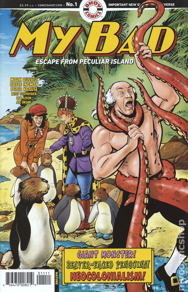
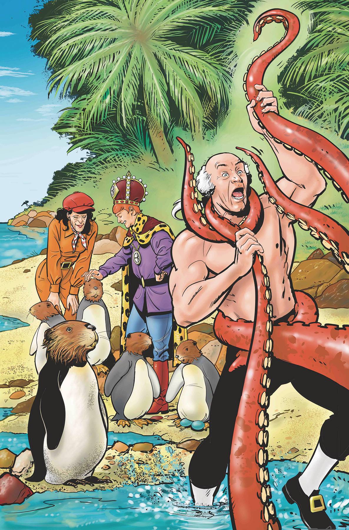
Lastly, we enter the main story-line as we see Rush Hour, Emperor King, John “Amazing” Adams, another guy, and a monkey land on a tropical island. I could go on about this plot-line, but honestly, it didn’t really catch my attention. John Adams is making a speech, King Emperor is doing some shady stuff, and then John Adams gets attacked by a Loch Ness-looking monster and a guy named Professor Octopus. The overall story is rather boring, and while it is clearly a parody of superhero comics and even Archie Comics, none of the jokes made me laugh. I think the only time I did giggle was during the throwaway gags like the visual gag of the Best Western or the back bonus page of “In Memoriam” of deceased punny heroes. It’s a comedy and an action comic, but it doesn’t have much of either, and for a first issue, it fell really flat for me. That being said, the art is great! I really like the style. It combines Archie Comics with Marvel heroes and then throws in a layer of parody that works really well for this sort of book. I just wish the jokes were stronger and the punchlines hit harder.
I am a fan of literally all the character designs, my favorites being Professor Octopus and the Chandelier, with special mentions to the cute monkey in the second half of the book and the beaver penguins. The coloring is great too, very vibrant but not distracting. Also, the spot blacks work really well to emphasize how some characters don’t understand how un-serious their world really is. I liked that. The lettering works well, and we get a nice blend of word balloons, narration boxes, and sound effects, which is always great to see. I also liked the in-world text on the billboards and the background gags.
There is a lot to like about this comic, but most of it comes in the form of visual comedy and art. The writing is not hitting as strongly as it could, and while the premises are very interesting, there is still a lot to be done to make them really hit you and make you laugh. It wasn’t my cup of tea, but it also wasn’t awful. I think there is room to improve with this one, and perhaps further down the line, once the writers hone in on their characters, they will be able to turn up the comedy and really make us laugh. If you’re a fan of Archie Comics, I think you should pick this up. The vibes are very similar, but with “funny” superheroes being the main focus of the story.
Writing: 3 Stars
Art: 5 Stars
Colors: 5 Stars
Overall: 3.5 Stars
Created by: Mark Russel,Bryce Ingman & Peter Krause
Illustrated by: Peter Krause & Joe Orsak
Coloring by: Kelly Fitzpatrick
Lettering by: Rob Steen
Cover art by: Peter Krause
Variant Covers by: Shannon Wheeler
Published by: Ahoy Comics
Author Profile
Latest entries
 ColumnsMay 6, 2025Primordios: Enchanting Creations and Heartfelt Moments at Puerto Rico Comic Con 2025
 Comic BooksApril 17, 2025REVIEW: Sister Imperator #1
 Comic BooksFebruary 25, 2025REVIEW: Cruel Kingdom #2
 Comic BooksFebruary 24, 2025REVIEW: Godzilla Heist #1