REVIEW: Night of the Slashers #1
 If you love a good slasher story mixed with mystery and eerie small-town vibes, this comic might be right up your alley. Right from the first page, it throws you into the action with a brutal kill, setting the tone for what’s to come. The art style took a little time to grow on me, but the strong storytelling, intriguing character designs, and clever use of color shifts kept me hooked.
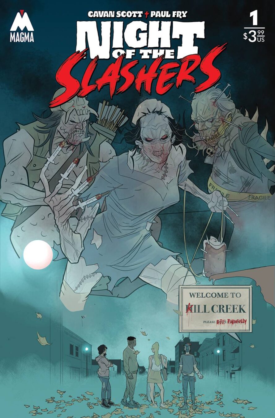
The cover art does a great job of pulling you in. The monochromatic blue palette is simple but super effective, giving the whole thing a cold, moody atmosphere. The title design is a standout—those wobbly block letters feel like a callback to classic slasher flicks like Day of the Dead and old-school George Romero films. Meanwhile, the stylized “slashers” text, with its brush-like strokes, mimics the slash of a blade, which is just a really cool touch. It perfectly captures the essence of the genre before you even open the book.
The credit page is pretty straightforward. The creators’ names are placed in a small, centered box, which works well enough. That bold red background, though? A bit much. It kind of clashes with the rest of the aesthetic, but overall, it gets the job done. One thing I really appreciate is that they included the cover artist credits right there. A lot of comics don’t do this, and it turns into a pain when you’re trying to figure out who did what, especially with variant covers.
This story wastes no time—there’s a kill on page one, which immediately sets up the stakes. The pacing is solid, building tension with each scene, and there’s this underlying uneasiness in the town that keeps you on edge. It reminds me a bit of Hot Fuzz, where everything seems just a little too off, like the whole town is hiding something. When the characters hear a scream, the entire mood shifts, and I love how the color palette follows suit. The transition into monochrome, along with the heavy use of spotted blacks, makes for some really striking visuals. Plus, the use of full-page illustrations and two-page spreads throughout the book adds a nice cinematic feel to the storytelling.
The art itself took a bit for me to warm up to. There are some great moments, like the full-page illustration of the girl’s death, and I really dig the bold outlines and heavy shadows. But at times, the line work feels a little too messy for my taste. It’s not necessarily a bad thing—it just wasn’t immediately appealing to me. That said, I do love the monster designs. They’re creepy in all the right ways, and when the horror really kicks in, the artwork shines. The setting plays a major role, too. The town itself feels eerie and suffocating, like it’s watching the characters, and that’s a big part of what makes the story work so well.
The lettering is another strong point. The word balloons are well-placed, keeping the dialogue easy to follow without overwhelming the artwork. There aren’t a ton of sound effects, but when they do appear, they hit the right balance. One of the best lettering moments happens early on, during that first kill scene—there’s something about the typography that adds to the impact. The font choice throughout fits the horror vibe without feeling gimmicky, which is always a plus.
Overall, I really enjoyed this comic. The art style didn’t grab me at first, but the story pulled me in, and by the end, I was fully on board. The pacing is great, the horror elements are well-executed, and the way the town’s eerie atmosphere builds up is seriously well done. If you’re into slasher horror, conspiracy-driven mysteries, or supernatural thrillers, this one’s definitely worth checking out.
This comic is for fans of unsettling horror stories where things feel just slightly off until everything suddenly spirals into chaos. If you like slow-burn tension that explodes into full-blown terror, this will be right up your alley. While it’s not perfect, the combination of strong storytelling, creative panel layouts, and moody visuals makes it a solid read. Definitely worth picking up if you’re in the mood for something dark, eerie, and packed with slasher-style thrills.
Writing: 4 Stars
Art: 3 Stars
Colors: 5 Stars
Overall: 3.5 Stars
Author Profile
Latest entries
 ColumnsMay 6, 2025Primordios: Enchanting Creations and Heartfelt Moments at Puerto Rico Comic Con 2025
 Comic BooksApril 17, 2025REVIEW: Sister Imperator #1
 Comic BooksFebruary 25, 2025REVIEW: Cruel Kingdom #2
 Comic BooksFebruary 24, 2025REVIEW: Godzilla Heist #1
