REVIEW: QUEST #5
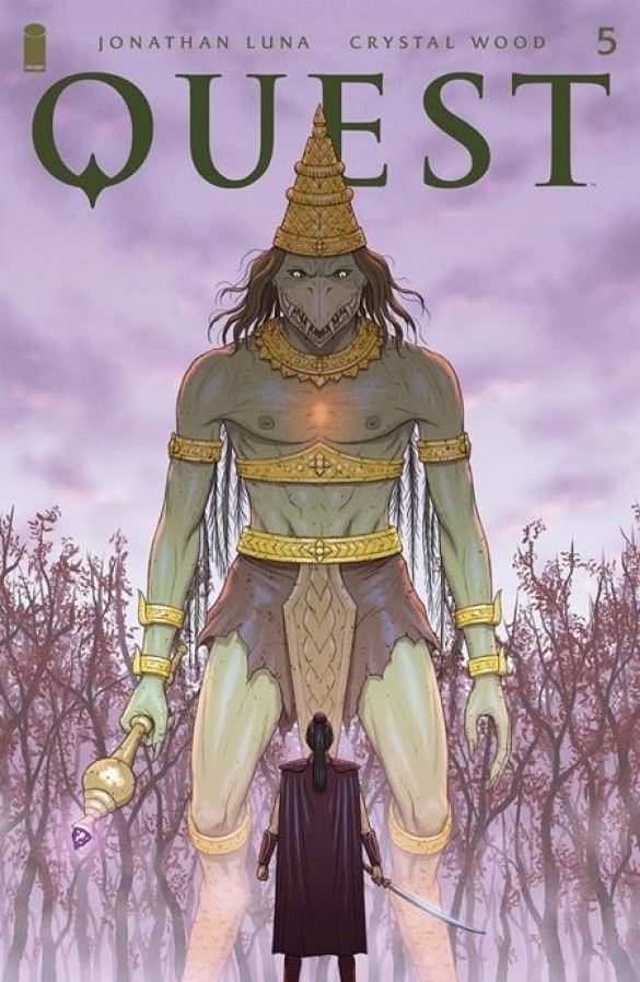 A great evil has taken Devyan; once the moon reaches its brightest phase, all his magic will be taken from him. Amidst the chaos, blood, and torn limbs the princess must defeat a giant beaked demon to find her beloved again. Written by Crystal Wood and Jonathan Luna, this story of love, magic, and action will without a doubt captivate your senses. Illustrated, colored, and lettered by Jonathan Luna this is a feat of magnificent proportions. It is an interesting read and one that I look forward to delving deeper into.
This issue has the Princess battling a demon named Kiat in hopes of getting information as to where her husband has been taken. Blood is shed on the battlefield as iron swords meet magic staffs but the battle is won, however not without a great cost to the Princess and her comrades. In between blows and magical spells, we get a look behind the scenes at what it took for Kiat the demon to become the monster that they are as well as a deeper look into the mechanics of the “demon organs”. Demon Organs are orbs of evil energy that impregnate human bodies to give them what they want the most, through any means necessary, slowly morphing them into full-fletched demonic beings capable of fantastical feats of darkness. Whilst I was not the biggest fan of the posing in this story, I loved the writing, the character designs, the pacing, and the coloring; even the lettering is done very well considering it is all done by one person and not the usual team of artists we are accustomed to with “Big 3” published comics.
The story has a fantastical nature to it, relying heavily on drama and action, especially during this issue. It is not particularly comedic however there is a character that makes me chuckle. I believe he is a Viking and doesn’t speak the language as well as the other characters, which makes for very funny quips of dialogue during action-packed and dramatic sequences such as “Keep slimy hands off!” and “I not leave side.” It is a nice change of pace because many of the other characters tend to speak in a more royal tone or the case of the demons and the spell-caster in a more poetic sort of mystical manner. Having this brutish character fumble his way through the English language whilst still having the best of intentions to be of service and help his teammates is very endearing. Even though the panel layouts are not particularly creative, with only 2 full-page illustrations in the whole story, the classic use of the horizontal and square panels makes you feel like you’re watching a movie instead of reading a comic which is a great touch.
The art is very interesting in this comic. It is good in many aspects such as the coloring, the background designs, the overall character designs, and the compositions, however, one place where I feel it falls a little flat is in the poses. Whilst the anatomy is on point the way the characters move seems very robotic, which reduces the impact of many of the pivotal moments of the story. The are several examples of this happening in the issue, but the biggest offender for me has to be the moment where the barbarian woman character destroys the staff of the demon. While the set-up has a strong pose with her holding her weapon high above her shoulders, the key moment has a very weird pose that has her looking like she’s about to do a put in golf, or worse, she’s ready to go to the bathroom. It’s not the best pose for such a key moment in the story and instead of delivering an impactful gasp, it gives more of an awkward chuckle. This issue would most definitely be solved with training in dynamic pose drawing and gesture drawing studies. Other than that though, there are a lot of good things in this story that make the experience worthwhile. I think the best-drawn character in this issue is the demon, he is full of life and he looks, feels, and acts in very evil ways. Even when he dies it carries a huge amount of impact, and his death is so gruesome it’s awesome. One of the best moments in the story by far.
I was quite surprised by the lettering in this story. Usually, when an artist takes on the bulk of the work the first thing to fall off tends to be the lettering, however, in this story, it is quite the opposite. There is a great variety of word balloons, we get some wonderful sound fx and the font choices are quite stellar. I am a huge fan of the choices made for the demon character, from his big grungy letter font to his red and black word balloons, every time this guy speaks he feels evil and terrifying. I am also a sucker for sound fx text design, and whilst there is not a big complicated sound fx that blurs the lines between character art and environment like in some other comics, the vast amount of sound fx in this issue more than makes up for it. There is at least one sound fx on every page, and I love every bit of it. It makes for a much more lively battle and it does a great job of having you feel and hear every swing and every blow of a sword, axe, or mace. Great lettering honestly.
Did I like this comic? Yes. Is it perfect? No, but then again usually nothing is perfect in this world. This was a very fun read and despite its flaws, there is still a great story to be read here. The pacing felt wonderful and it had me hooked right from the start. It also did a great job of showing you that there is a deeper world of lore at work here without having to spoon-feed it to you. I think this issue set a great expectation for what the world of Quest has to offer and I look forward to reading more. In conclusion, this was a fun read, the art is quite good, but it has a few flaws in terms of the poses, mostly around key action poses that could be heightened for better results. The story is really interesting and I feel some Egyptian elements in the demon character designs that make them feel more like ancient gods of evil rather than demons which only serves to make them an even bigger threat to the heroes. If you’re into fantasy this will be right up your alley.
Writing: 5 Stars Art: 4 Stars Colors: 5 Stars
Overall: 4 Stars
Written by: Crystal Wood Illustrated and Lettered by: Jonathan Luna Cover art by: Jonathan Luna
Published by: Image Comics
Author Profile
Latest entries
 ColumnsMay 6, 2025Primordios: Enchanting Creations and Heartfelt Moments at Puerto Rico Comic Con 2025
 Comic BooksApril 17, 2025REVIEW: Sister Imperator #1
 Comic BooksFebruary 25, 2025REVIEW: Cruel Kingdom #2
 Comic BooksFebruary 24, 2025REVIEW: Godzilla Heist #1
