REVIEW: Rick and Morty: Kingdom Balls #1
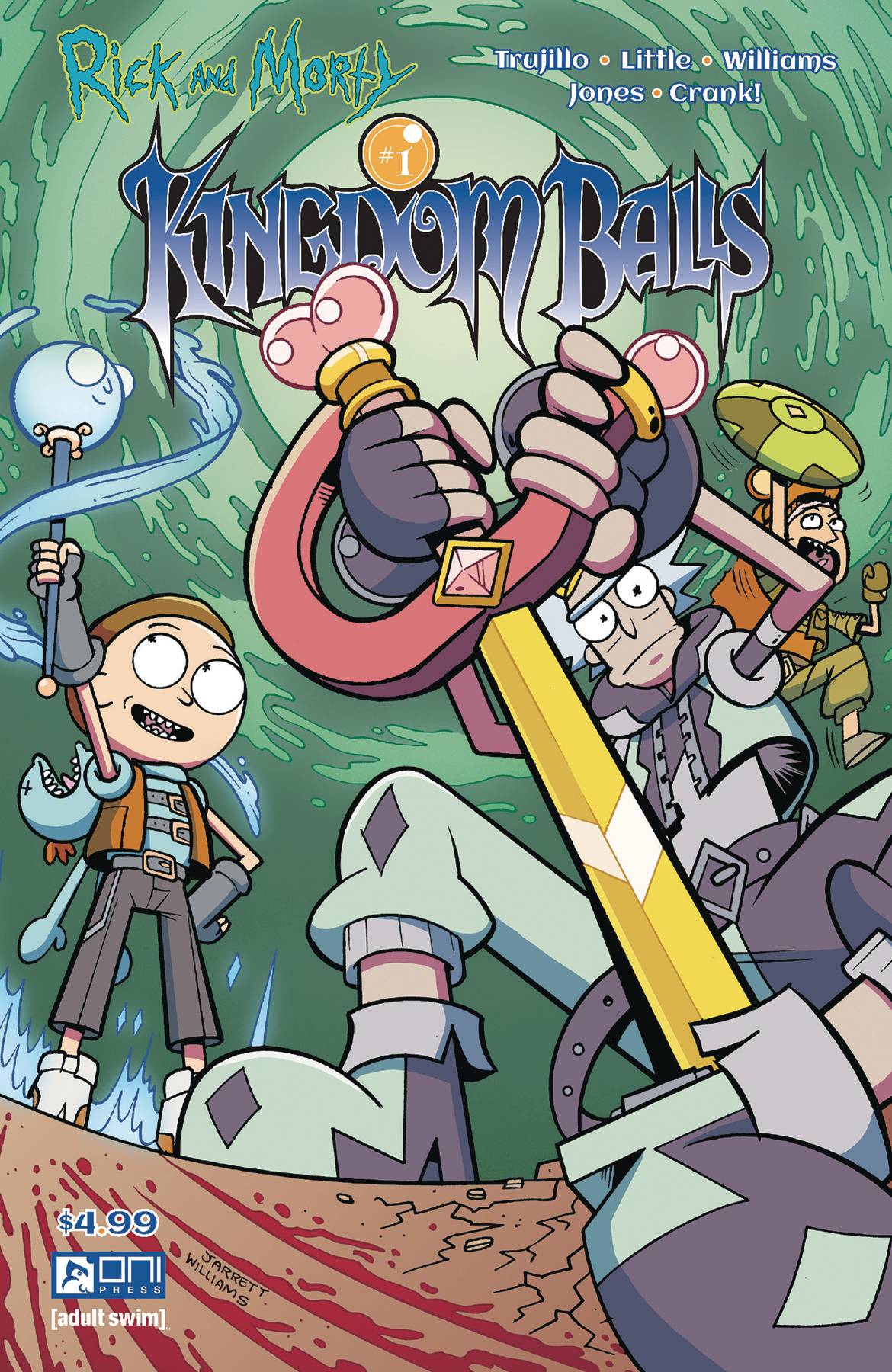 Set in the crazy polycosm of the Rick and Morty universe, OniPress brings us a match-up that we never thought was possible. Rick and Morty meet Kingdom Hearts in the new series of comics; Rick and Morty: Kingdom Balls. With very funny writing, amazing character designs, and beautiful environments to go along with a story that makes use of tried and true storytelling motifs. This is a series to look out for.
Morty being bored in his house decides to go through his grandpa’s vintage porno collection for a little man-on-man action but instead finds an enigmatic weapon that when wielded transports the user into a world not unlike the hit series of the video game world; Kingdom Heart. Overworld map and everything; Rick, Morty, and Jerry must battle their way through storytelling concepts of conflict to rescue Rick’s balls and hopefully return home.
Whilst the writing isn’t as funny or cynical as the show, the writers still did a great job at delivering witty punchlines that revolve mostly around the theme of dick jokes and dick-related comedy. Despite the monothematic nature of such jokes, the overall narrative of the story still feels deep with very interesting use of the conflicts in storytelling motif, literally pinning Man Vs Man in the first issue, and stripping Rick of his “manhood” in the process. The jokes are actually quite funny and are heightened by the character’s familiar voices. Rick is still a drunk, slurring, SOB in the comic just as much as he is in the TV show. Even though it can be hard to distance the two mediums there is a clear delineation between comic and TV shows; for starters, the writing feels a bit more tame in the comics while the art style itself is heightened exponentially. This can best be seen in many of the character designs that take a ton of inspiration from Kingdom Hearts, whereas the show’s character designs feel a bit more insulated from the world of Rick and Morty. My biggest issue with the comic comes in the form of panel layouts. At some cases, the story feels like it jumps a pivotal panel or two that should have been there to help guide the reader along in a smoother path. For example, when Jerry is knocked out and we are introduced to the idea that this world behaves in a similar fashion to a videogame and that Jerry is not actually dead but needs to be healed. While we see Rick come to his aid, there is no panel showing him clearly being healed fully and recovering, and yet on the next page, Jerry is back in action like nothing ever even happened. This confused me and I had to go back and see if I had missed a panel or a sound effect that showed that Jerry was back in business. This moment cheapened the overall conflict of the story and showed me that characters could die one second and be alive the next and there would be no explanation or repercussions to their dying.
Despite this fault in the writing, I was enamored with the character designs in this story. The art style is very nice, and even when it holds very close to the art style of the show we still get a heightened sense of wackiness in many of the designs. My two favorite character designs have to be Wizard Morty with his hollowed-out Mr. Meezek head cloak and “ball-less” Rick. Both designs were intense nods at Kingdom Hearts with Morty’s costume resembling Donald’s attire in the game, and “ball-less” Rick resembling a nobody and a heartless; very important enemy in the Japanese action-adventure game franchise. The environments also took heavy inspiration from the game with many of the worlds looking like Rick and Morty versions of the game’s levels. This was very cool, as a player of the game back in the early 2000’s this nice dose of nostalgia had me hooked right from the cover art.
Much like the lettering though, the coloring was rather standard. We had a few really cool moments with lights and shadows as well as some nice sound fxs here and there but for the most part, neither aspect of the story did much for me to write about. They worked, but they neither hindered the story nor heightened it; they simply were there. Truth be told though, I’d much rather have bland lettering and coloring than bad lettering and coloring so in that regard I can’t complain.
Opinion (Did you like it? Yes, No, explain why) All in all, this was a very fun read, and from the moment that it landed on my to-read list, I was excited to give it a look through. I am looking forward to seeing how the story develops and what other cool character designs are thrown in the mix for us to gawk over. If you’re a Rick and Morty fan or a child of the 90’s – 2000’s you gotta pick this baby up. It’s a fun read, it’s short, it’s funny and it has some beautiful illustrations.
Writing: 4 Stars Art: 5 Stars Colors: 4 Stars
Overall: 4 Stars
Written by: Josh Trujillo & Ryan Little
Illustrated by: Jarret Williams
Coloring by: Hank Jones
Lettering by: Crank!
Cover art by: Jarett Williams & Hank Jones
Variant Covers by: Gina Allnatt & Lane Lloyd
Published by: Oni Press
Author Profile
Latest entries
 ColumnsMay 6, 2025Primordios: Enchanting Creations and Heartfelt Moments at Puerto Rico Comic Con 2025
 Comic BooksApril 17, 2025REVIEW: Sister Imperator #1
 Comic BooksFebruary 25, 2025REVIEW: Cruel Kingdom #2
 Comic BooksFebruary 24, 2025REVIEW: Godzilla Heist #1
