REVIEW: Rick and Morty New Year, New Rick Special #1
The new Rick and Morty comic hits the ground running with some eye-catching cover art, but it quickly gets lost in its own weirdness, leaving you unsure whether it’s a wild ride or just trying a little too hard to be quirky. Let’s break it down.
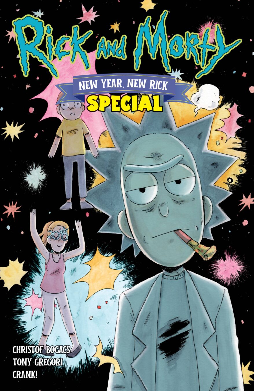
Right off the bat, the cover art grabs your attention. It’s clear we’re in the Rick and Morty universe, but there’s something fresh about it. The designs have this fun, almost anime-inspired vibe—Rick, for example, has a bit of that anime flair, which gives him a slightly different edge. The rest of the characters are similarly reimagined in a way that feels both familiar and new. Morty and Candace are redesigned too, looking a little more adorable and chubby than usual, which is a fun change of pace from the usual designs. There’s something undeniably cool about these alternate takes, even if they’re not what you expect. That said, not all the covers are equally strong. The second cover, with its watercolor vibe, offers a softer, cuter take on the characters, but the third—featuring Rick zooming out of a portal on a rocket—is a bit more generic, even if it captures that New Year’s vibe pretty well.
As for the credit page, it’s standard fare—functional but nothing to write home about. The first page of the comic opens with Rick having an existential crisis after ingesting some strange chemical, and while it’s an intriguing start, things get a little muddled on the second page. The perspective is off, and the word balloons feel all over the place—making it tough to figure out where to read first. I also have to admit, the art style just doesn’t totally work for me. It’s got bold lines and that cell-shaded look, but something about it feels a bit off. It’s hard to pin down—like it’s trying to blend the zany energy of the show with a style that doesn’t quite capture the same chaotic magic.
Candace, in particular, feels like a bit of a different character in this comic. She comes off a lot harsher than she does in the show, almost more aggressive than necessary. Maybe I missed a few seasons or something, but it doesn’t feel quite right. That said, the character designs themselves are still pretty cool—there’s a lot of fun, weird creatures, like the bun bun people and the pancakes, which add to the overall quirkiness of the comic. The environments are similarly well-designed, with nice, detailed backgrounds that give a little extra flair to the scenes, though they can sometimes feel like they’re trying a bit too hard to be visually impressive.
The coloring, on the other hand, is solid. It’s simple, but effective—using cell shading with just enough detail to keep things from feeling too flat. There’s something comforting about the simplicity of it, even if it doesn’t blow you away. That said, the dialogue and tone of the comic left me feeling a bit off. The humor leans heavily into today’s cultural climate, and while that’s not necessarily a bad thing, it often feels forced. It’s like the comic is trying a little too hard to be “in tune” with modern sensibilities, and it can get a little awkward. I’m reminded of those Always Sunny in Philadelphia episodes that feel like they’re trying to comment on everything, but it ends up feeling more cringey than funny. The narration boxes, which proudly call the comic “twisted, irreverent humor,” don’t help either—it just adds to the sense that the comic is trying to hard to be edgy and self-aware.
Some of the moments in the comic land better than others, though. I do appreciate the weirdness of the werewolf sequence in Morty’s New Year’s resolution. It’s a nice visual break and definitely stands out in a positive way. But for every cool moment, there’s another that feels like a forced joke or a bit of randomness that doesn’t serve much purpose other than to be weird for the sake of being weird. A prime example is the joke about cars being so polite that they all stop at a red light at once—it’s funny, sure, but it doesn’t really make sense in the context of the world. If these cars are that self-aware, why even have traffic lights?
Still, one thing the comic does get right is the emotional twist. Rick, in a rare moment of vulnerability, is shown to be nicer because he doesn’t want his grandkids to end up sad and alone. That bit, while unexpected, adds a layer of heart to the story and is a nice change of pace from the usual chaotic energy. It’s just a shame that by the time the emotional moment hits, the comic has already been so scattered that it doesn’t feel as impactful as it could have.
In the end, this Rick and Morty comic feels like it’s trying a bit too hard to crank up the weirdness and humor, but it ends up losing some of the charm that makes the show so great. The art style is hit or miss for me—there are cool elements, but it doesn’t capture the chaotic brilliance of the show as effectively as it could. The humor is all over the place, and the tone feels uneven, with some moments landing well and others falling flat. If you’re a hardcore Rick and Morty fan who loves the show’s chaotic energy and are okay with some of the more awkward attempts at commentary, you might find some enjoyment here. But if you’re hoping for a more cohesive, classic Rick and Morty experience, this might leave you scratching your head.
Writing: 1 Stars
Art: 5 Stars
Colors: 5 Stars
Overall: 2.5 Stars
Author Profile
Latest entries

 ColumnsMay 6, 2025Primordios: Enchanting Creations and Heartfelt Moments at Puerto Rico Comic Con 2025
 Comic BooksApril 17, 2025REVIEW: Sister Imperator #1
 Comic BooksFebruary 25, 2025REVIEW: Cruel Kingdom #2
 Comic BooksFebruary 24, 2025REVIEW: Godzilla Heist #1