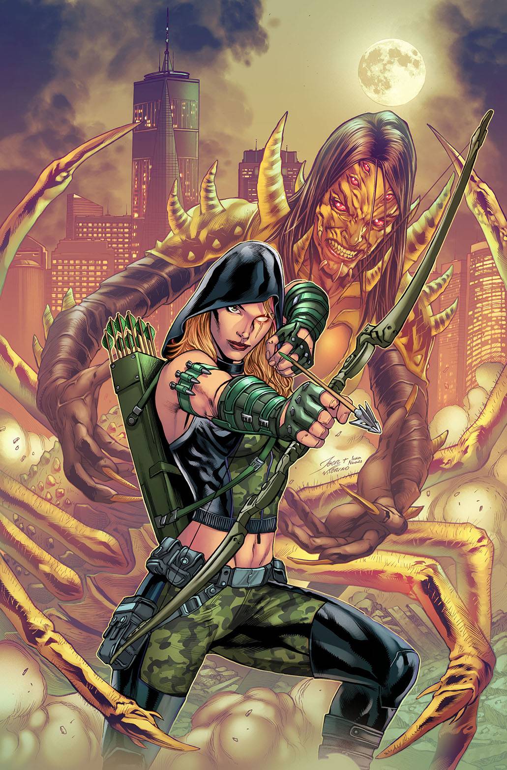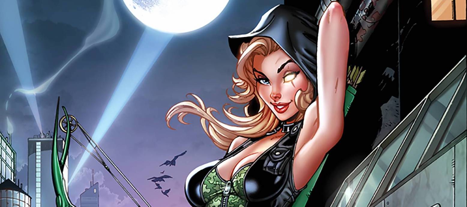
Despite the massive impacts that spiders have had on comic-dom, the eight legged buggers have a pretty bad rap, a rap that isn’t going to get any better with this new one-shot featuring everyone’s favourite Zenescope vigilante archer, Robyn Hood.
After her most recent adventures, Robyn is looking for a nice easy job. Up steps Peyton with a request of Robyn, investigate the mysterious disappearance of a host of people. Oh, that and super creepy spider graffiti! Of course with the title of the book, you are going to get spiders, very graphic spiders!
Zenescope veteran Joe Brusha delivers a one-shot that actually delivers a one-shot premise, at least for the most part. Brusha’s script assumes that you are up to date with Robyn, with little nods to her continuity, though this is deftly handled. With an extended cast, we get to see Robyn’s interactions before the action scenes that are well planned apart from a couple of panels where the laws of movement and momentum seemed to have been repealed. Brusha uses a mix of dialogue and monologue which keeps the reader entertained and on their toes.
The art by Babisu Kourtis is a mixed bag to be honest. There are some really strong action pieces and some good facial panels. However, along with that, there are some bland almost wooden panels within the first pages, specifically the meeting between Robyn and Peyton. With that said, the spiders are well drawn in the grotesque, which is all fun and games for a spider hater. Colors are provided by Juan Manuel Rodriguez with a depth and polished look that you would come to expect from the high production values of Zenescope. Taylor Esposito of Ghost Glyph Studios, the letterer extraordinaire get to have fun with some monster font!
I know that I am quite harsh when it comes to Zenescope books; mainly the inconsistencies of the female form. Yet when it comes to Robyn, the usual visual trope takes a break for something that look more utilitarian which fits the character well.
Writing- 3.5 Stars
Art – 3.5 Stars
Colors – 3.5 Stars
Overall – 3.5 Stars
Written by; Joe Brusha
Art by; Babisu Kourtis
Colors by; Juan Manuel Rodriguez
Letters by; Taylor Esposito of Ghost Glyph Studios
Published by; Zenescope Entertainment Inc.
Author Profile
-
I am a long time comic book fan, being first introduced to Batman in the mid to late 70's. This led to a appreciation of classic artists like Neal Adams and Jim Aparo. Moving through the decades that followed, I have a working knowledge of a huge raft of characters with a fondness for old school characters like JSA and The Shadow
Currently reading a slew of Bat Books, enjoying a mini Marvel revival, and the host of The Definative Crusade and Outside the Panels whilst also appearing on No-Prize Podcast on the Undercover Capes Podcast Network
Latest entries

