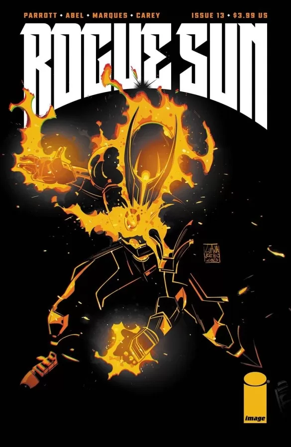
REVIEW: Rogue Sun #13
 Interesting book. I don’t know what to say about this one. It hits all the marks of a good comic book. The story is pretty solid, the art is very good and so is the lettering. Character designs are good and the art style is pretty awesome. Background work is equally good too. In all regards, this is a great book. I’m just a bit out of sorts with the story. This being issue 13 puts us pretty far along in the timeline, so it’s a bit hard to follow what’s going on. I don’t really know the characters and they don’t do much work giving you hints at who is who and what their motivations are. The enemy of this issue whilst looking really awesome only wants to feed, but who is she and where does she come from? Why is she feeding a bad thing? I’m honestly not sure, and that sucks because the hero Rogue Sun defeats her rather quickly.
Sometimes it’s so hard to get in on books that are going strong, starting late can be incredibly frustrating because you just don’t know what’s happening and who’s who. Some writers are able to give you a sense of the world with just a few pieces of information that whilst telling you about the overall environment the characters are in, you’re not being bombarded by a ton of exposition that will bore the usual reader who already knows it. Striking that balance between rehashing the story up to that point for new readers and adding new things for usual readers can be very hard, and it’s not really any fault of the writers or the people involved. It’s more so a fault of the medium of comics itself with its issue-based release schedules. That all being said I will talk about the things I did enjoy.
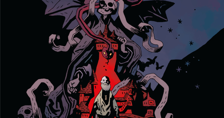
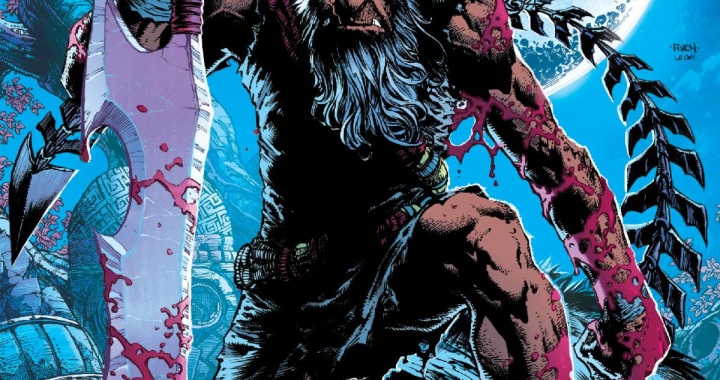
The cover is cool and the credits page is equally nice. I love how it’s mostly black but the little bit of texture and color makes it really fun to look at. The lettering fits very well with this story and is expertly done, even the sound fxs ballons are handled well and you know how I’m a sucker for good sound fx design in comics. This issue is divided into 4 parts. The first part sets up the villain of the issue, whilst the second part gives us a tiny bit of a glimpse at what has been going on with the story so far. It seems like someone died and I’m not sure who it is that died. I wish there was perhaps a bit of a flashback or maybe a character going into a bit more detail about who died and how they died, that would have been great. You know to perhaps set us up to feel some grief and connect with the characters a bit more. In any case, it seems like whoever died was important to the main character, however, our main character’s body is being possessed I guess by maybe a previous incarnation of the Rogue Sun? I really don’t know who the Rogue Sun is either, I’m not sure if they’re a spirit or a superhero or what’s up with them at all.
It pains me when this sort of stuff happens because by reading this comic I can tell that they’ve been building their world for a while and there’s some really cool stuff happening but this particular issue relies heavily on you already knowing the story and barely has any information on what happened in the previous issues so it mostly feels like a cool story that you can’t follow at all, but I digress. The third part of the story is about a Rogue Gallery (get it Rogue Sun, Rogue Gallery ;)) of villains meeting up for therapy and rehabilitation in what seems to be an alternate dimension, and whilst this section of the book only lasts 2 pages I think it’s probably the most interesting part of the whole book because it’s easy to understand. You don’t really know who the villains are, but they are given names one by one and shown a bit of their personality very quickly and you get an overall sense of some really awesome characters that either Rogue Sun will fight or has fought in the past. It also uses some very creative panel layouts that make you feel like you’re in a different dimension entirely and I love it when panel design compliments storytelling so harmoniously. Also, the villains look really awesome, they are all very unique and very interesting, and just from one or two-word balloons you get a sense of who they are and they are all very different even in personality. After such a great duo of pages we jump back into the whole “someone died” storyline and that gets kind of boring because not only do we not know who the kid that died is, but we barely know any of these characters at all. There’s a cool yoda easter egg statue though, so that’s fun. We also get two versions of the main character, and that gets confusing quickly. There’s just not enough of a difference between the version that can’t be seen and the main cast of characters so it often feels like there are 3 characters on the panel and two of the characters are just being rude to the third guy by completely ignoring that he’s there. Lastly, we jump to the “superhero” or “spirit warrior” part of the book where we revisit the main villain of the story and again we see that third kid that everyone is ignoring and we learn that his body has been hijacked by some dude. They do a couple of cool fire tricks, battle this horned red-headed demon girl and kill her by feeding her a knuckle sandwich from the dude inside the kid’s body.
It would have been a 10/10 fight scene had I any idea of who these characters are at all. The sfxs are on point and so is all the other art, and the coloring is fantastic, but not knowing anything about these characters makes it seem meaningless, and that brings the overall experience down. I’m not a fan of having to deduct score points from the writing because I understand that this is a problem of breaking up a story into issues but you have to take this kind of stuff into account when you’re writing comics otherwise you should be waiting till the whole thing is done and instead release it as a trade paperback.
I want to suggest this story for you because it is very good in many places, but if I have to suggest anything to you is that you pick up issue 1 first and work your way up till you reach this issue so that you’re not as lost as I am and can truly and fully enjoy this comic the way the creators intended.
Writing: 3.5 Stars
Art: 5 Stars
Colors: 5 Stars
Overall: 4 Stars
Writing by; Ryan Parrott
Art by; Abel Marco Renna
Coloring by; Natália Marques
Lettering by; Becca Carey
Cover art by; Luana Vecchio
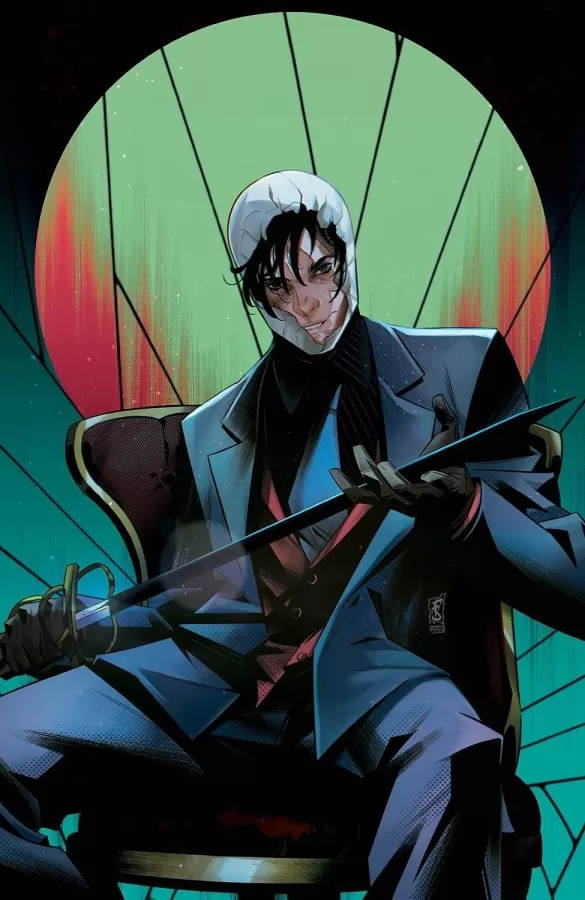
Variant Covers by; Federico Sabbatini & Mafuriah
Published by; Image Comics
Author Profile
Latest entries
 ColumnsMay 6, 2025Primordios: Enchanting Creations and Heartfelt Moments at Puerto Rico Comic Con 2025
 Comic BooksApril 17, 2025REVIEW: Sister Imperator #1
 Comic BooksFebruary 25, 2025REVIEW: Cruel Kingdom #2
 Comic BooksFebruary 24, 2025REVIEW: Godzilla Heist #1
