REVIEW: Rook Exodus #2
 Rook Exodus takes readers to an alien planet where masked soldiers struggle to survive, battling both the harsh environment and each other. The comic introduces intriguing concepts, such as masks that allow users to control animals but with a dangerous side effect: the longer they’re worn, the more beast-like the wearer becomes. The story combines elements of a Mad Max-style world with lush alien flora and fauna, offering some fascinating visuals despite a less memorable narrative. With stunning art, particularly in its depiction of mutant animals, the comic delivers on aesthetics even if the characters mostly react to, rather than participate in, the action.
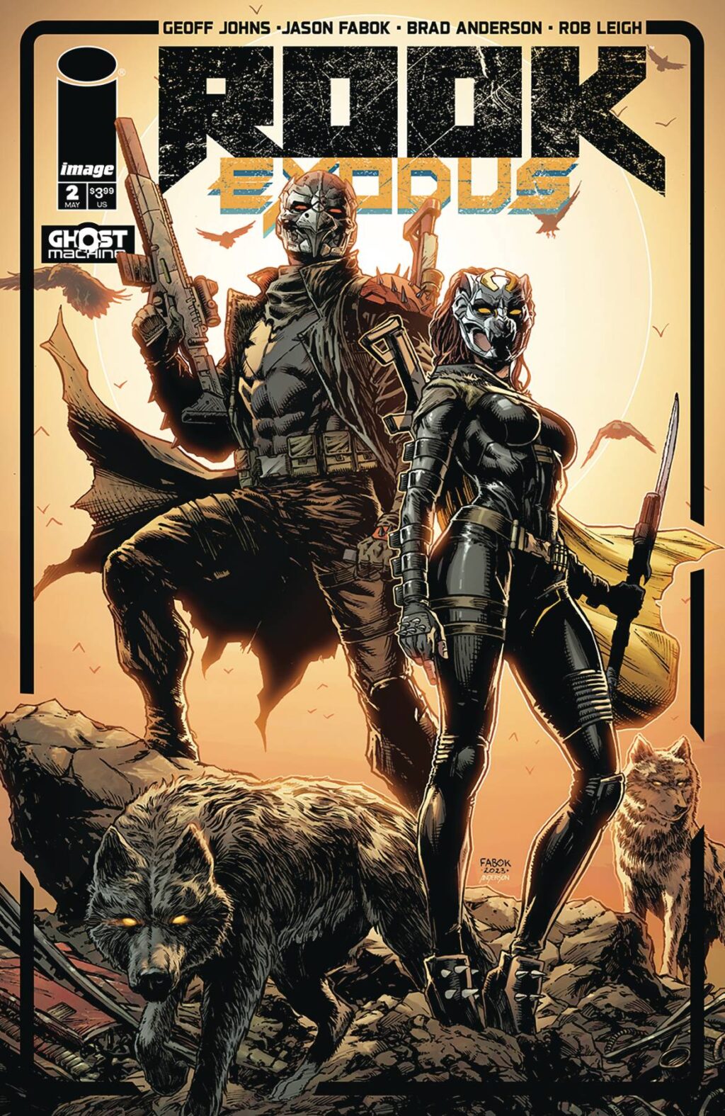
Whilst the cover art is not great in terms of composition, mostly because like the inside of the comic it is more passive than I would’ve liked. I did like the box that is put around the art, it gives it almost like a trading card look. There are a few elements at are going over the top of the box, and whilst most of them look really cool there is one wolf that is put in a way that looks unnatural and just plain odd. Which is a shame because the wolfs are my favorite part of the cover, well that and the color scheme. I liked the heavy use of yellow and black. Whilst it feels like it has a lot of colors; because there are blues, reds, browns and oranges, since all of them are tinted with yellow it remains cohesive and makes for a very simple an eye-catching color scheme. This same color scheme is on the title text for the words “EXODUS” and makes for a very consistent look through the cover.
Just as nice is the credit page, with a great use of a character shot in black and yellow, and all the necessary information for the reader to get up to date with the comic. However, I am personally not a fan of introductory text, much less two introductions back to back; that feels like overkill. If you’re gonna have any just have the previously on, but in my opinion the catching up should come from the actual reading of the comic and not a preamble in the credit page. Premises should be simple enough to be understood from reading the story and any extra information should come at the end and should serve to build out the world with extra lore. If you’re having to explain what’s been going on for me to understand this issue then you should probably be in the graphic novel industry and not necessarily the comicbook industry.
The first few pages are really nice to look at, and there is a nice mix of full page illustrations and half page illustrations that really stand out. I loved the design of the mutant turle and the helmets/masks of the characters all look really cool. The art style works really well for this sort of story, it’s a mix between cartoony, grungy and realistic that gives Marvel heroes vibes mixed with Mad Max and perhaps Power Rangers (with the helmets/masks). Like I mentioned earlier, the action happens around the characters and not directly to them so that means very few action poses/shors but really cool animal action shots, explotions and car illustrations. Most of the characters are really just standing around, either shooting or talking, and that’s boring.
Whilst the characters designs are cool with their Mad Max meets high-end ninja soldiers looks, the animals are were things really shine. The wolves, the turtles, the bears even the birds look really cool. One thing I did really enjoy though was the character sheet at the end of the book for the character “Dire Wolf” It shows a (yes, again) standing full body shot of the character with a great portrait illustration faded in the back over a mustard background and it just looks really nice. I also liked that they kept the ads to the end, I think more comics should keep that in mind. It feels obvious but we all know that not everyone out there is putting their ads at the end (looking at you DC).
Lettering is pretty good with a great use of sound fxs, which is always good sign because it should that they took the time to consider how the world sounds and aren’t trying to just show you pictures but instead bring you into a world. That being said though, I have a bit of an issue with word balloons placement in a few pages.A lot of people tend to forget that in Western culture we read top to bottom, left to right, so they place balloons backwards and then when you change panels you end up reading the bottom one first because it’s closer to the left than the top one because it’s the last one you see when you change the panel. Gotta give this a bit of a consideration when putting your word balloons, turning the page and getting disorientated makes for an awkward reading experience.
All in all and alright comic, it was weird that the action was happening around the characters and not directly to them. Other than that I think it was alright, it wasn’t my cup of tea but I’d read another one if I got the chance. The art is really good and I liked the animal illustrations a lot.
You might like it, if anything this comic could make for a great reference book on animal illustrations so that’s a plus.
Writing: 3 Stars
Art: 4 Stars
Colors: 5 Stars
Overall: 3 Stars
Created by: Geoff Johns & Jason Fabok
Coloring by: Brad Anderson
Lettering by: Rob Leigh
Cover art by: Jason Fabok & Brad Anderson
Published by: Image Comics/Ghost Machine
Author Profile
Latest entries
 ColumnsMay 6, 2025Primordios: Enchanting Creations and Heartfelt Moments at Puerto Rico Comic Con 2025
 Comic BooksApril 17, 2025REVIEW: Sister Imperator #1
 Comic BooksFebruary 25, 2025REVIEW: Cruel Kingdom #2
 Comic BooksFebruary 24, 2025REVIEW: Godzilla Heist #1