REVIEW: Sanction #1 (of 5)
 In the freezing streets of Russia, a dead prostitute sets the stage for a chilling detective story in Sanction #1. While the pace may be slow, the stunning artwork and masterful use of color make this issue a visual treat, building suspense that promises a thrilling hunt for a psychopath in the icy depths of winter.
Whilst the first issue is a little slow, it is full of jokes and great transition moments as well as fantastic artwork. It is mostly a dramatic story revolving around dialogue for the most part, and yet the way the color script is handled we see the environment come to life, to the point of Mother Russia becoming a character in itself. The panel layouts are nicely done with a nice overall pacing both to the story and the reading experience. Think a morning tea, versus a cup of coffee. There is very little actual action but you can feel the anticipation building, and this issue does not disappoint with a wonderful 2 page cliffhanger that turns an otherwise standard detective story into a full-on psychopath hunt.
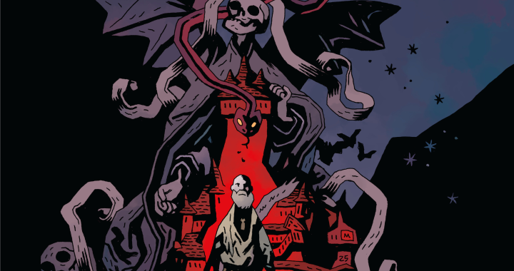
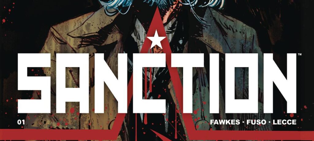
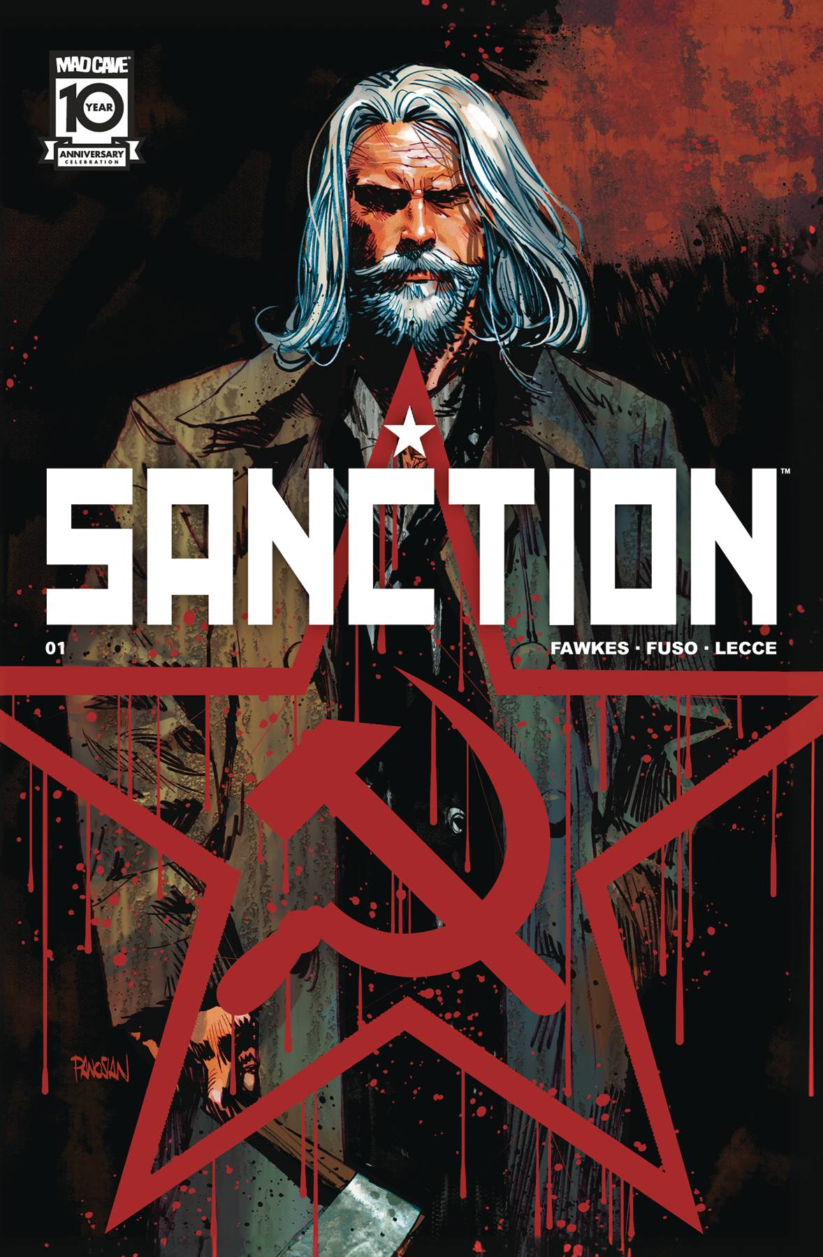
As soon as you grab this comic you can tell that you are in for a treat. The cover itself is very well done and even though it is a simple cover, with a symmetrical composition. The way the logo is done it makes for a very good Russian war poster. A lot of red and white, with some drips to symbolize the blood that has been spilled inside the pages. It works well, it is not outstanding but it does a good job at transmitting the overall mood of the story.
The credit page is fantastic though, here we see true Russian aesthetic at its finest. With a red, blue, and white palette we are treated to minimal text and maximum graphic design. We also get a first look at our hero detective as well as the silent chapter of the story, Mother Russian and her cold winter air. There is a (pardon the pun) air of abstraction that permeates the overall story, almost like the cold winter air is inciting people to be their worst selves, and sometimes the worst in people means mass murder…
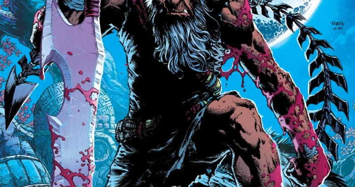
Like I mentioned earlier, the color script is fantastic on this comic. We mostly see blues and oranges throughout the story but they are used more like location markers and tonal identifiers than colors. Outside in the cold winter air of Russia, everything is colored with hues of blues, greys and snowy whites. Inside however in the heat of civilization we are treated to oranges, browns and subdued yellows that make for a warm environment when contrasted with the blueish cold panels. It works very well at transmitting the weather our characters are living in.
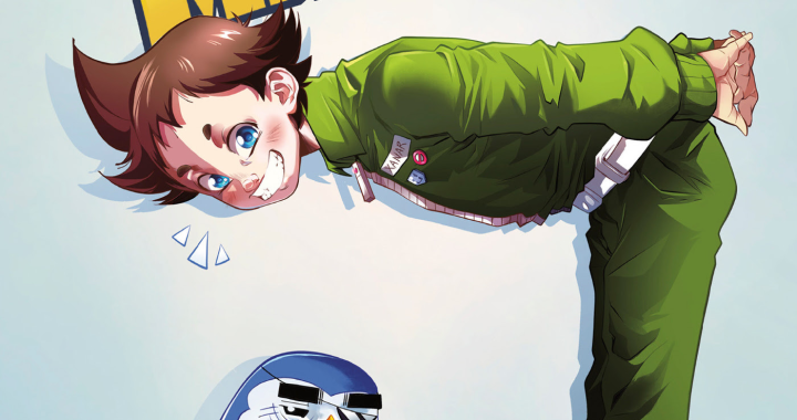
Overall it has a great art style, there is clear Russian inspiration to the comic. Not only in the actual story but also in the way things are drawn. Characters are drawn in a sort of cubist manner with a lot of angles, and not that many details, heavy shadows and barely any emotion in their faces; and yet you can tell exactly how they feel from the few strokes we do get in each face. Where the art really shines is the environments. Backgrounds are very well rendered, from inside shots to outside establishing shots, these illustrations look very realistic with establishing shots almost looking like photos at times.
I wasn’t a huge fan of the lettering job; while it does work, it has a few issues here and there that could have been solved with better font choice and a different style for location banners. There is also a bit of a problem with word balloon placements in a few panels that make you have to backtrack in order to really follow along but there is a nice mix of sound FX’s, special word balloons/text and captions. The sound FX are clearly handcrafted and they fit the art style very well, that is a huge win in my book.
Whilst the comic as a whole is a little boring, you can feel that it is building to what will be a huge payout in a few issues. This being the first issue is doing its best to establish who everyone is and what will unfold in future installments. I would however, read this for the art alone because it is very good and quite refreshing.
As a change of pace from your usual comics, this is a nice issue to pick up. You might not enjoy how slow it can be at times, but if the last two pages don’t intrigue you enjoy to pick up the next chapter then maybe this series isn’t for you. If they do though, then join the ride, because I’m excited to see who this mass murderer is and why he’s out here killing red dressed ladies in the middle of winter.
Writing: 3 Stars
Art: 5 Stars
Colors: 5 Stars
Overall: 4 Stars
Written by: Ray Fawkes
Based on an Idea by: Mark Irwin
Illustrated by: Antonio Fuso
Coloring by: Emilio Lecce
Lettering by: Dave Sharpe
Cover art by: Dan Panosian
Variant Covers by: Ray Fawkes, Antonio Fuso & Dani Strips
Published by: Mad Cave Studios
Author Profile
Latest entries
 ColumnsMay 6, 2025Primordios: Enchanting Creations and Heartfelt Moments at Puerto Rico Comic Con 2025
 Comic BooksApril 17, 2025REVIEW: Sister Imperator #1
 Comic BooksFebruary 25, 2025REVIEW: Cruel Kingdom #2
 Comic BooksFebruary 24, 2025REVIEW: Godzilla Heist #1