Review: Sirens Gate #1
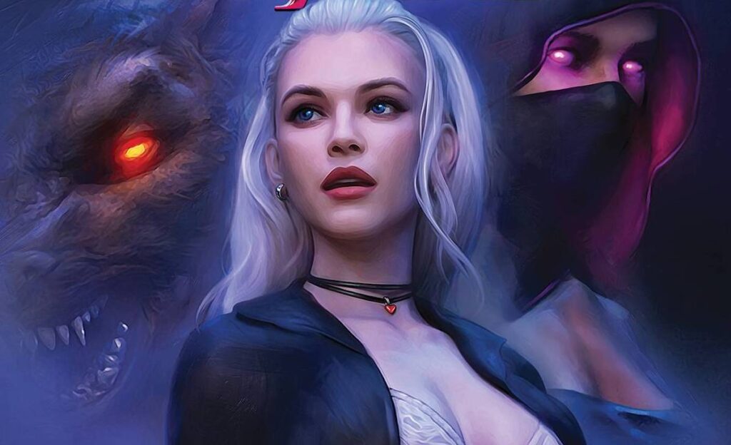
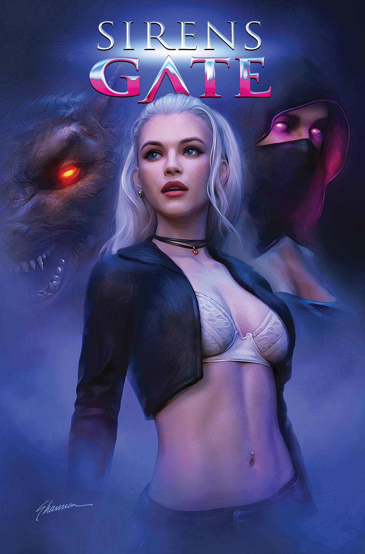 Comics Twitter has a lot to answer for! Case in point; a few images of a bra wearing silver haired girl, kind of like Buffy, was always going to get my attention. Now that the book is finally here, I have the “enjoyment’ of reading it; I do have to say that “reading it”, may be some kind of misnomer.
There are supernatural shenanigans going on along with a few oddities. It seems that not quite dead but fully recovered Tara is the only woman in a strip bar that pretty much fully dressed. What follows is an introduction of sorts that displays inconsistencies of intent along with the type of coincidental timing that makes me shake my head in bewilderment!
Shannon Maer is known as an extraordinary cover artist, and I am doubting his talent in that area. This book though, is the first featuring his interior art and writing. These first steps work to Maer’s strength but in doing so, also shows his weaknesses. Taking the writing first, the dialogue is awful, the pacing is choppy and in part, Tara is known as a writer, which is intimated her heroine is aware of, yet said heroine states that she herself had been told? Please make up your mind! Throw in the pseudo intimation of two girl kissing, surely we are past such titivation; if you want them kiss they can kiss, only serves today’s readers who are aware that same sex couples kiss and become even more intimate! Don’t even get me started on the timing of a werewolf and a rescue occurring with a panel of each other!
Maer’s art is of the 3D model, photo-manip style which has a charm to it, if you like that sort of thing. The figures are fully realised, giving some weight to the art, though it took some time for me to realise that the girlin the white hold-ups was Tara and that only due to a comment about cat ears! Another problem here is that for large parts of the book, Maer cannot stop drawing covers. One panel pages may look great but means that you do not get a lot of reading; with the poor dialogue on show, I am not sure if that is actually a bad thing. The colors are probably the best part of the book, carrying a depth of texture to them. Maer ‘s lettering is distracting with its angular boxes trying to carry a 3D effect. As least this letterer get a cover credit!
This is a true mishmash of a book. after showing this to my wife, Mrs H promptly stated “it looks like the letters are for a four year old and the art a twenty year old.” This then is a great analysis of this book; buy it if you like half dressed women and poster page art. If, on the other hand, you want a horror book with a Buffy vibe, you will need to look elsewhere.
Writing – 2 Stars
Art – 3 Stars
Colors – 5 Stars
Overall – 2.5 Stars
Written, art & letters by; Shannon Maer
Published by; Dynamite Entertainment
Author Profile
- I am a long time comic book fan, being first introduced to Batman in the mid to late 70's. This led to a appreciation of classic artists like Neal Adams and Jim Aparo. Moving through the decades that followed, I have a working knowledge of a huge raft of characters with a fondness for old school characters like JSA and The Shadow
Currently reading a slew of Bat Books, enjoying a mini Marvel revival, and the host of The Definative Crusade and Outside the Panels whilst also appearing on No-Prize Podcast on the Undercover Capes Podcast Network
Latest entries
 Comic BooksOctober 14, 2024Review: Absolute Batman #1
 Comic BooksSeptember 25, 2024Review: Defenders of the Earth #2 (of 8)
 Comic BooksAugust 7, 2024Review: Gatchaman #2
 Advance ReviewJuly 30, 2024Advance Review: Defenders of the Earth #1 (of 8)
