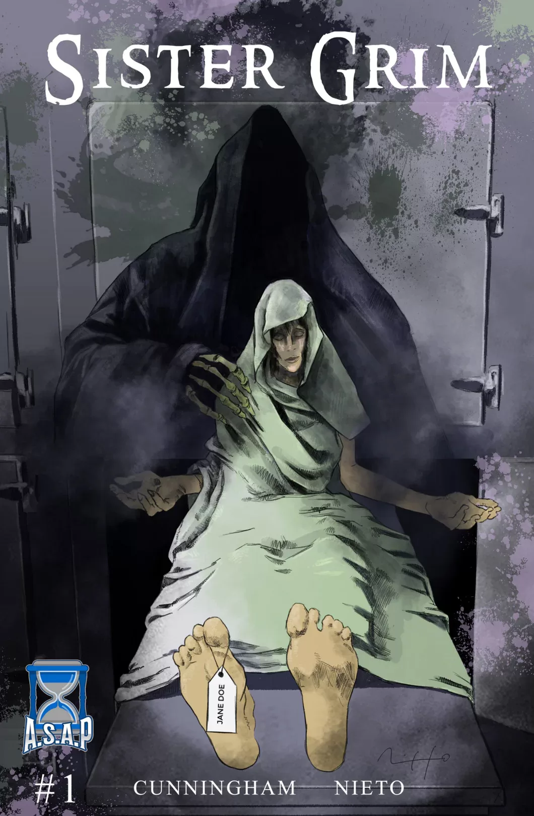
Whilst I am not a huge fan of the character designs in the story, other than Lily Connors herself, and perhaps the ghost man at the end of the story; this book has fantastic color choices. A rather depressing story set on a palette of greens, yellows, greys, and purples sprinkled in with some heavy textures makes you feel like this won’t be quite a happy story. This is fantastic because I don’t think that any story where the main character wakes up from death and in the words of (The Sixth Sense) “can see dead people”, shouldn’t make you feel like this is a walk in the park. The colors in the story are very well chosen, and they help not only add ambiance to the story but it clearly defines who is alive and who is dead or in the process of dying in the story, which is something that could easily become confusing if not delineated well. There is one page in this book where I just love how the panels were laid out, it is innovative and interesting and it makes you feel just like the character feels, which is sad, scared, and scatterbrained. Even though there is not a lot of action per-se in terms of big bombastic pages, the scenes of Lily running home are very well done and the action lines further convey the fear that the character experiences.
The writing itself is straightforward in the sense, that we open with a girl in the morgue who just wants to get home, but the way that L.A. Cunningham adds details helps us get a much better look at who Lily Connors is without having to have pages upon pages of exposition, heck, there is barely anyone talking in the story and we are still able to connect with the main character. Speaking of well, not speaking; I am a huge fan of silent comics because they make it a point to show you what is happening instead of telling you, and I love that in the medium of comics. This story does it really well, and it does it in such a way that even though no one is speaking you still feel like the world is very much alive through the use of well-placed, and quite stylistically drawn sound fx text that sparkles your senses. A well-timed “DING” from the elevator lets us know that she is going up and out of the hospital without having to show us that she’s in the elevator. A noisy “VVRRRR”, “SQUEAK”, and “Foosh” tells us that the bus has just arrived, a”Click” here and a “Click” there to shed some light on the darkness that is currently enveloping Lily Connors. It’s wonderful to see comics that embrace the medium and limit their words to just the essentials to tell their story, this method of storytelling also works really well for the kind of story that is being told because let’s face it; if you wake up after visiting the other side, would you be in a chatty mood? I think not.
Like every new series, the first issue’s art is still not 100% there and a couple of the panels are a little timid in terms of expressions and posing, but this is something that will no doubt continue improving as the artist further familiarizes themselves with the story. That being said, there are some pages in here that are truly beautiful. Apart from the previous page I mentioned with the really interesting panel layouts, there are two other pages that really stood out for me. These are, the little girl ghost in the bedroom page, and the greenery page. The little girl ghost is just really creepy, I love how they used that magenta color for the ghost girl. Setting this magenta color against an otherwise greyish-black background, really makes her feel creepy, and it feels even creepier when you realize that she’s watching Lily sleeping, it’s just weird and I love it! The other page that really stood out comes before the ghost girl, and it’s a page with lots of green and purple plants. The main horizontal panel looks beautifully designed and it visually isolates as well as entrapes the main character against a bunch of greenery and it feels very lonely. The use of green and purple to drive most of this page works really well because these are colors that are very complimentary in the color wheel and it shows that the artist is very well-spoken in the language of color and design.
All in all Sister Grimm #1 is a fantastic first look at a very interesting story, the art has a lot of potential, and no doubt the lettering does as well. I am a huge fan of the cover art of this book, it features more wonderful color choices from Nicolás Nieto and a beautiful rendition of the Grimm Reaper that is chilling. I also love the little Jane Doe tag on the character’s foot, really nice detail. I am excited to read more from L.A. Cunningham and the talented artists at A.S.A.P Imagination
Writing: 5 Stars
Art: 4 Stars
Colors: 5 Stars
Overall: 4.5 Stars
Written by: Laurie Cunningham
Art and Coloring by: Nicolás Nieto
Lettering by: C. Hess
Cover art by: Nicolás Nieto
Published by A.S.A.P Imagination
Author Profile
Latest entries

