 Step into the surreal world of “Something Epic”, where a blind character named Ron becomes the gardener of creativity, guiding us through an intriguing blend of reality and imagination. In issue #10, the lines between these worlds blur even further, with unexpected twists, grungy art, and a prosaic narrative style that leaves you both soothed and on edge. If you’ve ever wondered what it feels like to see the world through the eyes of someone who can perceive the very essence of ideas, then read on.
In this issue of “Something Epic”, we meet a character who is blind but can see the imaginary world of the epics for what it truly is. He is the caretaker of ideas, the gardener of creativity. He looks almost like Morpheus from “The Matrix”, but in the unique art style of “Something Epic”, which combines human characters with cartoon characters, much like the old “Who Framed Roger Rabbit” movie, albeit much grungier.
This issue is heavy with narration boxes written in a prosaic style that is soothing but also a bit eerie—two adjectives that could describe the personality of Ron (the idea gardener). I’ve liked “Something Epic” from the very beginning. When I read the first issue, I knew this was going to be a very interesting ride, and I’m happy to be reading more of it now. It’s always refreshing when one artist can transmit such a vast world of ideas in a manner as creative as what we see in the pages of this comic book. Combining action, drama, and even comedy, this comic is incredibly interesting to read. The jokes in this series are usually delivered by the cartoon characters, but they never overshadow the main storyline or the seriousness that comes from it.
One specific scene I liked in this issue is when the two main characters enter the public library, and the duck detective is sucked into the “Dante’s Inferno” book. It was very unexpected, and it served to establish who the main villain of the next issue could be, which I thought was a really cool way to do it. It was done in about 2-3 pages, way before the ending of the comic, and it almost seemed like a throwaway moment—only to be revisited at the end of the book, keeping you in suspense as to what might come from it further down the line. Brilliant!
I’m not the biggest fan of the art style, but I can still appreciate it for what it is—a vehicle for the amazing story being told. That being said, I do like the cartoon characters and how they are portrayed. I don’t particularly like the humans that much, mostly because it feels like they’ve been traced from pictures, and a lot of the colors on them feel washed out and muddy. Yet for the cartoon characters, this art style really works.
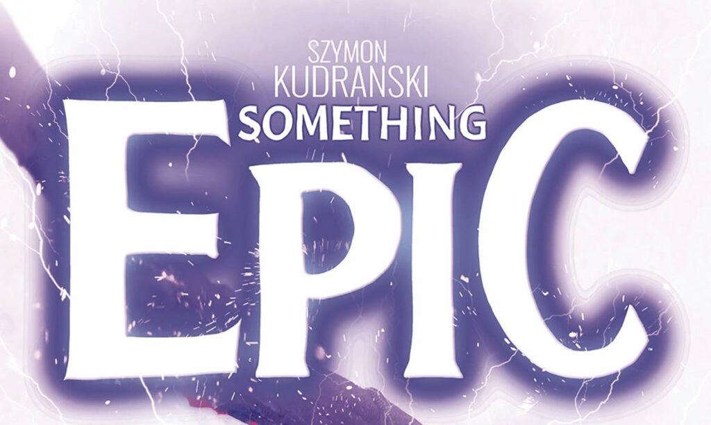
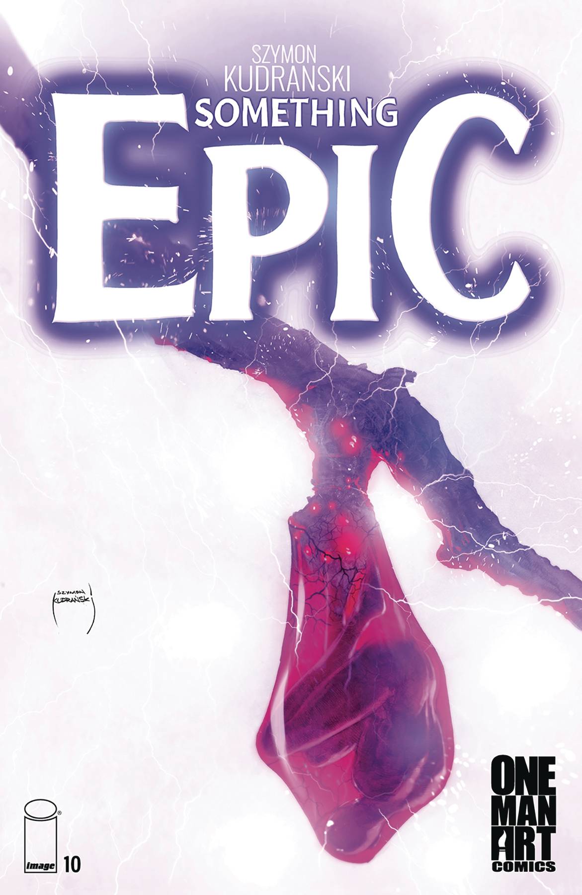
The cover art is alright, in my personal opinion. I’ve never really seen a great cover from “Something Epic”, but this one is alright. It features a man inside a cocoon, and at first glance, you don’t really know what you’re looking at, but once you finally get it, there’s a cool effect where you’re both intrigued and repulsed at the same time. A neat way to grab the attention of readers. Speaking of things that grab our attention and are a little out there in terms of standard comic habits: the panel borders for this book aren’t white; instead, they’re all black, and because the overall art style of the comic is rather grungy, it serves well to blend the panels together and make you feel like you’re in a different world altogether.
The font choice works well here. I like the word balloons, and I really like how the word balloons for the cartoon characters (also called epics) are a different color. It’s a nice way of spicing up a page as well as bringing a little bit of light-heartedness to an otherwise deeply serious story. I always want more SFX text, but here we got a nice “DING” that sat right between cartoon style and the real world, and it worked really well.
All in all, this was a good experience. I didn’t go too deep into the story because I feel like it’s better if you read it yourself than have me explain what’s going on. Just know that it’s almost like a poem, the way Ron handles ideas that come into the world, and it’s a very beautiful and moving experience to read through how he does that. For me, “Something Epic” will remain a very interesting book that keeps you hooked.
At this point, if you’ve read any other “Something Epic”, you definitely need to continue reading the story with this one. This is also a great book if you’re an artist of any kind, as it serves as a testament to how ideas can turn into reality with hard work, passion, and discipline.
Writing: 5 Stars
Art: 4.5 Stars
Colors: 5 Stars
Overall: 4.5 Stars
Written and Illustrated by: Szymon Kudranski
Lettering by: DC Hopkins
Covers by: Szymon Kudranski
Published by: Image Comics
Author Profile
- Antonio Rodriguez
Latest entries
 ColumnsMay 6, 2025Primordios: Enchanting Creations and Heartfelt Moments at Puerto Rico Comic Con 2025
 Comic BooksApril 17, 2025REVIEW: Sister Imperator #1
 Comic BooksFebruary 25, 2025REVIEW: Cruel Kingdom #2
 Comic BooksFebruary 24, 2025REVIEW: Godzilla Heist #1
