REVIEW: Star Wars Bounty Hunters #36
 Star Wars comics are such a treat to read. I love all the awesome character designs, the sweet aliens, and being able to see our favorite characters in all new stories really makes me a very happy comic nerd. This issue is all about gun battles and double-crossing and I’m here for all of it. This being a part of the Bounty Hunter’s series it’s no surprise that we are going to see our favorite space bounty hunter, Boba Fett in all his greenish splendor. In this comic, he is as mysterious and smart as in the movies, but this time he is even cooler because we actually get to see him succeed and have his plans come to fruition. That spacecraft of his is so cool too, and I love how it looks drawn by Lan Medina and colored by Arif Prianto.
Speaking of art, it never fails to amaze me how good the Star Wars comic’s art is. I love it so much, it’s just so much better than the stuff we see in the movies. The character designs are inventive, unique, and totally out of this world and that is a huge reason as to why I love these books so much. I think that Star Wars is such a richly developed world that giving artistic licenses to great creators makes it that much better. Each installment in the comic series just provides you with even cooler characters to pick from later down the road. The one thing I have to criticize is the lettering, it looks like stickers on top of this awesome art, and it gets under my skin when I am reading. The actual fonts and balloons are great, and even the sound fx are pretty cool, although some of them cool be a little more creative, but they are just too clean for my liking. When you have beautifully rendered digital paintings with tons of highlights, shadows, and a huge amount of soft blending techniques, having perfectly vectorized word balloons just looks weird in my opinion. However, the coloring is so good! Every panel looks outstanding! I particularly love page 20 with the big robot bounty hunter shooting a machine gun, it’s a full-page illustration with two rectangular panels framing the huge robot and it looks so cool. The lasers, the gun, the fire, the explosion. So much action in just one page feels fantastic to read.
I enjoyed the writing a lot too, I think they wrote Boba Fett perfectly and it fits just right with our collective idea of who he is based on the movies, whilst still having a unique spin to him. With his writing Ethan Sacks, has shown that he is a true fan of the Star Wars universe because he was able to get the voice of Boba down perfectly and still add new layers to his character without having to break away too far from who we know he is. I also appreciate how many new characters are introduced in this series, and I think it was a genius move of the team to have the names of the characters right next to them when they first appear in the story. This is a great move because it helps new readers of this series know who everyone is without having to go too deep into their own personal stories. You get to know their names, and based on their dialogue you get a quick grasp of their personality. For example, the alien lizard man Bossk, is a sneaky prick and you are able to deduce that from literally 3 panels and 2 lines of dialogue. That shows you that both the writers and the artists know their characters very well.
To sum it all up, this is an awesome story worth every dollar. I was gonna say cents, but we all know it’s been a hot minute since comics were worth cents. This issue is filled with lots of action shots, beautifully drawn characters, great writing, and fantastic backgrounds and coloring. The lettering could use a little more creativity to marry the art better, but even then it’s not so bad that it makes the story unreadable, and this is a hell of a story. If you like Star Wars, guns, explosions, or got the hots for “Bobby Fetty” then get in line for this issue of Star Wars Bounty Hunters because it is a juicy one.
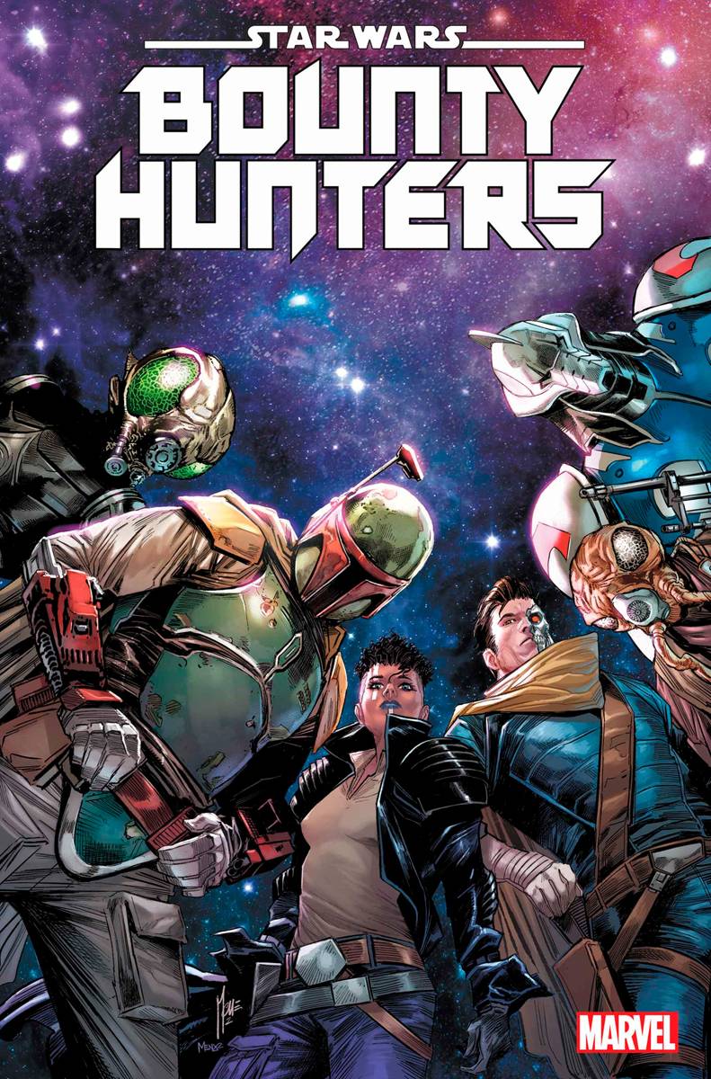
Oh and before I forget! The cover art is awesome, like really pretty. It features a bunch of the bounty hunter characters all under a colorful galactic sky and painted in a style that is very similar to the inside pages, which is awesome cause right from the cover art you get to appreciate how awesome the art will be. I also liked the credit page a lot which acts both as a credit page as well as a recap page, and it’s short and gets right to the neatly gritty of the story without being boring and taking the fun out of reading the actual comic. It’s also really cool that it looks like a futuristic space screen which goes perfectly with the rest of the sci-fi aesthetic.
Writing: 5 Stars
Art: 4.5 Stars
Colors: 5 Stars
Overall: 4.5 Stars
Written by; Ethan Sacks
Art by; Lan Medina
Coloring by; Arif Prianto
Lettering by; Vc’s Travis Lanham
Cover art by; Marco Checchetto & Marcio Menyz
Variant Covers by; Chris Sprouse, Karl Story, Neeraj Menon, Jerry Ordway, Nolan Woodard, Salvador Larroca & Edgar Delgado
Published by Marvel
Author Profile
Latest entries
 ColumnsMay 6, 2025Primordios: Enchanting Creations and Heartfelt Moments at Puerto Rico Comic Con 2025
 Comic BooksApril 17, 2025REVIEW: Sister Imperator #1
 Comic BooksFebruary 25, 2025REVIEW: Cruel Kingdom #2
 Comic BooksFebruary 24, 2025REVIEW: Godzilla Heist #1
