REVIEW: Star Wars Doctor Aphra #32
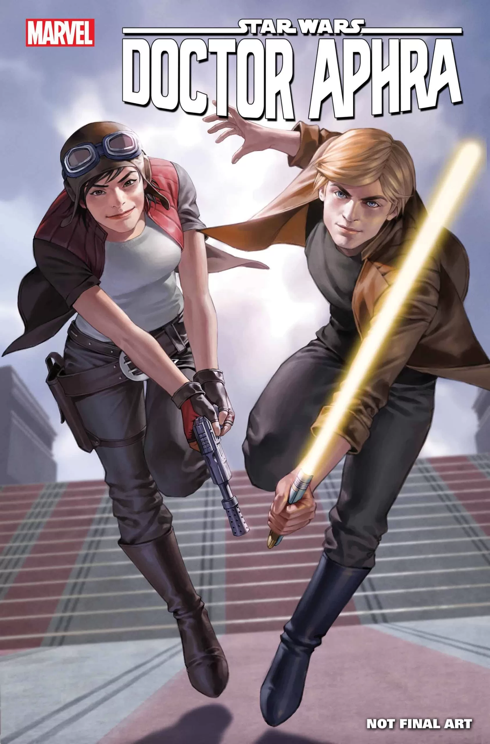 In a comic far far away, three unlikely allies must find their way into the tomb of a Jedi to rob it. In this issue of the Star Wars extended universe Doctor Aphra and “The” Luke Skywalker must find a temple deep inside a notoriously dangerous gas giant and hope that the force inside Luke is strong enough to help them not get killed.
I actually love the Star Wars extended universe so much more than the movies, and hey don’t get me wrong, the movies are great but in the comics, you are able to see so many other cool things. Really interesting plot lines, and weird aliens like the magnetic storm guardians in this comic, heck there’s even a whole book about stormtrooper zombies! All of it is so awesome! To me, this is the real Star Wars Universe right here and this issue does not disappoint. Written by Alyssa Wong, with art by Minkyu Jung and colors by Rachelle Rosenberg this story is epic! Alyssa has a very witty sense of humor in her writing and they are able to showcase it very well through the interactions between Doctor Aphra and Luke Skywalker, even Artoo gets a couple of funny little jabs in there too and he doesn’t even speak. In all seriousness though this is a great issue and I had no idea there was a whole 30+ page series about a character named Doctor Aphra but just from this issue alone I want to read so much more, because she is so likable!
Without going into too much detail, our story starts with Luke tied up inside a crate and Doctor Aphra sitting on a said crate. Right from page one, there is no doubt that this woman is smart, cunning, and definitely a match for the son of Vader, Luke Skywalker himself. And to go against one of the last and strongest Jedis in the galaxy is no easy feat and yet Luke seems to like her and even appreciate her company and being the pure of-heart sweet farm boy that he is, we too must trust his instinct, and like her too. All of this happens in the first two or three pages of the issue. I’ve never seen such empathic transference achieved in such little time, it’s truly wonderful writing, and to top it all Joe Caramagna is back at it again with his perfectly placed sound fxs and word balloons. Speaking of which, even though this suffers a tiny bit from perfect “vector ballon-oitis” I have to give huge props to Joe for those wonderfully shaped holographic balloons, I think the static sound fx woven into the actual dialog text is fantastic and definitely helps us feel that we’re looking at a broken transmission. Even though the sound fxs in this comic are nothing compared to the story of Spider Rex Joe, they work perfectly and are intermixed into the story in a brilliant way, adding just the right amount of extra ambiance and character to the story. It does a fantastic job of making the world come alive and immersing us in the galactic magic of Star Wars.
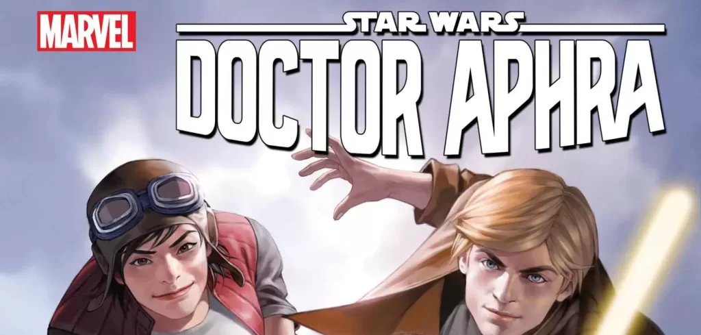
The art by Minkyu is stellar and I gotta say it. Those faces are fantastic! They are filled with emotion and pop really well on top of the heavily textured backgrounds. By the way, it’s no easy task to illustrate a “gas giant” 90% of that is going to be negative space and yet with the use of lines of action Minkyu does a magnificent job at making us feel the air around the characters. The colors by Rachelle Rosenberg are so nice too! They could’ve gone with whites and greys to illustrate air and gas, and yet they went with this pink and orange palette that looks so pretty! This palette contrasts so well with Luke’s brownish attire and Doctor Aphra’s mostly brown and grey colors. I also think that the way the red of her jacket is almost always on top of the orange sky in the background is such a good choice! It’s a tiny detail that I can’t help but appreciate because if it had been done backward with the ground being orange and the sky being pink, we would’ve had a constant clash of colors, and yet the way Rachelle handles it is just incredible.
Character design wise what can I say? It’s Luke and R2D2, there’s nothing more iconic than them, and yet Minkyu does a very nice job at drawing them in a style that feels very unique to this story and to the world of Doctor Aphra that allows us to create a mental divide between the Luke of Star Wars movie fame and this more expanded, and more personality-driven character. Of course, he looks a little bit like Mark Hamill in his youth but still, he feels special and unique. I love that a whole lot. The monsters in this issue are also quite unique and I love how Minkyu used shaped shapes to convey their animosity towards our main characters, that is a great lesson in shape language that every character designer should keep in mind. If you want your character to be scary, fill them up with triangles.
All in all, this is a great issue and everyone in this team is firing on all cylinders. Even the cover art does a wonderful job of showing how dynamic and fun these two characters are! My only wish was to see R2 somewhere in that cover art, even though he’s not that important in the actual issue. R2 has a couple of nice little cameos that bring out a nice chuckle, so our boy should’ve definitely been on that cover.
Writing- 5 Stars
Art – 5 Stars
Colors – 5 Stars
Overall – 5 Stars
Writing by; Alyssa Wong
Art by; Minkyu Jung
Colors by; Rachelle Rosenberg
Lettering by; Joe Caramagna
Cover art by; Junggeun Yoon
Variant Covers by; Chris Sprouse, Karl Story & Neeraj Menon, Ema Lupacchino & Jay David Ramos, Leinil Francis Yu & Romulo Fajardo Jr.
Published by; Marvel
Reviewed by Antonio “Mabs”
Author Profile
Latest entries
 ColumnsMay 6, 2025Primordios: Enchanting Creations and Heartfelt Moments at Puerto Rico Comic Con 2025
 Comic BooksApril 17, 2025REVIEW: Sister Imperator #1
 Comic BooksFebruary 25, 2025REVIEW: Cruel Kingdom #2
 Comic BooksFebruary 24, 2025REVIEW: Godzilla Heist #1
