REVIEW: Stellarlands #1 (of 8)
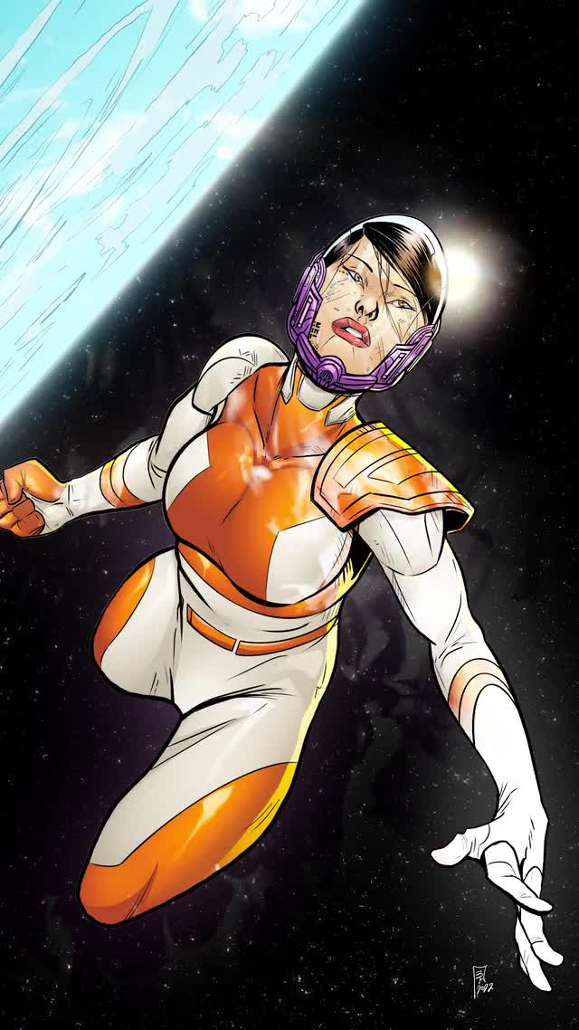 Straight from the outback, the newest release by Comx Studio is magnificent. I am by no means a superhero guy. I do not like Superman and do not care much for the Flash or the Justice League. I barely like the Avengers and definitely think that heroes with capes (other than Doctor Strange and Doctor Fate) are weirdos making weirder fashion choices. So color me intrigued when I realized halfway through this comic that I am in love with Stellarlands!
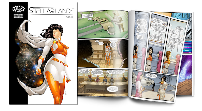
Coming right out of a successful Kickstarter (still with 12 days left to go). Stellarlands follows Daffney aka “Anvil Liza” a superhero sponsored by Anvilcore to run cover missions, and generally save the day. However, there is one key point that sets her apart from other superheroes. Even though her powers are very similar to the likes of Superman and Homelander, she is an alcoholic and is currently suffering from alcohol withdrawals. This aspect of her life makes her instantly relatable and is treated in such a cool way. From blurry panels to having her stop mid-flight through space to puke due to motion sickness, it does a wonderful job to humanize a superhuman. I love that so much, it takes the super right out of the hero and makes you remember that just like everyone else these caped crusaders are nothing but frail egos trying to do the best that they can. Another neat trick that this comic employs to dive deeper into the layers of the story is to frequently cut in between the story with what looks like an ad for a space product that actually ties into the story. Think of it like the Rick and Morty ad episodes but instead of it making no sense, here the product goes very in line with what is happening in the story and allows you to dive deeper into the world of Stellarlands.
Speaking of the world. Let’s talk a little bit about the art. The character designs are fantastic! I appreciate it very much when artists are able to create several different species of humanoid creatures that actually look different and aren’t just your hyper-generic alien species. Also, the line work is magnificent, Ben Worrell’s mastery over humanoid anatomy is very apparent and it is easy to see why they went with this artist for this comic because their work is outstanding. Couple that with the incredible coloring of Wilson Go and you have a comic book issue worthy of being right next to the DC and Marvel superheroes. This is some grade-A Australian storytelling. It is also quite fascinating how many of these pages don’t even have dialogue at all, and in that, I have to tip my hat off because unlike many DC and Marvel comics, especially the older titles, those are packed with unnecessary text but this comic only tells you what is important and then just shows you the rest. This method of storytelling feels fast, and more action orientated than if the characters were explaining all their moves and attacks as they happened. Showing instead of telling is always the way to go with action comics. The lettering is also very good in this comic, from the space dialogue font used to the narration boxes and the overall fonts used for the characters. This is some good stuff. Es Kay did A-Okay. I do however wish they had done one extra pass of sound fx text to further heighten important moments like explosions and hardcore deaths but that is my personal preference. On the topic of personal preferences, I really do not like it when panel borders don’t end perfectly. In this comic, they decided to go with a black panel border that has a little texture to it and whilst that looks very good, it annoys me that the lines don’t meet up perfectly. As an artist myself I end up wanting to erase those little lines to make them align and I end up getting thrown a bit off when reading, but the story is so good and at times even quite funny that it doesn’t really matter that much and I enjoy going back to the panel anyways.
In conclusion, Stellarlands is an amazing comic and you would do well to add it to your collection. The fact that it was kickstarted with less than $1,000 US and still manages to show a high level of mastery of writing, art, coloring, and lettering tells you that this studio is gonna be cranking out a lot of really good stuff and you should keep your eyes out for them. I am a bit mad at the fact that their mission is to publish Australian authors for the most part but only because I think this is one of those studios that actually cares about the quality of the stories they are publishing, and I would love to have my stories on their roster, but alas I am not from Australia. If you kickstarted this book but haven’t had a chance to read it, know that you made a wise investment in backing this project because it is phenomenal, and standing at 48 pages of pure art it already exceeds the normal 30 pagers from a DC or Marvel comic. It’s great, and at the end, you even get some funny cartoons of the creators and how they came together and even that is well written. It’s fantastic, from cover to cover this is an amazing piece of comic work. I am very excited to read the next chapter, and once you read this one I have no doubt that so will you.
Writing: 5 Stars
Art: 5 Stars
Colors: 5 Stars
Overall: 5 Stars
Written by; Max Ferrada
Art by; Ben Worrell
Coloring by; Wilson Go
Lettering by; Es Kay
Cover art by; Ben Worrell
Published by Comx Studio
Author Profile
Latest entries
 ColumnsMay 6, 2025Primordios: Enchanting Creations and Heartfelt Moments at Puerto Rico Comic Con 2025
 Comic BooksApril 17, 2025REVIEW: Sister Imperator #1
 Comic BooksFebruary 25, 2025REVIEW: Cruel Kingdom #2
 Comic BooksFebruary 24, 2025REVIEW: Godzilla Heist #1
