REVIEW: Teenage Mutant Ninja Turtles: Black White and Green #1
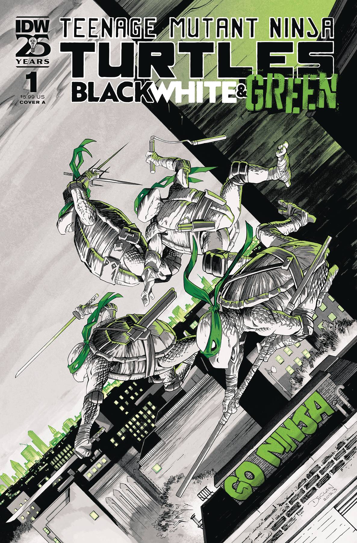 The turtles are back in the newest series by IDW. TMNT: Black, White, and Green is an anthology book featuring four stories of the Sewer Brothers done exclusively using a black, white, and green color palette. Four stories by four teams of creators come together to form this fantastic book and give a nice dose of creativity and innovation to our favorite crime-fighting, pizza-eating chelonids.
The book is quite refreshing to read, especially after watching the latest TMNT movie which, to be honest, wasn’t that much of a thrill. Other than the visual effects and the great animation that particular rendition of the franchise didn’t really hit home for me. However, this book did so in a lot of ways. As I mentioned earlier, it is divided into 4 stories; each one focusing on one member of the TMNT group. The simplicity of focusing on only 1 turtle at at time whilst also keeping the color palette to only 3 colors makes for a unified project that is wonderful to read through because it brings a fresh perspective to an otherwise classic formula. Not only that though, having four unique stories in one book makes me feel like I’m getting a huge bang for my buck.
The first story is about Donatello and we are treated to a mostly narrated world of the inside of Donny’s mind and how he feels inside the group’s dynamics. Despite being a computer whiz it is obvious to him and us that Donny can’t stay locked behind his screens all the time and he must go out in the field with his brothers if he wants to truly help rid NYC of crime like papa Splinter taught him. The art of this story is really nice because it mixes a semi-realistic approach with the cartoony nature of the turtles that we all have loved for so many years. Despite a few weird panels and some weird faces to go along with those weird panels we can see beautifully illustrated backgrounds and amazing use of spot blacks and negative space to tell a story that feels rich with emotional turmoil and brotherly love.
The second story has us travel back in time with Leonardo as he explores the role of a warrior king. Whilst the story itself is very fun because it contains a ton of awesome action shots and lots and lots of prehistoric fighting sequences. What attracted me most to this story (and I think it’s my favorite one out of all 4) is the way colors are used. Even though the same color palette is used, in this story we see green brought out to the spotlight whilst in the previous story one could argue that black and white were the main characters. This allows for a wide range of tonalities that help tell the story and set it in a time very far away, much like the feeling you get when you see a sepia-colored film versus a black-and-white film. It is also important to note that the lettering in this story plays a huge role in how the story is told and it almost is its own character with beautiful fonts and great use of word balloons and narration boxes. The lettering and the motif of prehistoric warriors give me Sergio Aragones’ Groo vibes and I am all for it. This story feels a lot more action orientated and it can be seen most when we look at the amount of panels that each page has, whereas the last story relied heavily on drama this story is all about punches and fast action sequences, so much so, that some pages feature very small panels that help move the story along at rapid speeds without giving us tons of pages to thumb through. These large amount of panels make for crazy cool, quick fight sequences, and set this story apart from the more classically laid out stories in the book. It is also worth noting that different styles of both art and storytelling are deeply refreshing for the readers.
The third story is about Raphael and I think it’s probably the most forgotten of the 4, not because it’s bad but because it’s being pinned against 3 other stories that are either really, really good or so weird and wacky that you can’t help but remember them. In this story, Raph is visited by a spirit in his dreams and must face his inner demons if he wants to be a valuable member of the team. YOu might notice that this story is very similar to the first one in that the turtles are essentially working out ways on how to best serve the team. This idea of seclusion and working together versus being alone wolf is explored in all the stories to different degrees. Each story ends in the same conclusion, the brothers are best working together even if some of them could work great alone; nothing will be the power they have when they work as a family. Color-wise this story is mostly done in blacks, whites, and greys with a little bit of greens done for word balloons and sound effects. I am not sure if it was done traditionally or digitally but there is a heavy texture of black ink washes that whilst I like it, could have been greatly enhanced with a heavier use of green.
Lastly, we have a story about Mickey stealing a hoverboard and the gang going out to have fun with him only to find that one of Donatello’s experiments going awol and then trying to kill them. The pacing is a little all over the place and makes for a rather confusing read. The story feels more modern than the previous stories and uses a cellphone (think TikTok video) to show what is happening with the brothers and the hoverboard and what is happening back at the science lab. This use of time and space, whilst very innovative in comics where a single panel is usually meant to represent a single moment in time and space; does not seem to be polished enough to keep the reader from becoming confused and losing his thread altogether. Despite this though the art style is very cute, it features a similar black and white and grey coloring style like the previous story but here we see green being used way better to mostly accent important elements of the story. The art style isn’t as realistic or detailed as the previous stories but instead, we get a cute almost Steven Universe version of the TMNT gang and I’m ok with that. The lettering in these last two stories is by Nathan Widick and they are really good, sound fxs, font choice, and word balloons the whole thing is just fantastic. Nathan is without a doubt a really good letterist.
This is a great start for a new series in the TMNT franchise and I’m glad I got to read it. It’s not too “think”, but it’s also smart enough to not make me feel like I’m reading the New Teen Titans version of the TMNT. It’s a nice dose of emotional drama, action, comedy, and brotherly dynamic that we can easily get behind.
If you’re a TMNT fan then yeah, I wouldn’t pass up the opportunity to grab this book because honestly it is worth every dollar.
Writing: 4 Stars
Art: 4 Stars
Colors: 5 Stars
Overall: 4 Stars
Written by: Declan Shalvey, Dave Barker, Jesse Lonergan, Gigi Dutreix, Lorenzo Hall & Paulina Ganuchea
Art by: Declan Shalvey, Jesse Lonergan, Gigi Dutreix & Paulina Ganuchea
Lettering by: Nathan Widick
Cover art by: Declan Shalvey
Variant Covers by: James Stokoe, Pualina Ganuchea, Dan Berger & Paris Alleyne
Published by: IDW
Author Profile
Latest entries
 ColumnsMay 6, 2025Primordios: Enchanting Creations and Heartfelt Moments at Puerto Rico Comic Con 2025
 Comic BooksApril 17, 2025REVIEW: Sister Imperator #1
 Comic BooksFebruary 25, 2025REVIEW: Cruel Kingdom #2
 Comic BooksFebruary 24, 2025REVIEW: Godzilla Heist #1
