Review: The Last Session #4 (of 5)
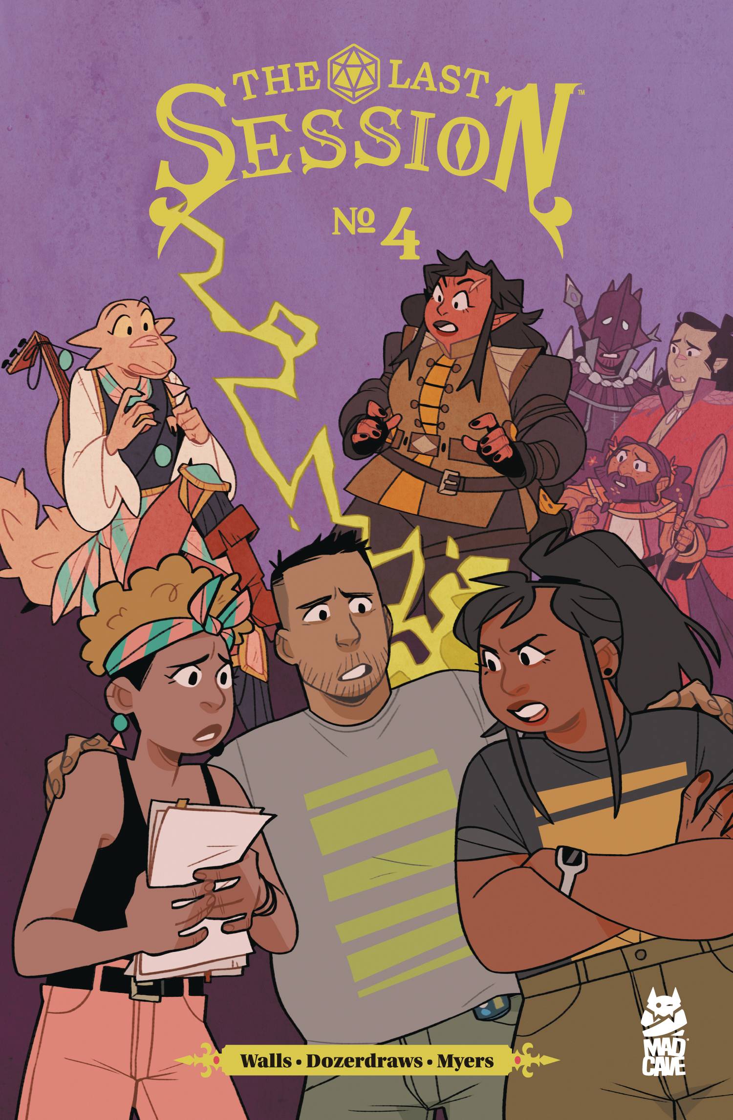 In my experience, it can be hard finding a good DND group. Whether it’s work, school, or a last-minute doctor’s appointment; life tends to get in the way. Perhaps that’s why I really appreciated how the latest issue in Mad Cave Studios series balanced real-world friendships with in-game consequences.
Differing player approaches are central to this issue. Players Lana, Drew, Walter, and Shen want to focus on a straightforward approach to the campaign. This causes a falling out with another player, Cassandra, who’s more interested in worldbuilding and distracting theories. However, when that fallout backs them into a corner in-game, they realize there may have been a point to her theories after all.
Jasmine Walls tells a phenomenal story blending two worlds. She balances the issues of the characters’ real-world lives with the game world almost seamlessly. The decision to begin the issue by focusing on Lana’s struggle with body image made the central conflict of the issue so much more relatable and intense. The game is a comfort to her. It’s a place where she can accept herself and her body. Sharing that sort of space with a new person who has a different approach like Cassandra can be frustrating. However, Walls continues to highlight the importance of doing so by having the characters feel immediate consequences. Her skill as a storyteller shines so clearly through her well-written characters.
The art and colors by Dozerdraws’ perfectly fit the story. They draw the characters with a clear shape language that makes every panel easy to understand. They always keep the characters in focus with subtle use of brighter colors to help draw the eye. Their use of flat colors with minimal shading also feels like a particularly wonderful choice. It gives the story a homebrewed aesthetic that fits the vibe of friends coming together to play a game centered around imagination. The choice also lets them fill backgrounds with more details throughout the issue. We see messy rooms, hallways full of judgmental kids, and expansive battle sequences all in just 21 pages. It’s a smarter approach to detail that helps the reader envision the world.
The whole issue has so many details that really sell the story. Micah Myers’ lettering is a great example of this. He gives clear and legible text throughout the issue. What really struck me was the choice to shift the font when transitioning to the game world. Although a small shift, it remains clear and offers another wonderful bit of immersion that makes the change positively stand out more. Myers helps in creating a clear transition from the real world to the in-game world without slowing down the story pacing.
It was really impressive how much the team of Walls, Dozerdraws, and Myers were able to fit so much depth into just one issue. It’s such a fantastic story that I wish I had found it sooner. I may not have a good DND group, but I do have a series I’m looking forward to reading the finale of in April.
Writing – 5
Art – 4
Color – 4.5
Lettering – 4.5
Overall – 4.5 stars
Written by – Jasmine Walls
Art/Color by – DozerDraws
Letters by – Micah Myers
Edited by – Michael Moccio
Book/Logo Designed by – David Reyes
Published by – Mad Cave Studios
Author Profile
Latest entries
 Comic BooksApril 13, 2022Review: Norse Mythology #3 (of 6)
 Comic BooksMarch 30, 2022Review: The Last Session #4 (of 5)
