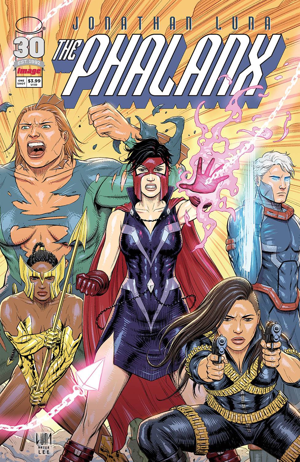
Spur, a mercenary in present day LA, has been tasked to find a certain red gem of mysterious powers. On the hunt, as the villain of the piece uses the gem to escape; following him leads spur to 1992 and the Phalanx!
This book is created by Jonathan Luna who produces the script, the art, letters and the design is, ironically, a homage to Image circa 1992. Therefore you could argue it is a book that is more art than story, more style than substance. Taking the writing first, Luna starts with an adult theme; you can tell its adult because of the swearing! Whilst I am being facetious, it is a nice change to have the expletive used rather than the usual symbols. It’s just a pity that there is no real impact or need for it. Story wise, it all hangs on the dubious decision of Spur. The introductions to the Phalanx seems a little twee and despite their various designs, at this stage I can’t really tell one from another personality wise. The other aspects of the book could have been taken from Power Rangers Time Force.
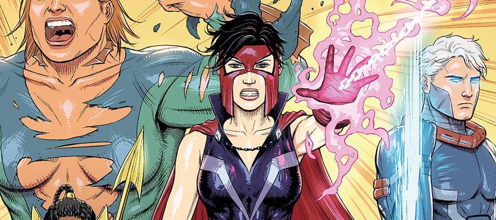
Regarding the art, I can see what Luna is trying to achieve, yet lacks dynamism. This gives the book a flat look in most of the panels. Perspectives can also be a tad off which distracts the eye. Facial elements look vacant, as if disjointed from the action or situations that the myriad of characters find themselves in. I am also at a loss as to why one of the female characters is bare chested. Is it a nod to the absurdity of the Hulk’s trousers? For a homage to artists like MacFarlane, Lee, Liefeld and Silvestri there is a lack of background art. The colors, acting as the background in places, are muted with a scratchy element in places. The font is easy to read and Luna does well with some of the conversational panels where dialogue dominates.
I understand the need to pay homage to that which you love. It’s a laudable idea and thanks to a Youngblood type cover, Luna is clearly wearing his heart on his comic, rather than his sleeve. For me, I am not certain that Luna manages to achieve his lofty goal, though I applaud his effort.
Writing – 2.5 Stars
Art – 2.5 Stars
Colors – 3 Stars
Overall – 2.5 Stars
Written, Art, Letter & Design by; Jonathan Luna
Published by; Image Comics
Author Profile
-
I am a long time comic book fan, being first introduced to Batman in the mid to late 70's. This led to a appreciation of classic artists like Neal Adams and Jim Aparo. Moving through the decades that followed, I have a working knowledge of a huge raft of characters with a fondness for old school characters like JSA and The Shadow
Currently reading a slew of Bat Books, enjoying a mini Marvel revival, and the host of The Definative Crusade and Outside the Panels whilst also appearing on No-Prize Podcast on the Undercover Capes Podcast Network
Latest entries

