Review: The Vampire Slayer #5
 Changing up a premise for an established series, essentially changing key parts, you run the risk of alienating the existing fanbase. Remember the furore when Azbats took over from Bruce or when Ben Reilly took over from Peter Parker? BOOM! Studios have taken a solid idea restructuring their Buffy series and have continued to run with it. But when is enough actually enough?
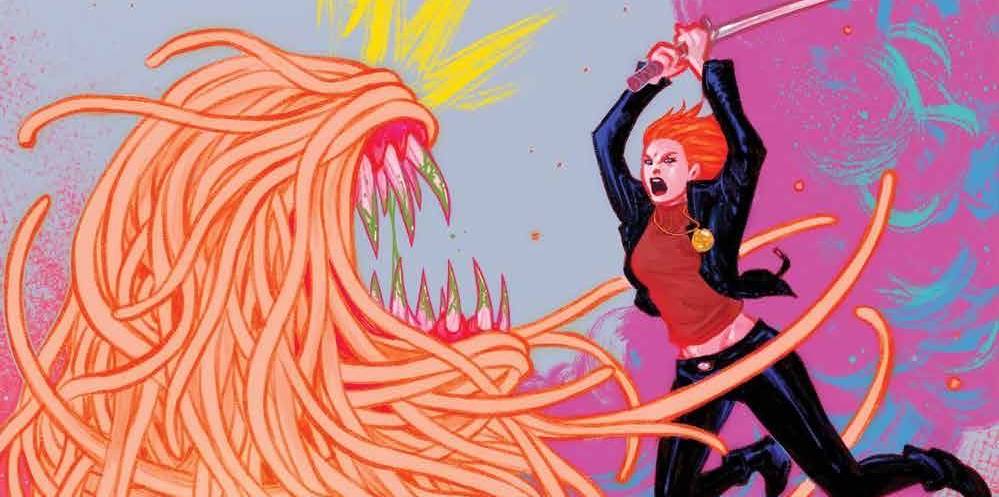
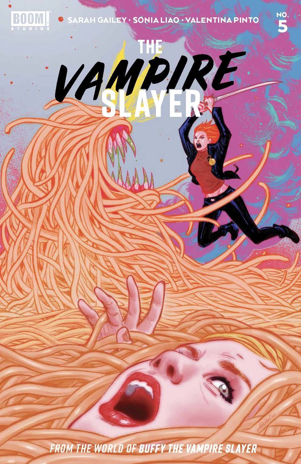
Sunnydale, situated on the Hellmouth receives a visit from a pasta monster and a new Slayer. Faith joins existing Slayer, Willow and the rest of the Scooby gang. That’s right, Willow is the Slayer, using mgic and dark magic in order to take Buffy’s place. What of Buffy? She has become something of a liability, a course of action forced upon her in order to save her psyche and mental health. Without an awareness of her powers or her memory of her skills, Buffy is he fifth wheel whose new powers seem to be getting in trouble and alienating her friends and frenemies alike.
Sarah Gailey is maintaining her course, we are five issues in with no reset button in sight. Five issues in and the the originality of the first issue, the freshness of the idea, at least for me, is starting to wane. For all the smoke and mirrors of the subplots, the main idea is being overplayed and re-ran over again. Pacing is key here; how long can Gailey keep this going? Consider this, the first episode of season three features a despondent Buffy lost in dodgy situation. When she gets her confidence back, the image stays in the credits scene for ages due to its badass-ness. Gailey may be planning for that scene of her own, but it is taking a while getting there. Finally, with all the tension and dislike between Buffy and Faith, I am not so sure that Faith would keep the big secret to help her non-slaying counterpart.
The art is provided by Sonia Liao and I have to say, that I am not a huge fan. There are some nice facial moments, for Buffy at least, but I wandered through the book assuming that the dark haired girl was Faith! Does everyone have to have an upturned nose? When doing a book based on TV show or movies then likeness has to be taken into consideration. Throw in the fact that the characters look short and therefore younger than you would expect, gives the art a disjointed feel. The heavy lines don’t help, giving the book a really dark feel and look. Part of this will fall at the feet of colorist Valentino Pinto who also goes for a dark scheme. Letters are provided by Ed Dukeshire who has to deal with a surprising amount of verbiage to contend with; I guess that “Whedon-speak” comes with a cost. BOOM! are following the trend of lack of cover credit for letterers.
This book started with an interesting premise, and truth be told, the book has a consistent approach. I am a tad bored though; having “all-new, all-different” would be more fun if every publisher wasn’t doing the exact same thing. As it is, i am sat waiting for the stake to drop, proverb-ally.
Writing – 3 Stars
Art – 3 Stars
Colors 3.5 Stars
Overall – 3 Stars
Written by; Sarah Gailey
Art by; Sonia Liao
Colors by; Valentino Pinto
Lettered by; Ed Dukeshire
Published by; BOOM! Studies
Author Profile
- I am a long time comic book fan, being first introduced to Batman in the mid to late 70's. This led to a appreciation of classic artists like Neal Adams and Jim Aparo. Moving through the decades that followed, I have a working knowledge of a huge raft of characters with a fondness for old school characters like JSA and The Shadow
Currently reading a slew of Bat Books, enjoying a mini Marvel revival, and the host of The Definative Crusade and Outside the Panels whilst also appearing on No-Prize Podcast on the Undercover Capes Podcast Network
Latest entries
 Comic BooksOctober 14, 2024Review: Absolute Batman #1
 Comic BooksSeptember 25, 2024Review: Defenders of the Earth #2 (of 8)
 Comic BooksAugust 7, 2024Review: Gatchaman #2
 Advance ReviewJuly 30, 2024Advance Review: Defenders of the Earth #1 (of 8)
