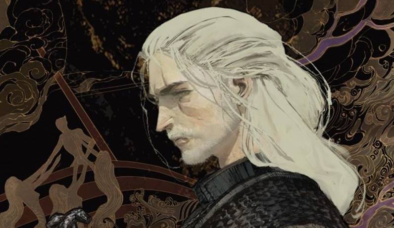
The Witcher is once again on his travels. This time, however, he is a victim of his own success as there is nary a monster in sight for him to dispatch and earn his beloved coin. A cry for help from a neighbouring burg offers some semblance of his preferred life, though this comes at a high price.
This little tale of two villages is written by Bartosz Sztybor who places Witcher in a new bind of sorts. With no monsters to slay, he finds himself effectively out of work. Being a resourceful sort, there are options before he is called back into duty. Sztybor works hard to build resonance for Geralt, with the aim to give latter parts of the book more impact. It kind of works but only because of the state of mind Geralt is in; at the height of his powers would he feel the same way? The dialogue has an earthy feel to it, though there are a few pages that are exposition heavy, I do wish that story setups weren’t so clumsy or obvious.
The art is by Amad Mir, a French artist whose European style fits the book well. If the characters are a little static it is to be expected given how talky the book is. Mir does well enough with the environments, though the monsters look a little tame. As for Geralt himself, well it’s hard to produce a likeness of a character based of a tv show, based on a video game series, based from the book. That said, there is enough of a likeness to the TV show to make it recognisable. The tone of the book is well crafted by colorist Hamidreza Sheykh who gives the land a murky feel, where darkness seems to grow rather than fester. The muted colors are contrasted by some clever usage of light sources. Finally, letterer Steve Dutro gets to have fun with a couple of font styles, the first one having a bigger impact than thought of at first glance.
Truth be told, I have never played the game or read the novels; the TV show was fun, well, my wife enjoyed the show. Dungeons and dragons, apart from the cartoon show, have never really caught my attention. I am sure that there is enough of the various Witcher treatise to garner the attention of the various groups of fans.
Writing – 3 Stars
Art – 3 Stars
Colors – 4 Stars
[yasr_overall_rating size=”large”]
Written by; Bartosz Sztybor
Art by; Amad Mir
Colors by; Hamidreza Sheykh
Letters by; Steve Dutro
Published by; Dark Horse Comics
Author Profile
-
I am a long time comic book fan, being first introduced to Batman in the mid to late 70's. This led to a appreciation of classic artists like Neal Adams and Jim Aparo. Moving through the decades that followed, I have a working knowledge of a huge raft of characters with a fondness for old school characters like JSA and The Shadow
Currently reading a slew of Bat Books, enjoying a mini Marvel revival, and the host of The Definative Crusade and Outside the Panels whilst also appearing on No-Prize Podcast on the Undercover Capes Podcast Network
Latest entries

