REVIEW: TMNT Saturday Morning Adventures #5
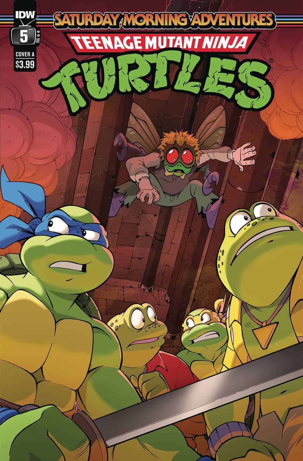 Fresh out of the sewers of NYC comes another installment of TMNT: Saturday Morning Adventures #5. If you, like me were raised in the 90’s there is no doubt that you spent many Saturdays glued to your sofa watching the original TMNT animated tv show. This comic features an art style that is incredibly similar to the old cartoon shows as well as writing that is just like watching a whole new episode of those great shows. In this issue Leonardo and Michelangelo team up with Genghis Frog and Napoleon Bonafrog to defeat the mutated evil villain Baxter Stockman who has kidnapped the reporter in yellow April O’Neil.
When I got this comic in my mailbox, I did not hesitate to not only crack it open but also read it all the way through because as of yesterday, I can be counted as one of the many moviegoers who have sat in a theater to watch our favorite teenage mutant ninjas on the big screen. Whilst I enjoyed the movie a lot, it was refreshing to read this plus go back to my younger years watching cartoons, when time was much simpler and less social media/ internet-centric. The writing in this comic is incredibly similar to that of the old cartoons; with clever jokes, quirky commentary, plus language such as “Mondo” that dates this comic all the way back to the 90’s. It was a fun read for sure, however being an adult I guess the 90’s style of animation isn’t as deep as my young brain once thought, which is understandable. We all grow and change in like manner this comic seems to be a portal back into those days. If you’ve ever had the need to go back in time in order to watch animated TV shows from the 90’s but don’t really have the 20-30mins it takes to sit down to watch an episode of Swamp Thing, Captain Planet, or X-men with their Villain of the Week narrative together with their “friendship is all that matters” themes. Then perhaps this comic might be more worth your time. It is not a deeply emotional story, whilst there is some action, it is also not particularly inventive in the way it delivers that action. It instead is a dose of good ‘ol nostalgia that no doubt many of us could use after watching the new TMNT movie (which I’m not saying it was bad, but it definitely had a little too many “look at me I’m a Gen Z” jokes.)
The art is good, it does a wonderful job of mimicking the cartoon too. I honestly think if you took these pages, and turned them into a storyboard for a cartoon show, you would have exactly what the old TMNT show was, which is a good thing considering that the title of the comic is literally: “Saturday Morning Adventures”. I think that everyone on this team knows what they are supposed to be doing, they know the goal they should be aiming to achieve and they are executing those tasks perfectly. However, when it comes to reviewing this sort of work you have to ask yourself two things. Am I reviewing this for what it is or am I reviewing it compared to other comics in the market today? I personally would have to say that I am reviewing it based on other comics in the market and whilst it does an amazing job at being a 90’s animated show in comic book format, it is not particularly interesting or innovative in any other way outside of that gimmick. Don’t get me wrong, it’s a wonderful gimmick in addition to being one that for sure has a very popular market out there, but I think that the creativity of this comic is a little too constricted to the concept of “making it as close to the cartoons as possible”. The art is nice, but the poses could definitely have been much a lot further. The backgrounds are alright but they aren’t stellar. There are one or two panels that play around with some cool perspectives, but they come few and far between which often go unnoticed amongst the very tame artistic choices coupled with equally tame panel layouts. Speaking of panel layouts, this comic uses about 5 different panel layouts. While I appreciate the consistency I think that they did a lukewarm job of breaking up those panels in order to not make them feel so repetitive. They did try to break them up by having a couple of panels where the art pushes outside of the panel layouts, but they didn’t push them enough. A little leg that sits outside the panel border, or a couple of wings that show up on the top of other panels; these choices are so tiny that they hardly seem interesting or important for that matter. There is clearly a desire to innovate but it seems like the artist is either being told to keep to the 90’s motif or is internally limiting their creativity to not break away from that. This results in a great 90’s comic, but a rather boring 2020’s comic. I think if artist Dan Schoening pushed his ideas a little bit further along with his poses to be more dynamic we would get something really cool that blends the 90’s style of coloring plus writing with a much more modern and stylistic look for our beloved turtles.
Speaking of which, this is exactly what is wrong with the new movie. They went in a completely different direction than the comic has taken. Instead of going back to the ’90s, they’ve decided to go full into 2020 even with a little easter egg of Covid appearing in the pages of April O’Neil’s notes. I am of the opinion that in order to really strike gold with the TMNT in this day and age you need to be able to mix the wonderful style of the new movie with the quirkiness we saw of the animated TV show, along with the violence in addition to the drama of the original comics.
The coloring in this comic is good, again it is simply a 90’s animated TV show turned comic, this is reflected in the coloring as well with a palette of muted colors. The only relatively vibrant colors you are going to see in this comic are in explosions and in sound fx text. The lettering is alright, but it suffers from “stickeroritis”, which is a new term I’m trying to coin (joking) in which the lettering has been done completely in vector format as well as placed right on top of raster art with grainy or heavy textures resulting in the lettering looking almost like stickers on top of the illustrations instead of having them be part of the actual illustrations. This is a fault of the process of making comics not necessarily the artists because often times letterers along with artists aren’t working together on a given project; instead, they pass things off down the process funnel without really interacting with each other. This in addition to the one-word balloon that wasn’t aligned properly to the left edge of the panel, are my only two gripes with the lettering. The rest is pretty good. The word balloon shapes are very nice, the sound fxs are plentiful likewise the fonts for those have been chosen very well.
In conclusion; as a 90’s animated TV show turned into a comic book this is a 5/5 with a wonderful script and a great dose of nostalgia. However as a modern comic reader, this was rather boring. Furthermore, while it did scratch my itch for old-school TMNT, it is not something I personally would continue reading. It is up to you to decide if you’d like to fill your shelves with 90’s nostalgia comics. I honestly don’t think this would fare very well for kids either, it’s just very niche. It worked for us in the 90’s because that was the newest and most innovative thing that existed back in the day, but now if you’re trying to hold the attention of a kid who can literally watch people explode in 4k while dressed as a unicorn in a fortnight, you’re gonna have to draw extreme perspective angles, crazy poses that seem to defy reality moreover you’re definitely gonna have to push the writing to really too, creating emotional and dramatic story arcs that will tug at their heartstrings. I’m gonna give this comic a 3.5, because it is a good comic for what it is, but compared to other things out there it sadly falls flat.
Writing: 4 Stars
Art: 3 Stars
Colors: 4 Stars
Overall: 3.5 Stars
Written by: Erik Burnham
Art by: Dan Schoening
Coloring by: Luis Antonio Delgado
Lettering by: Ed Dukeshire
Cover art by: Jack Lawrence & Raúl Angulo
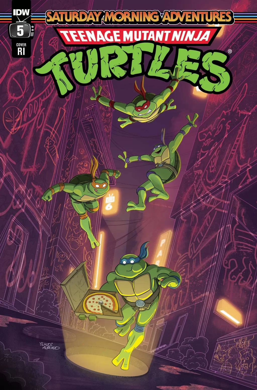
Variant Covers by: Audrey Suntrup & Yehudi Mercado
Published by IDW
Author Profile
Latest entries
 ColumnsMay 6, 2025Primordios: Enchanting Creations and Heartfelt Moments at Puerto Rico Comic Con 2025
 Comic BooksApril 17, 2025REVIEW: Sister Imperator #1
 Comic BooksFebruary 25, 2025REVIEW: Cruel Kingdom #2
 Comic BooksFebruary 24, 2025REVIEW: Godzilla Heist #1
