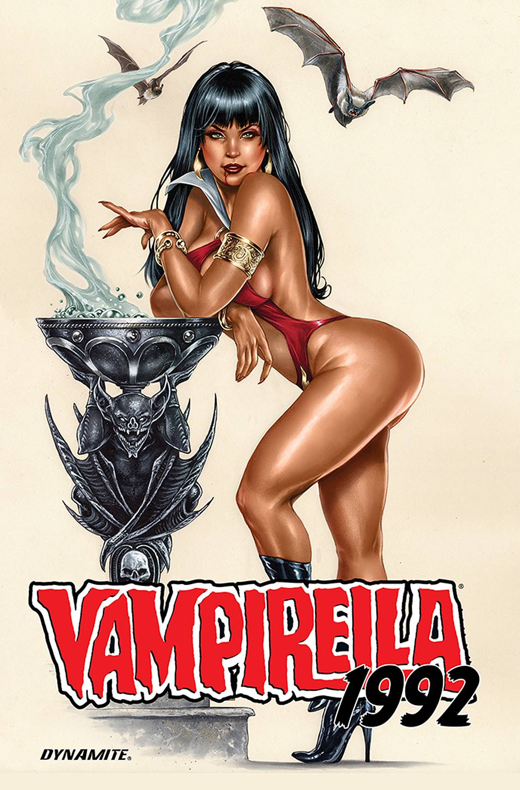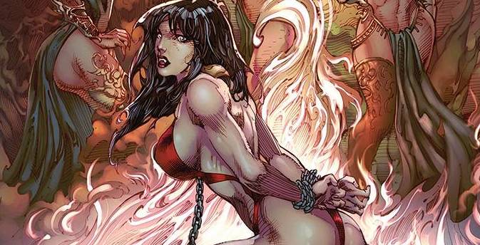
This book is throwback to those days of excess, though with an apology of sorts thrown in for good measure. Sexy babes, and violent images are the raison d’etre. Along with all that comes a story that barely makes as much sense as Vampi’s costume barely covers skin!
Max Bemis could be seen as an eclectic writer. Moving from music into comic book writing, Bemis has spent at Marvel, most notably on Moon Knight. When it comes to this book however, I think that Bemis is trying too hard. In much the same way Spider-Man Life Story failed, in my opinion, here the writing trying to cover two period s doesn’t know where or when to set its stall. Rather than letting the vibe of the period permeate the book, Bemis goes in heavy handed, letting us know that we are in the 90’s, which he does at least twice, that one of the girl is a lesbian and that there is black Purgatori. None of these things matter to the story, yet scream of a writer not wanting to offend anyone by these elements inclusion. Believe me, fans of this era of comics won’t care one jot! truth be told, i barley care about them today! Speaking of the fans of the era; Bemis take an unusual approach by poking fun at them, with an almost arrogant “we are better now than we were ” attitude. I say this is odd as he effectively insulting one of the groups of people who this books is aimed for.
Say what you want about comics in the 90’s, but women were always gorgeous. Roberto Castro and Marcos Ramos definitely jump into to this book curves first, perfectly capturing the feel of the 90’s. Establishing body focused panels lead the way for sure, though there are also excellent facial designs on show; page 6 manages to demonstrate this statement brilliantly. The art could have been seen in any number of books from 1992. The pair make no bones, make no pretentious comments or commentary. Instead they just deliver a book that is ridiculously on point. Bearing, or should that be baring, in mind the time period vibe, you know what sort of art you are going to get and Castro and Ramos deliver in spades! Colors are provided by one of my favourite colourists in Andrew Dalhouse, this time ably joined by Dinei Ribeiro. There are a few environs to consider throughout the book; each one, from the dark apartment to the oh so bright mall are well observed. Finally, the letters are supplied by Carlos M. Mangual who gets to play with different fonts.
I was really looking forward to this book. I remember buying Vampi back in the day when she was at Harris Publishing and was looking forward to a walk back through yesteryear. Instead, I find a book that doesn’t appreciate the fans of the character and to some extant, doesn’t appreciate the character herself, in an almost meta-message book that ridicules anyone for a buying a book for anything other than the purest or the self appointed socially acceptable reasons.
Writing – 2 Stars
Art – 4 Stars
Colors – 5 Stars
Overall – 3 Stars
Written by; Max Bemis
Art by; Roberto Castro & Marcos Ramos
Colors by; Andrew Dalhouse & Dinei Ribeiro
Letters by; Carlos M. Mangual
Published by; Dynamite Entertainment
Author Profile
-
I am a long time comic book fan, being first introduced to Batman in the mid to late 70's. This led to a appreciation of classic artists like Neal Adams and Jim Aparo. Moving through the decades that followed, I have a working knowledge of a huge raft of characters with a fondness for old school characters like JSA and The Shadow
Currently reading a slew of Bat Books, enjoying a mini Marvel revival, and the host of The Definative Crusade and Outside the Panels whilst also appearing on No-Prize Podcast on the Undercover Capes Podcast Network
Latest entries

