Review: Vampirella Dracula Unholy #1
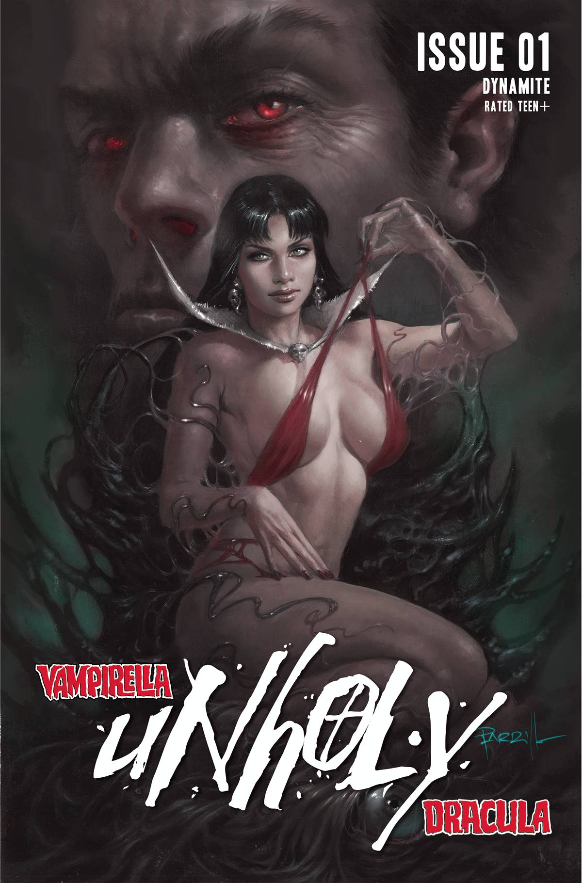 Following the events of Vampirella #25, it would seem that this book is a perfect jumping on point, right? Well no, not really! This new Vampi series from Dynamite continues where Christopher Priest’s previous run left off, begging the question why restart at #1 again?
Vamoi and Matt are now married, in part as a first step towards thwarting an ancient curse and a high-tech virus from using matt to resurrect the great vampire of the all, Dracula!
Behind the dodgy title, Matt may or may not be Dracula but he firmly isn’t at the moment and dodgy marketing strategy by restarting at #1 for no real reason and a plethora of variant covers there is a sense of logic to Christopher Priest’s ongoing drama. Priest’s dialogue works hard to move things along, despite the hangover from the previous run making its presence felt. It’s a hard track to run; it’s kind like taking alternative bites from your starter followed by your desert and then back to the starter. Priest’s telltale style of panel design rears its head, giving the book a sense of familiarity. Story wise, there is a sense of maturity to proceedings, a weighty feel of impending doom and disaster that feels genuine rather than the usual “no ramifications” that some books rely on.
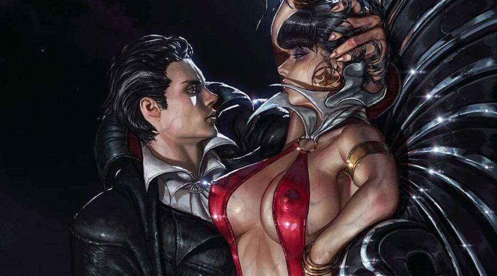
The art is supplied by Donny Hadiwidjaja who demonstrates all the requirement of a successful Vampi artist. Long black hair, check. Long legs, check, red swimsuit costume, check. Sexy poses, check. Along with the thing the we love about Vampi, Hadiwidjaja ensure Matt also gets the consistent pencils. Well, both Matt and Vampi are consistent for the majority of the book with heavy ink lines giving the book an almost cartoon feel, though at times can appear unfinished. Yet the first act has cleaner lines that add. a sleekness to proceedings. Hadiwidjaja ensures that there is a pace to the storytelling, across every aspects, be it action of the various conversation pieces that switch between educating the reader and moving things along. The colors from Mohan has the same sort of contrast as the pencils between the first act and the rest of the story; both working well in setting the tone, with the latter pages feeling darker. Willie Schubert’s fonts are a mix to delineate the differences between Matt’s inner monologue and the dialogue from the cast of characters. As alluded to, there are a raft of covers to choose from; cover A from Lucio Parrillo and cover D from Kyu Yong Eom are the winners for me, though the Adam Hughes cover, E, also has a fun cheesecake element.
Vampi has been having something of a resurgence of late for me; I may be late to the Priest party, but Tom Sniegoski and Jeannine Acheson’s Vampiverse has been fun. Priest has certainly draped Vampi in more than her swimsuit, instead letting the cape of horror and macabre swirl.
writing – 4 Stars
Art – 4 Stars
Colors – 4 Stars
Overall – 4 Stars
Written by; Christopher Priest
Art by; Donny Hadiwidjaja
Colors by; Mohan
Letters by; Willie Schubert
Covers by; Lucio Parrillo, Kyu Yong Eom, Adam Hughes and various
Published by; Dynamite Entertainment
Author Profile
- I am a long time comic book fan, being first introduced to Batman in the mid to late 70's. This led to a appreciation of classic artists like Neal Adams and Jim Aparo. Moving through the decades that followed, I have a working knowledge of a huge raft of characters with a fondness for old school characters like JSA and The Shadow
Currently reading a slew of Bat Books, enjoying a mini Marvel revival, and the host of The Definative Crusade and Outside the Panels whilst also appearing on No-Prize Podcast on the Undercover Capes Podcast Network
Latest entries
 Comic BooksOctober 14, 2024Review: Absolute Batman #1
 Comic BooksSeptember 25, 2024Review: Defenders of the Earth #2 (of 8)
 Comic BooksAugust 7, 2024Review: Gatchaman #2
 Advance ReviewJuly 30, 2024Advance Review: Defenders of the Earth #1 (of 8)
