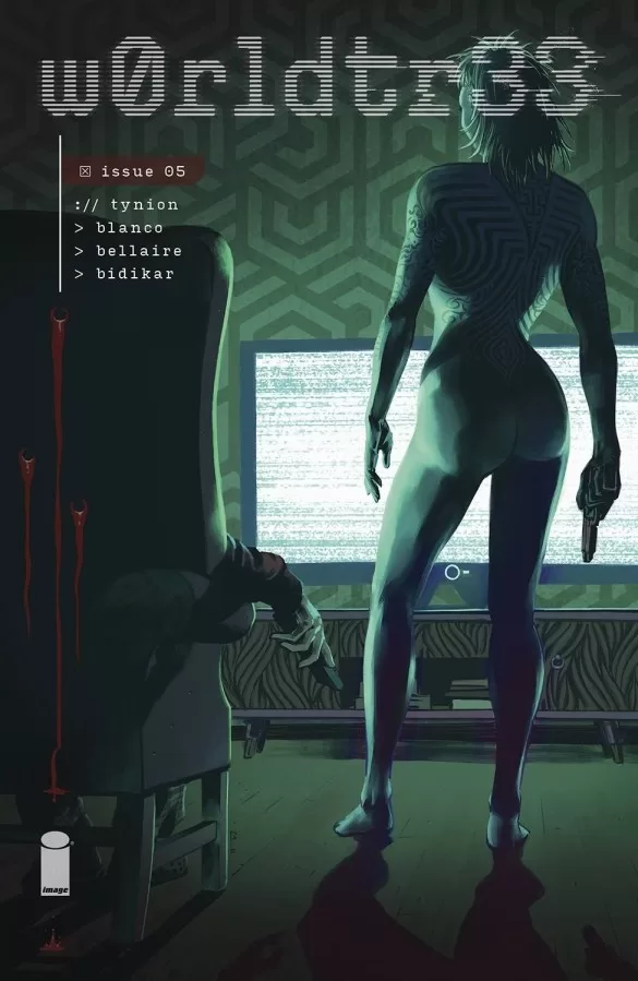
I’ve been receiving the different issues of this comic for a while now but I hadn’t had the chance to read through them yet so jumping into issue #5 to review put me in a bit of a confused place as to who is who and why things are happening the way they are. That being said, the overall plot of the story is pretty easy to grasp your fingers around. What looks like an AI has taken the body of a human and is plotting to end the world, through acts of organized crimes broadcasted through the internet. The only way to stop her murder spree is to stop the internet altogether. It’s a cool concept and it is well executed. The scenes of murder are grotesque and whilst often shown in a collection of close-ups still manage to put a eerie feeling in your mouth. That feeling is heightened with their glitch effect aesthetic that reminds you that these acts of violence are being broadcasted through the internet, and it paints a dystopian future of what the world could be if one day all that mattered were likes and views and people would go so far as to murder to go viral online.
The art is cool, especially in the panels with full color. The art is divided into three parts, with 3 overall color schemes that dictate where things are happening. If it has a blueish-grey tint to it, then it’s happening in the past but in the real world. If it’s in full color but it has a glitch effect like what you would see when you break the screen of a phone, then it’s in the past but being broadcasted through the internet, and finally, if it’s in sepia then it’s happening in the future. I think this technique of dividing the different timelines into different colors is really well thought out and works very well to let you know where you are in space and time. It makes the story that much easier to follow along with.
One thing that makes it hard to follow along with however is that sometimes the panel layouts are a little convoluted and whilst they provided innovative ways to tell the story, sometimes the word ballon paths become mixed with where things are in the panel order and you end up reading one ballon before the other and then have to go back and figure out what you were supposed to read first or second. This issue however only happens on one or two pages and whilst it’s not particularly off-putting it can be annoying in the grand scheme of things. When reading the full paperback 1 or 2 pages per issue can turn into 20-30 pages of the whole book that you have to read through twice to understand and that can be a drag.
The lettering however is pretty good. It does its job well, There are some cool sound FX fonts here and there, some interesting word balloons and the font choice works well with the tone of the story. It’s nothing too crazy in terms of technique or style but it works well and gets the job done. The character designs are rather simple in general but there are two or three characters like the AI women, the red-haired FBI agent, and a few of the male characters with very interesting faces and distinct features.
It is however a mature story featuring nudity, lots of violence, and dark topics so that’s something to both be intrigued about as well as mindful of when picking this comic up for yourself or someone else. It’s a fun read and one that I will no doubt continue enjoying as I read both forwards and backwards through it’s different issues.
Writing: 4 Stars
Art: 4 Stars
Colors: 5 Stars
Overall: 4 Stars
Script by; James Tynion IV
Art by; Fernando Blanco
Colors by; Jordie Bellaire
Lettering by; Aditya Bidikar
Cover art by; Fernando Blanco
Variant Cover by; Jordie Bellaire
Published by Image Comics
Author Profile
Latest entries

