I absolutely love this comic! Out of the whole batch of comics I’ve read in my stint as a comic reviewer for Comic Crusaders, this is by far the series that I’ve enjoyed the most. Each issue brings with it, a creepy story that captures your imagination and your emotions far too well. I also absolutely adore the character designs in these stories. They are fun to look at, weirdly inventive, and highly diverse. It is also refreshing in ways that you wouldn’t otherwise imagine, things like the mixing of art styles to deliver a cohesive narrative that still feels mindboggling makes this series (at least for me) incredibly worthwhile. So much so that one of my closest friends has recently started reading it based on the last review we made for it. This is just a good series through and through. Issue 14 is no different. I am still not knowledgeable enough about the series to understand the overarching narrative of the stories, and the deeper world lore that is being created, so I can’t speak to that; but there is something really fun about reading these as stand-alone stories and I think they work just as well when you read each issue as it’s own independent story perhaps set on the same horrifyingly fantastical world. This issue is all about tricks and treats; Sid in a very Halloween fashion is found outside the house of a few people dressed up as different Halloween characters. After a brief confusion between them, Wolfman, Dracula, and a skeleton kid invite her to stay with them for the night so she can rest up after her travels. She agrees and they offer her a choice. Trick or Treat? Choosing to go for a treat, she ingests a soup of mushrooms that sets her on a path of nightmarish terrors.
I can’t stop gushing about the character designs in these stories. They are just so cool to look at, they aren’t fancy designs with tons of details or anything like that, but at the same time, there is a beauty to their simplicity that makes them incredibly unique. In this story, we get some really cool Halloween costumes, like Hulk, a Leatherface, and probably my favorite one; Frankenstein. I love Frankenstein so much because not only does the rendition of him in the classic WTFPH style look fantastic with its blueish-green colors, but because they draw a panel of this Frankenstein character that is very reminiscent of the old school horror comics (think Tales from the Crypt) and they use that brief change in style to begin a psychedelic sequence that is just pure perfection. In technicolor palettes, we are able to understand the current psyche of Sid after eating that mushroom soup; even though it lasts only 2 pages with one of those pages being a full-page illustration we quickly realize that we are going on a trippy ride with this one. Speaking of trips, right after she’s done tripping balls on shrooms, we go on a two-page journey of establishing shots that show the world of WTFPH that are just fantastically creative. We see giant spider creatures with long spindly legs, that are very reminiscent of “The Martians” from War of the Worlds (recently picked up a vinyl set of this, so it was great to see these creatures in this story), we also see giant footprints that our characters have to walk through; beautiful luminescent caves with weird tentacled creatures, and a tiny bug that can speak and who warns Sid of the upcoming dangers she is about to face. I genuinely love these two pages so much, because in 6 panels we know that this series is only gonna get crazier and crazier, there is no knowing the amount of horrors that await our characters in future stories. This sort of standalone issue book in a world where everything is possible is just brimming with potentiality and I adore it.
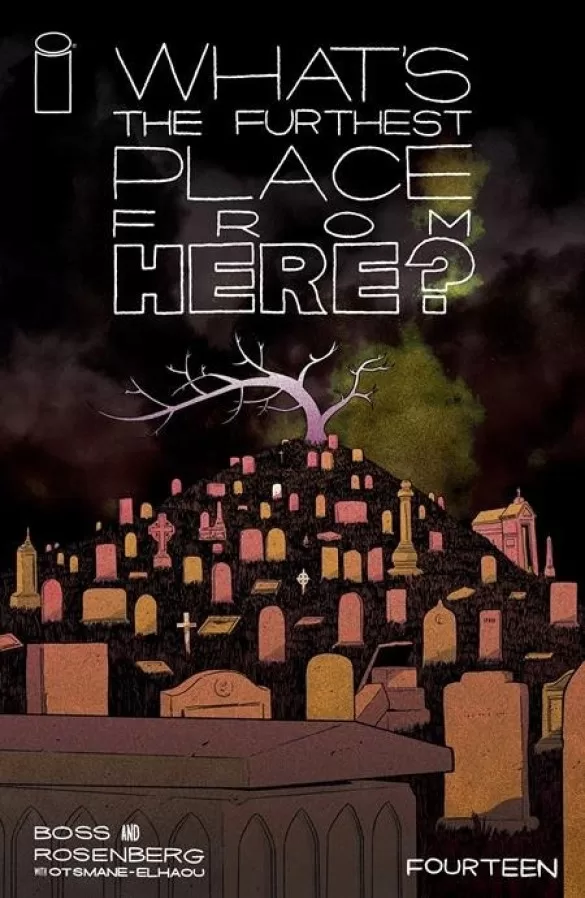
It is worth noting that the colors are just as beautiful as always. The color scheme of this issue is heavy on oranges, and I think that it’s very fitting considering that in a way, it reads as a Halloween special edition story which makes the pumpkin orange feel very relevant. It is very easy on the eyes as well, it is painted with several gradients and relies heavily on spot blacks to add shading, contrasts, and interest to an otherwise flat panel. This use of black ink is something that I love and it is definitely a little thing that I adore seeing in all the comics I love. Whether it’s Mike Mignola’s Hellboy franchises, or Jeff Smith’s Bone and RASL; if you’re using black to shade instead of going the cell-shaded route, and you’re pulling it off well, I will forever applaud that. This kind of comic-making can set you apart from other comics in the market, especially when that market is heavy on using colors for shading. This series has a style of its own and right from the cover art you know that what you are reading is going to be very different from anything you’ve read before. The lettering is equally fantastic on this as well as in previous issues. It very much looks to be done with the art style in mind and everything from word balloons to sound fx maintains the grunginess of the rest of the art, and it works perfectly. No sticker lettering to be seen in this book at all. I have to say that the sound fx are all very creative, and I love that they opted for what seems to be hand-drawn sound fx that do not repeat (even if it’s the same sound fx), I think this attention to detail heightens the story greatly and makes for a wonderful reading experience. Everything feels seamless. Even the different chapter stops work wonderfully at conveying a sense of pacing that reads like an old-school RL Stine-ish tv episode. Here we literally fade to black, after a chapter ends. I also like this a lot because it almost feels like I could be reading a webcomic and this is just another installment in the series, if I was reading this on my phone on a weekly basis, I would have no trouble reading through to the end of the chapter because each chapter is packed with enough action and drama to move the story further without feeling too convoluted. That being said, being able to read the whole thing in one issue is 10x better because the payoff at the end (even when it ends in a cliffhanger) is well worth it.
In conclusion, I really like this series. I love what they are doing with the story. I love that I can jump in on any issue and not feel totally and completely lost. I love the art, the character designs, the colors, the lettering, and the cover art; I love the whole thing thoroughly. I can’t wait to read this in a Hardcover when the issue is fully completed.
Writing: 5 Stars
Art: 5 Stars
Colors: 5 Stars
Overall: 5 Stars
Story by: Tyler Boss & Matthew Rosenberg
Coloring by: Roman Titov & Shycheeks
Lettering by: Hassan Otsmane-Elhaou
Cover art by: Tyler Boss
Variant Covers by: Andy Macdonald, Lauren Affe & Marcus Jimenez
Published by Image Comics
Author Profile
Latest entries

