REVIEW: What’s the Furthest Place from Here? #16
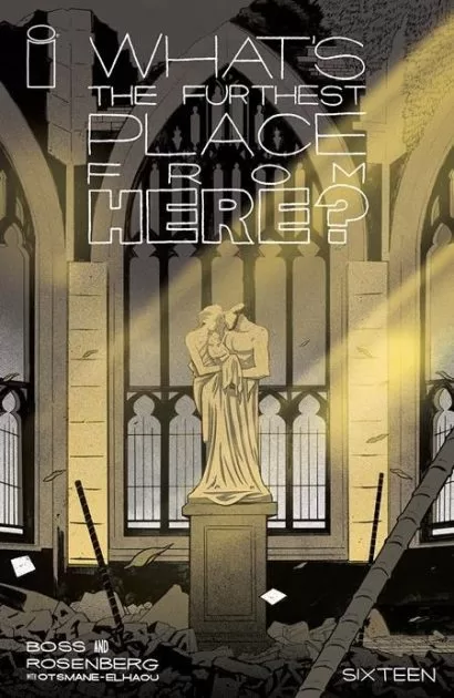 Gods become records, records become memories, memories become music and the cycle begins anew. This, the latest issue of “What’s the furthest place from here” begins shedding light into the mysterious world of WTFPFH and with this light, Sidney’s questions start getting answers. Fantastic pacing, a beautiful environment design, and wonderful characters continue the journey that creators Tyler Boss and Matthew Rosenberg have thus far laid out for us. Whilst this issue is not as fantastical as the previous ones, it is nonetheless a wonderful addition to the series, and it feels much more peaceful than the chaos of previous issues. This issue is also the home of some fantastically drawn action panels, as well as a full-page illustration of a world that time has forgotten.
After taking the boat to “Citwall” and passing out upon arrival, Sidney is welcomed and cared for by… humans. Yes, in this issue the curtain is pulled back and we begin to see the mystery unravel. Everything is in fact not as it seems. Kids have been made sterile by the food of the strangers, but Sidney is still as pregnant as ever. This issue unlike previous ones feels much more technological, whereas previous issues were all about a world filled with fantasy. Behind the city wall, we find a society that is much more adept at surviving, with commodities such as clean air, and birds. In the world of WTFPFH, this revelation is more alien than the actual alien creatures of previous chapters.
Whereas the previous issue was all about action and fast-paced movement. This part of the story is more peaceful and feels like a breath of fresh air not only for the characters but also for the reader. In this issue, we are not bombarded with fantasy, mystery, or the unknown. Instead, we are gently caressed by the hands of familiarity in a society that is much like our own, a society that grows its own food and doesn’t have to trade for it. A society that has a socio-political structure is a society where individuals have jobs and duties. After so much time running, Sidney is given a break to take in the reality of her existence and figure out the world with much-needed clarity. Accompanied by a fellow member of the Academy, Sidney ventures down below the city to a place that is reminiscent of New York had it been blown up by an Atomic Bomb years before. It is in this place that her Gods are made to sing, and she is able to not only listen but feel them for the first time. It is here that the Gods of Hall & Oates become manifest. This issue has some of the best sequences in the whole story; I am in love with the way the playing of a vinyl record is handled in a post-apocalyptic society, as well as the beautifully illustrated “waking up in the hospital” sequence. It is during this latter sequence that the best most action-packed drawing of Sidney has been drawn (in my opinion). The way she rips out her IV needle and then uses it to threaten Poly in just 3 panels is beautiful. Great pacing and fantastic art and posing that serves the story well.
This issue also has one of my favorite color schemes so far, which are green-blue-yellow juxtaposed with blues-greys and purples. The first half of the story is rich in color with this GBY color scheme, and it sets the tone of the story quite well as this part of the story is more peaceful and revolves around Sidney acclimating to the world behind Citwall, which in no way is as dark as we all thought it was going to be. The second half of the story is more serious and thus the colors change to greys, blues, and purples to emphasize both the seriousness of the narrative but also the mysterious aspect of a world forgotten by time. Speaking of colors, the last few pages are filled with colors as Sidney lays down and enjoys the music of Hall & Oates for the very first time. This issue also excels with its environment design as it demonstrates a fantastic use of nature and architecture by having the city be a mix of a greenhouse and a futuristic domed town, with plenty of greenery to go around. While the character designs are mostly human, and many of them are of similar body types and heights, we are still treated to a wonderful duo of characters known as the Magister and Arbiter Fagin. The Magister a tall, long, white-bearded man with purple and green robes stands out perfectly well next to the short and plump green and yellow Arbiter Fagin, one small note here, I love Arbiter Fagin’s mustache and little red nose, it makes him look so cute. This cuteness is only exaggerated next to the grimness and darker demeanor of the High Magister.
Even though this is a more relaxed issue, we still get some great lettering choices. The same fantastic fonts used throughout the book continue to be used here, but there are a few great ideas that worked very well for this issue. In my favorite panel of the whole story, we see a wavy word balloon that merges with the white of the page and holds the sound “graah!”, it also has a balloon tail that goes behind the art and serves to further the impact of Sidey’s scream as she wakes up in unknown circumstances. Letterer Hassan Otsmane-Elhaou also does a great job at knowing exactly when to cut off a word balloon, or when to emphasize a certain word to truly drive the script of Tyler Boss and Matthew Rosenberg home. Last but not least, if I had to summarize the lettering style of Otsmane-Elhaou into one thing they do really well, it would have to be custom word balloons. There are a handful of them, but they all serve different purposes and they all work really well together to illustrate exactly what is happening in the story. My favorite instance of this technique is when Sidney is chowing down on a plate of soup, and Otsmane-Elhaou uses the word ballon that I truly have never seen before that is a mix between a thought balloon, a wave ballon, and also an explosion balloon. This balloon is so chaotic that it literally feels like a person stuffing their head into a bowl of food and slurping it all in one go, truly fantastic work.
All in all, I liked this issue a lot. While the last issue was great, it did feel a little too Halloweeny, however, this is a wonderful conclusion to the journey Sidney and I am excited to see what happens moving forward now that Sidney is so ready to give birth, and we’ve learned that kids are being deliberately sterilized by strangers. I must confess, a friend read through most of the series and felt that it wasn’t going anywhere, or rather that it was going too many places at once. This issue for me, feels like a lot of those threads are being tied together, and that we are narrowing down on a proper conclusion for the story, which to me feels like Tyler and Matthew are definitely on the right track with the story.
To close off the review, I must be fair and let you know that this is not one of those issues that you can pick up and read without any backstory like a few of the other ones have been. It is still very interesting for the fans of WTFPFH and feels like the perfect set-up for an upcoming action-filled surprise twist.
Writing: 5 Stars
Art: 5 Stars
Colors: 5 Stars
Overall: 5 Stars
Written and Illustrated by: Tyler Boss & Matthew Rosenberg
Coloring by: Roman Titov & Shycheeks
Lettering by: Hassan Otsmane-Elhaou
Cover art by: Tyler Boss
Variant Covers by: JoeMulvey & Kelly Fitzpatrick
Published by: Image Comics
Author Profile
Latest entries
 ColumnsMay 6, 2025Primordios: Enchanting Creations and Heartfelt Moments at Puerto Rico Comic Con 2025
 Comic BooksApril 17, 2025REVIEW: Sister Imperator #1
 Comic BooksFebruary 25, 2025REVIEW: Cruel Kingdom #2
 Comic BooksFebruary 24, 2025REVIEW: Godzilla Heist #1
